Exam 2: Graphical Methods for Describing Data Distributions
Exam 1: Collecting Data in Reasonable Ways44 Questions
Exam 2: Graphical Methods for Describing Data Distributions33 Questions
Exam 3: Numerical Methods for Describing Data Distributions32 Questions
Exam 4: Describing Bivariate Numerical Data33 Questions
Exam 5: Probability45 Questions
Exam 6: Random Variables and Probability Distributions57 Questions
Exam 7: Selecting an Appropriate Method4 Questions
Exam 8: Sampling Variability Sampling25 Questions
Exam 9: Estimation Using a Single Sample29 Questions
Exam 10: Asking and Answering Questions About a Population Proportion37 Questions
Exam 11: Asking and Answering Questions About the Difference Between Two Population Proportions22 Questions
Exam 12: Asking and Answering Questions About a Population Mean38 Questions
Exam 13: Asking and Answering Questions About the Difference Between Two Means27 Questions
Exam 14: Learning From Experiment Data8 Questions
Select questions type
When using histograms to compare groups of different sizes, one may
use either frequencies or relative frequencies for the vertical axis and still
be effective.
(True/False)
4.9/5  (29)
(29)
A segmented bar chart uses rectangles rather than circles to display
different categories in a set of data.
(True/False)
4.7/5 (31)
One of the "media messages" sent by television is that appearance is very important.
These messages are thought to spur young women to have unrealistic expectations
about beauty, thus encouraging women to spend more money on cosmetics and
toiletries. During a recent prime-time television season investigators kept track of
"appearance" comments. Data on comments by TV males, classified by gender of the
comment recipient and type of appearance comment, are given in the table below. Insults, Compliments, and Neutral Appearance Comments (Males commenting)
Nature of comment Males about males Males about females Compliments 52 106 Insults 41 15 Totals 93 121 (a) Graphically present these data by constructing a comparative bar chart that would
allow you to compare the comments about males and females.
(b) Using the information in the table, write a few sentences about how the
comments differ for male recipients and female recipients.
(Essay)
4.8/5 (28)
An outlier is a data value that is unusually far from the rest of the values
in a data set.
(True/False)
4.9/5 (30)
A time series plot is a graph of data that has been gathered at different
points in time.
(True/False)
4.7/5 (38)
In a scatter plot, both the horizontal and vertical axes must start at zero.
(True/False)
4.8/5 (33)
A report in the Des Moines Register presented the average number of years of
teaching experience for the teachers in elementary schools in Des Moines, Iowa.
These data appear in the table below. School Average Years Exper. School Average Years Exper. School Average Years Exper. School Average Years Exper. Adams 13.8 Hanawalt 12.7 McKee 17.5 Phillips 10.5 Capitol View 9.7 Hillis 17 McKinley 5.6 Pleasant 12.8 Hill Cattell 8.5 Howe 14.9 Mitchell 6.2 River Woods 5.9 Douglas 13.8 Hubbell 15.1 Monroe 16.2 Stowe 16.5 Downtown 7.0 Jackson 16.8 Moore 16.6 Studebaker 18.4 Edmunds 8.4 Jefferson 19.2 Morris 9.9 Wallace 4.8 Findley 14.9 King 7.0 Moulton 8.6 Willard 9.7 Garton 9.3 Longfellow 9.8 Oak Park 11.4 Windson 17.7 Granger 17.2 Lovejoy 9.9 Park 11.4 Woodlawn 17 Greenwood 14 Madison 20.8 Perkins 11.2 Wright 12.9 (a) Sketch a histogram for these data, using the following class intervals:
0 to <4 4 to <8 , etc. (b) Describe the distribution of the average number of years of teaching experience,
and note any unusual features.
(Essay)
4.8/5 (31)
If the upper tail of a distribution stretches out farther than the lower tail,
the distribution is negatively skewed.
(True/False)
4.7/5 (33)
A report in the Des Moines Register presented on the percentages of students who
qualify for Free/Reduced lunch programs in the elementary schools in Des Moines,
Iowa. These data appear in the table below. School \% F/R School \% F/R School \% F/R School \% F/R Adams 64 Hanawalt 14 McKee 55 Phillips 27 Capitol View 78 Hillis 35 McKinley 78 Pleasant Hill 17 Cattell 55 Howe 49 Mitchell 64 River Woods 48 Douglas 45 Hubbell 31 Monroe 52 Stowe 56 Downtown 8 Jackson 60 Moore 42 Studebaker 30 Edmunds 83 Jefferson 5 Morris 54 Wallace 80 Findley 64 King 71 Moulton 88 Willard 82 Garton 53 Longfellow 84 Oak Park 59 Windson 37 Granger 52 Lovejoy 66 Park Avenue 38 Woodlawn 40 Greenwood 38 Madison 58 Perkins 54 Wright 29 (a) Sketch a histogram for these data, using the following class intervals:
20 t
0 t 0 to <20 20 to <40 , etc. (b) Describe the distribution of Free/Reduced eligibility percents, and note any
unusual features.
(Essay)
4.9/5 (34)
Desert organisms must cope with extreme and variable conditions. Their coping strategies frequently involve retreating to a sub-surface refuge. Researchers in New Mexico, investigating the underground shelter choices by Gila Monsters (Heloderma suspectum), hypothesized that depth might be a factor. They reasoned that deeper shelters would be less susceptible to extremes of heat and cold and thus depth would be preferred in a shelter. Depth data for 20 chosen shelters and the 20 nearest available shelters not chosen are presented in the table at right.
Shelter Depths (cm) Chosen Nearest Chosen Nearest 94 54 33 32 89 6 15 14 32 57 27 7 76 50 27 32 65 46 85 28 30 41 52 52 68 43 80 50 84 59 33 55 10 55 79 69 58 53 71 55
a) Display these data using a comparative (back-to-back) stem-and-leaf plot. Use the
stems shown below, and be sure to include all information needed to compare the
two distributions.
|1|
|2|
|3|
|4|
|0| |0|
|1|
|2|
|3|
|4|
|5|
|6|
|7|
|8|
|9| |5|
|6|
|7|
|8|
|9|
(b) Describe the similarities and differences between the chosen and not chosen
shelter depths.
(c) Are these data consistent with the researchers' expectations? Explain, using
specific aspect(s) of your plot in part (a).
(Essay)
4.9/5 (26)
D Desert organisms must cope with extreme and variable conditions. Their coping strategies frequently involve retreating to a sub-surface refuge. Researchers in New Mexico, investigating the underground shelter choices by Gila Monsters (Heloderma suspectum), hypothesized that depth might be a factor. They reasoned that deeper shelters would be less susceptible to extremes of heat and cold and thus depth would be preferred in a shelter. Depth data for 20 chosen shelters and 20 available shelters not chosen are presented in the table at right.
Shelter Depths (cm) Chosen Nearest Chosen Nearest 94 54 33 32 89 6 15 14 32 57 27 7 76 50 27 32 65 46 85 28 30 41 52 52 68 43 80 50 84 59 33 55 10 55 79 69 58 53 71 55
a) Display these data using a comparative (back-to-back) stem-and-leaf plot. Use the
stems shown below, and be sure to include all information needed to compare the
two distributions.
|1|
|2|
|3|
|4|
|0| |1|
|2|
|3|
|4|
|5|
|6|
|7|
|8|
|9| |5|
|6|
|7|
|8|
|9|
(b) Describe the similarities and differences between the chosen and not chosen
shelter depths.
(c) Are these data consistent with the researchers' expectations? Explain, using
specific aspect(s) of your plot in part (a).
(Essay)
4.8/5 (32)
Marine biologists have reported the discovery of a new species of fish in the Western
North Atlantic. Data on the head length (n=41) and pelvic fin length (n=30) are
shown below. 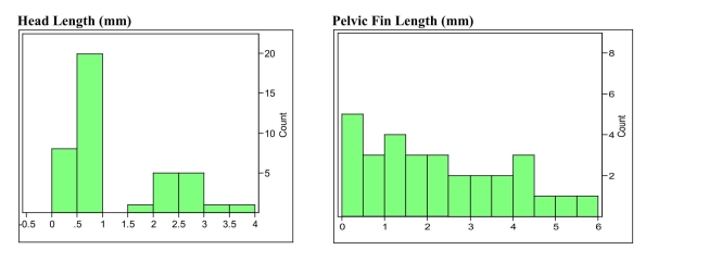 a) Describe the distributions of these two variables using appropriate statistical
terms.
b) The distribution of head lengths appears to be rather strange. What do you think
might account for the shape of this distribution?
a) Describe the distributions of these two variables using appropriate statistical
terms.
b) The distribution of head lengths appears to be rather strange. What do you think
might account for the shape of this distribution?
(Essay)
4.9/5 (35)
Filters
- Essay(0)
- Multiple Choice(0)
- Short Answer(0)
- True False(0)
- Matching(0)