Exam 4: Analyzing and Charting Financial Data
Exam 1: Getting Started With Excel100 Questions
Exam 2: Formatting Workbook Text and Data100 Questions
Exam 3: Calculating Data With Formulas and Functions100 Questions
Exam 4: Analyzing and Charting Financial Data100 Questions
Exam 5: Working With Excel Tables, Pivot-tables, and Pivot-charts100 Questions
Exam 6: Managing Multiple Worksheets and Workbooks100 Questions
Exam 7: Developing an Excel Application100 Questions
Exam 8: Working With Advanced Functions100 Questions
Exam 9: Exploring Financial Tools and Functions100 Questions
Exam 10: Performing What If Analyses100 Questions
Exam 11: Connecting to External Data99 Questions
Exam 12: Collaborating on a Shared Workbook120 Questions
Exam 13: Managing Your Files100 Questions
Select questions type
The range of values,or ___________________,of an axis is based on the values in the data source.
Free
(Short Answer)
4.8/5  (47)
(47)
Correct Answer: Verified
scale
When combination charts have data series with vastly different values,you can create ____ charts.
Free
(Multiple Choice)
4.8/5 (34)
Correct Answer:Verified
A
A ____________ displays data values as columns with the height of each column based on the data value.
Free
(Short Answer)
4.8/5 (22)
Correct Answer:Verified
column chart
Consider the impact of a poorly designed chart.Explain why it is important to have a well-designed chart,and name at least four tips for creating a good chart.
(Essay)
4.8/5 (25)
Simon has just started a job with the police department. His director has given him the last six months of test results from four local precincts. Simon has organized the results as four data series and needs to display the trends in a graphic format.
-Simon wants to change the chart's border.To do this,he should select the CHART TOOLS ____ tab.
(Multiple Choice)
4.8/5 (32)
A chart that compares three set of values in a three-dimensional chart is _____.
(Multiple Choice)
4.8/5 (30)
____provide descriptive text for the individual data markers,such as pie slices
(Multiple Choice)
4.8/5 (31)
Edward Tufte said that ____ ink is any part of the chart that does not convey information about the data.
(Multiple Choice)
4.9/5 (28)
Category values are usually located in the ____ of the data source.
(Multiple Choice)
4.9/5 (34)
The goal of a ______ is to convey the maximum amount of information within a very small space.
(Short Answer)
4.9/5 (40)
To reposition the legend to the left-hand side of a chart,click the _________ button,point to Legend,click the right arrow icon,and click Left.
(Multiple Choice)
4.9/5 (44)
A ________ contains the actual values that are plotted on the chart
(Multiple Choice)
4.7/5 (41)
The ____ identifies which data markers are associated with each data series.
(Multiple Choice)
4.8/5 (31)
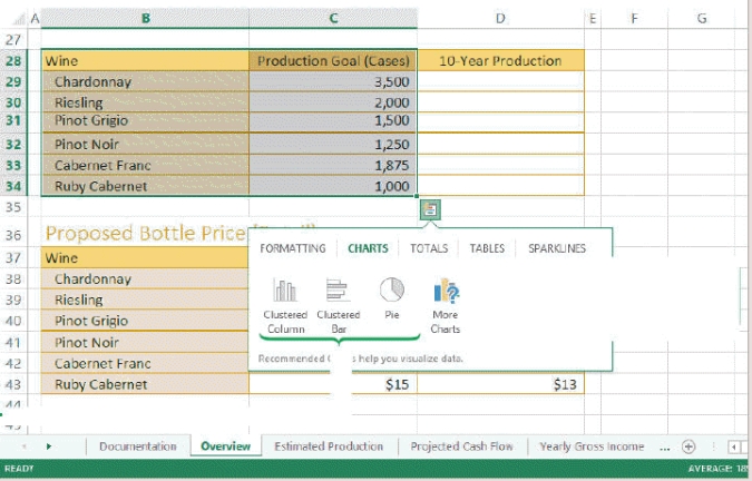 -Referring to the figure above,if you were to create a Wine Production Chart pie chart using the information in B28:C34,the data source for that chart would be ____.
(Multiple Choice)
4.9/5 (36)
A bar is a conditional format that adds a horizontal bar to the background of a cell containing a numeric value._________________________
(True/False)
4.9/5 (34)
In cases where a label placed outside a pie might appear farther from its slice than is easily readable,a(n)____________________ might be added to connect the data to its corresponding slices.
(Short Answer)
4.8/5 (35)
Edward Tufte was concerned with what he termed as "chart ____," in which a proliferation of chart elements-chosen because they look "nice"-confuse and distract the reader.
(Multiple Choice)
4.9/5 (28)
Filters
- Essay(0)
- Multiple Choice(0)
- Short Answer(0)
- True False(0)
- Matching(0)