Exam 4: Analyzing and Charting Financial Data
Exam 1: Getting Started With Excel100 Questions
Exam 2: Formatting Workbook Text and Data100 Questions
Exam 3: Calculating Data With Formulas and Functions100 Questions
Exam 4: Analyzing and Charting Financial Data100 Questions
Exam 5: Working With Excel Tables, Pivot-tables, and Pivot-charts100 Questions
Exam 6: Managing Multiple Worksheets and Workbooks100 Questions
Exam 7: Developing an Excel Application100 Questions
Exam 8: Working With Advanced Functions100 Questions
Exam 9: Exploring Financial Tools and Functions100 Questions
Exam 10: Performing What If Analyses100 Questions
Exam 11: Connecting to External Data99 Questions
Exam 12: Collaborating on a Shared Workbook120 Questions
Exam 13: Managing Your Files100 Questions
Select questions type
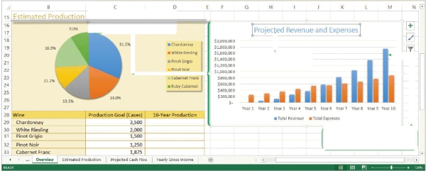 -Referring to the figure above,in the column chart,the values along the left side ($200,000,$400,000,$600,000,etc.)are ____.
(Multiple Choice)
4.8/5  (39)
(39)
____ is the amount added to the prinicpal of a loan by the lender.
(Multiple Choice)
5.0/5 (37)
MATCHING
Identify the letter of the chart type that best matches the phrase or definition.
-Compares three sets of values in a three-dimensional chart
(Multiple Choice)
4.8/5 (39)
MATCHING
Identify the letter of the chart type that best matches the phrase or definition.
-Compares values from different categories.A value is indicated by the length of the ____
(Multiple Choice)
4.9/5 (43)
A(n)____________________ chart shows patterns or relationships between two or more sets of values,much like an XY chart,except the size of the data marker is determined by a third value.
(Short Answer)
4.7/5 (38)
MATCHING
Identify the letter of the chart type that best matches the phrase or definition.
-Compares values from different categories.A value is indicated by the height of each ____.
(Multiple Choice)
4.9/5 (39)
Sparklines differ from data bars in that the sparklines are always placed in the cells containing the value they represent.
(True/False)
4.8/5 (36)
The cell with the largest value contains a that extends across the entire width of the cell,and the lengths of the other bars in the selected range are determined relative to that bar._________________________
(True/False)
4.8/5 (37)
is the amount added to the principal by the lender._________________________
(True/False)
4.8/5 (39)
To compare values from several categories with a sequential order,such as dates and times occurring at evenly spaced intervals,you would use a(n)____________________ chart.
(Short Answer)
4.7/5 (45)
In a line chart,the are the points connected by the line._________________________
(True/False)
4.8/5 (34)
Generally,_____ are given a "washed-out" appearance and are placed behind text or charts on the sheet so that they do not obscure any of the other content on the sheet.
(Multiple Choice)
4.8/5 (37)
Simon has just started a job with the police department. His director has given him the last six months of test results from four local precincts. Simon has organized the results as four data series and needs to display the trends in a graphic format.
-Simon has finished his chart but needs to save some space.What's the most effective way for Andy to reduce space without losing important data?
(Multiple Choice)
4.8/5 (40)
You already created a line chart,but now decide that you want to change this chart to a pie chart.To do this,you click ____ from the Type group in the Chart Tools Design tab.
(Multiple Choice)
4.9/5 (40)
MATCHING
Identify the letter of the chart type that best matches the phrase or definition.
-Compares a collection of values from several different data sets.
(Multiple Choice)
5.0/5 (38)
Which of the following shows the correct order of steps for adding a data series to a chart?
(Multiple Choice)
5.0/5 (42)
Line charts are best suited for representing data that follows some nonsequential order.
(True/False)
4.8/5 (29)
MATCHING
Identify the letter of the chart type that best matches the phrase or definition.
-Shows patterns or relationship between two or more sets of values.Often used in scientific studies and statistical analyses.
(Multiple Choice)
4.7/5 (38)
Filters
- Essay(0)
- Multiple Choice(0)
- Short Answer(0)
- True False(0)
- Matching(0)