Exam 4: Analyzing and Charting Financial Data
Exam 1: Getting Started With Excel100 Questions
Exam 2: Formatting Workbook Text and Data100 Questions
Exam 3: Calculating Data With Formulas and Functions100 Questions
Exam 4: Analyzing and Charting Financial Data100 Questions
Exam 5: Working With Excel Tables, Pivot-tables, and Pivot-charts100 Questions
Exam 6: Managing Multiple Worksheets and Workbooks100 Questions
Exam 7: Developing an Excel Application100 Questions
Exam 8: Working With Advanced Functions100 Questions
Exam 9: Exploring Financial Tools and Functions100 Questions
Exam 10: Performing What If Analyses100 Questions
Exam 11: Connecting to External Data99 Questions
Exam 12: Collaborating on a Shared Workbook120 Questions
Exam 13: Managing Your Files100 Questions
Select questions type
MATCHING
Identify the letter of the chart type that best matches the phrase or definition.
-Displays stock market data
(Multiple Choice)
4.8/5  (37)
(37)
To format an individual sparkline,select the sparkline you want to format,and then click the Ungroup button in the Group group on the SPARKLINE TOOLS ____ tab.
(Multiple Choice)
4.8/5 (41)
In pie charts,it's best to make the slice colors as similar as possible.
(True/False)
4.8/5 (48)
The PMT function calculates the payment required in each period to pay back the loan.
(True/False)
4.8/5 (30)
The ____ is the only one of the following charts to compare relative values from different categories to the whole.
(Multiple Choice)
4.9/5 (45)
Combination charts enable you to show sets of data using the chart type that is best for each data set._________________________
(True/False)
4.8/5 (39)
You can move a chart from one worksheet to another,or you can place the chart in its own chart sheet.
(True/False)
4.8/5 (42)
When you create sparklines,clicking any cell in the range selects all of the sparklines in the group._________________________
(True/False)
4.9/5 (42)
MATCHING
Identify the letter of the chart type that best matches the phrase or definition.
-Compares values from different categories.Areas under the lines contain a fill color
(Multiple Choice)
4.7/5 (39)
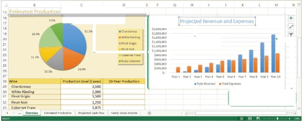 -Referring to the figure above,the rectangular area to the right of the pie chart is the ____.
(Multiple Choice)
4.8/5 (38)
Mya has just surveyed 100 students to get their reaction to a new textbook she is reviewing. She has one data series that she wants to represent graphically, and she needs to display her data in a way that lets her visually compate the data values and see how much contributes to the whole.
-Mya has asked for your advice.A colleague told her to remove the legend from her pie chart because it takes up too much space.What would be a better piece of advice to give Mya?
(Multiple Choice)
4.9/5 (30)
The ____ CHART TOOLS contextual tabs appear on the Ribbon when you select a chart.
(Multiple Choice)
4.9/5 (35)
Since scientific data is often plotting two numeric values against one another,it is oftentimes best to represent this data type with a(n)____________________ chart.
(Short Answer)
4.9/5 (27)
-Referring to the figure above,the entry 31.5%,shown next to the largest pie slice,is a ____.
(Multiple Choice)
4.8/5 (35)
In the lower right corner,below C34,the _____ tool displays.
(Multiple Choice)
4.8/5 (38)
You can add ___________________ to identify smaller intervals between the major tick marks.
(Short Answer)
4.8/5 (33)
A column chart turned on its side is called a bar chart,with the length of the bar determined by the data value.
(True/False)
4.8/5 (38)
Filters
- Essay(0)
- Multiple Choice(0)
- Short Answer(0)
- True False(0)
- Matching(0)