Exam 4: Analyzing and Charting Financial Data
Exam 1: Getting Started With Excel100 Questions
Exam 2: Formatting Workbook Text and Data100 Questions
Exam 3: Calculating Data With Formulas and Functions100 Questions
Exam 4: Analyzing and Charting Financial Data100 Questions
Exam 5: Working With Excel Tables, Pivot-tables, and Pivot-charts100 Questions
Exam 6: Managing Multiple Worksheets and Workbooks100 Questions
Exam 7: Developing an Excel Application100 Questions
Exam 8: Working With Advanced Functions100 Questions
Exam 9: Exploring Financial Tools and Functions100 Questions
Exam 10: Performing What If Analyses100 Questions
Exam 11: Connecting to External Data99 Questions
Exam 12: Collaborating on a Shared Workbook120 Questions
Exam 13: Managing Your Files100 Questions
Select questions type
Pie charts are most effective with or fewer slices._________________________
(True/False)
5.0/5  (32)
(32)
Each data source is a collection of ____________________,which is a range of values plotted as a single unit on a chart.
(Short Answer)
4.8/5 (37)
MATCHING
Identify the letter of the chart type that best matches the phrase or definition.
-Compares relative values of different categories to the whole.A value is indicated by the area of a(n)____
(Multiple Choice)
4.7/5 (40)
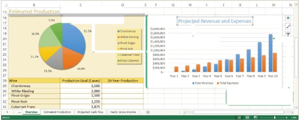 -Referring to the figure above,the chart title for the pie chart is ____.
(Multiple Choice)
4.8/5 (35)
Which of the following represents the pointer when it is over the chart area?
(Multiple Choice)
4.8/5 (39)
Mya has just surveyed 100 students to get their reaction to a new textbook she is reviewing. She has one data series that she wants to represent graphically, and she needs to display her data in a way that lets her visually compate the data values and see how much contributes to the whole.
-Mya has decided she needs to move her chart so that it appears below her data source. Before she can move or resize her chart she must ______.
(Multiple Choice)
4.7/5 (33)
______ are horizontal and vertical lines that help you compare data and category
values.
(Short Answer)
4.8/5 (45)
Simon has just started a job with the police department. His director has given him the last six months of test results from four local precincts. Simon has organized the results as four data series and needs to display the trends in a graphic format.
-Simon's boss wants him to compare the values in this chart with several different data sets. Simon should prepare a(n)____ for his boss.
(Multiple Choice)
4.8/5 (33)
To move one slice of a pie chart away from the pie creates a(n)____.
(Multiple Choice)
4.7/5 (35)
The range of values or _______,of an axis is based on the values in the data source.
(Multiple Choice)
4.9/5 (31)
A chart that combines two or more chart types into a single graph is called a(n)____________________ chart.
(Short Answer)
4.8/5 (34)
Excel supports all of the following types of sparklines EXCEPT ____.
(Multiple Choice)
4.7/5 (37)
Every chart contains elements that can be formatted,added to the chart,or removed
from the chart.
(True/False)
4.9/5 (35)
Excel charts are either placed in their own chart sheets or embedded in a worksheet.
(True/False)
4.8/5 (37)
To add and remove chart elements,you can use the Add Chart Element button in the Charts Layout group on the ____ tab.
(Multiple Choice)
4.7/5 (30)
The ____ dialog box provides options for moving charts between worksheets and chart sheets.
(Multiple Choice)
4.8/5 (47)
When selecting a chart,it's important to choose the right type of chart to represent your data. If choosing between a pie chart and a line chart,what factors would you evaluate in choosing which chart to use? How would each chart differ in representing your data?
(Essay)
4.8/5 (39)
 -In the figure above,the biggest slice is the cases of _______.
(Multiple Choice)
4.9/5 (31)
Filters
- Essay(0)
- Multiple Choice(0)
- Short Answer(0)
- True False(0)
- Matching(0)