Exam 21: Graphs in Economics
Exam 1: First Principles198 Questions
Exam 2: Economic Models295 Questions
Exam 3: Supply and Demand264 Questions
Exam 4: Consumer and Producer Surplus228 Questions
Exam 5: Price Controls and Quotas215 Questions
Exam 6: Elasticity88 Questions
Exam 7: Taxes280 Questions
Exam 8: International Trade261 Questions
Exam 9: Decision Making by Individuals and Firms165 Questions
Exam 10: The Rational Consumer197 Questions
Exam 11: Behind the Supply Curve- Inputs and Costs357 Questions
Exam 12: Perfect Competition and the Supply Curve341 Questions
Exam 13: Monopoly316 Questions
Exam 14: Oligopoly272 Questions
Exam 15: Monopolistic Competition246 Questions
Exam 16: Externalities194 Questions
Exam 17: Public Goods and Common Resources180 Questions
Exam 18: The Economics of the Welfare State125 Questions
Exam 19: Factor Markets and the Distribution of Income317 Questions
Exam 20: Uncertainty, risk, and Private Information150 Questions
Exam 21: Graphs in Economics62 Questions
Exam 22: Consumer Preferences153 Questions
Exam 23: Indifference Curve Analysis41 Questions
Select questions type
Use the following to answer questions : 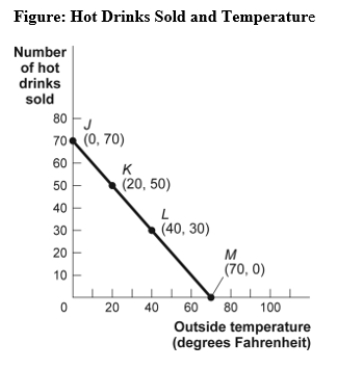 -(Figure: Hot Drinks Sold and Temperature)Use Figure: Hot Drinks Sold and Temperature.If we move from point K to point L in the figure,the outside temperature has _____ degrees and the number of hot drinks sold has _____.
(Multiple Choice)
4.9/5  (33)
(33)
The ratio of the change in the variable on the vertical axis to the change in the variable on the horizontal axis,measured between two points on the curve,is the:
(Multiple Choice)
4.9/5 (34)
A positive relationship between swimsuits purchased and ice cream purchased could be the result of:
(Multiple Choice)
4.9/5 (31)
Use the following to answer questions : 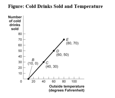 -(Figure: Cold Drinks Sold and Temperature)Use Figure: Cold Drinks Sold and Temperature.If we move from point B to point C in the figure,the outside temperature has _____ degrees and the number of cold drinks sold has _____.
(Multiple Choice)
4.8/5 (26)
Use the following to answer questions :
-(Figure: Cold Drinks Sold and Temperature)Use Figure: Cold Drinks Sold and Temperature.If we move from point C to point D in the figure,the outside temperature has _____ degrees and the number of cold drinks sold has _____.
(Multiple Choice)
4.9/5 (30)
Use the following to answer questions : 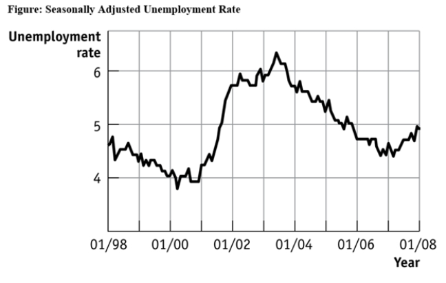 -(Figure: Seasonally Adjusted Unemployment Rate)Use Figure: Seasonally Adjusted Unemployment Rate.The distance between each labeled point on the horizontal axis is 1 year,and the distance between each labeled point on the vertical axis is 1 percentage point of unemployment.Using this graph,the unemployment rate was at its lowest point (in the time window shown)in _____ and at its highest point (in the time window shown)in _____.
(Multiple Choice)
4.8/5 (42)
Use the following to answer question 43: 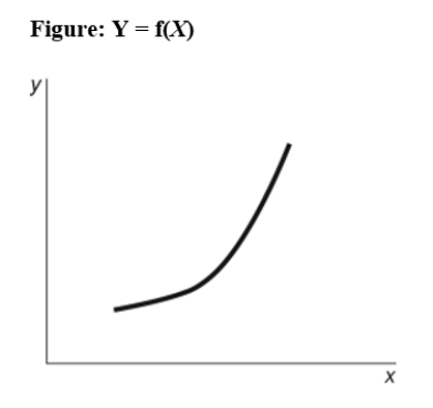 -(Figure: y = f(x))Use Figure: y = f(x).The slope of the relation between x and y is:
(Multiple Choice)
4.8/5 (36)
Use the following to answer questions :
-(Figure: Seasonally Adjusted Unemployment Rate)Use Figure: Seasonally Adjusted Unemployment Rate.The distance between each labeled point on the horizontal axis is 1 year,and the distance between each labeled point on the vertical axis is 1 percentage point of unemployment.Unemployment was _____ between 1/2001 and 1/2002 and _____ between 1/1999 and 1/2000.
(Multiple Choice)
4.8/5 (33)
Use the following to answer questions : Table: Price, Quantity Demanded, and Quantity Supplied Price Quantity demanded 16 8 4 2 1 Quantity supplied 3 5 7 9 11
-(Table: Price,Quantity Demanded,and Quantity Supplied)Use Table: Price,Quantity Demanded,and Quantity Supplied.The data in the figure suggest a non-linear relation between:
(Multiple Choice)
4.9/5 (27)
Use the following to answer questions : 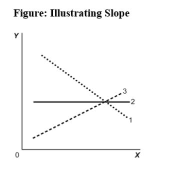 -(Figure: Illustrating Slope)Use Figure: Illustrating Slope.In the graph,line 1 depicts X and Y to be:
(Multiple Choice)
4.8/5 (29)
Use the following to answer questions : 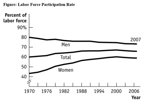 -(Figure: Labour Force Participation Rate)Use Figure: Labour Force Participation Rate.During 1970-1985,the labour force participation rate was _____ for women and _____ for men.
(Multiple Choice)
4.9/5 (39)
Use the following to answer questions :
-(Figure: Hot Drinks Sold and Temperature)Use Figure: Hot Drinks Sold and Temperature.If we move from point J to point L in the figure,the outside temperature has _____ degrees and the number of hot drinks sold has _____.
(Multiple Choice)
4.8/5 (30)
Use the following to answer questions : 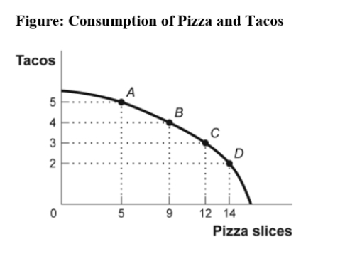 -(Figure: Consumption of Pizza and Tacos)Use Figure: Consumption of Pizza and Tacos.The figure shows the number of tacos and pizza slices Matt can eat in a day.The best estimate of the slope between point A and point B is -4.
(True/False)
4.9/5 (35)
The point at which the axes of a graph intersect is called the:
(Multiple Choice)
4.8/5 (35)
Use the following to answer questions :
-(Figure: Hot Drinks Sold and Temperature)Use Figure: Hot Drinks Sold and Temperature.If we move from point L to point M in the figure,the outside temperature has _____ degrees and the number of hot drinks sold has _____.
(Multiple Choice)
4.9/5 (38)
Use the following to answer questions :
-(Figure: Consumption of Pizza and Tacos)Use Figure: Consumption of Pizza and Tacos.The figure shows the number of tacos and pizza slices Matt can eat in a day.The relation is non-linear,and there is a negative relation between the number of tacos and pizza slices that Matt can eat in a day.
(True/False)
4.7/5 (42)
Use the following to answer questions : 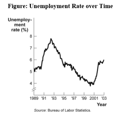 -(Figure: Unemployment Rate over Time)Look at the figure Unemployment Rate over Time.In the time-series graph,as we move from the beginning of 2001 to the beginning of 2003,we see that the unemployment rate has _____ from approximately _____ to approximately _____.
(Multiple Choice)
4.8/5 (43)
A town hires more police officers and then has an increase in arrests.One can conclude that the larger police force caused more crime.
(True/False)
4.9/5 (37)
Filters
- Essay(0)
- Multiple Choice(0)
- Short Answer(0)
- True False(0)
- Matching(0)