Exam 21: Graphs in Economics
Exam 1: First Principles198 Questions
Exam 2: Economic Models295 Questions
Exam 3: Supply and Demand264 Questions
Exam 4: Consumer and Producer Surplus228 Questions
Exam 5: Price Controls and Quotas215 Questions
Exam 6: Elasticity88 Questions
Exam 7: Taxes280 Questions
Exam 8: International Trade261 Questions
Exam 9: Decision Making by Individuals and Firms165 Questions
Exam 10: The Rational Consumer197 Questions
Exam 11: Behind the Supply Curve- Inputs and Costs357 Questions
Exam 12: Perfect Competition and the Supply Curve341 Questions
Exam 13: Monopoly316 Questions
Exam 14: Oligopoly272 Questions
Exam 15: Monopolistic Competition246 Questions
Exam 16: Externalities194 Questions
Exam 17: Public Goods and Common Resources180 Questions
Exam 18: The Economics of the Welfare State125 Questions
Exam 19: Factor Markets and the Distribution of Income317 Questions
Exam 20: Uncertainty, risk, and Private Information150 Questions
Exam 21: Graphs in Economics62 Questions
Exam 22: Consumer Preferences153 Questions
Exam 23: Indifference Curve Analysis41 Questions
Select questions type
Your boss asks you to graph company profits for the past 10 years.The BEST way to show this information is with a(n):
(Multiple Choice)
4.8/5  (29)
(29)
Use the following to answer questions : 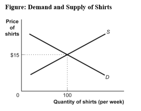 -(Figure: Demand and Supply of Shirts)Use Figure Demand and Supply of Shirts.If the line labeled S shows how many shirts per week will be offered for sale at various prices,then it is clear that,for supply,quantity and price are:
(Multiple Choice)
4.9/5 (39)
Use the following to answer questions : Table: Price, Quantity Demanded, and Quantity Supplied Price Quantity demanded 16 8 4 2 1 Quantity supplied 3 5 7 9 11
-(Table: Price,Quantity Demanded,and Quantity Supplied)Use Table: Price,Quantity Demanded,and Quantity Supplied.The slope of the line representing the relationship between price on the vertical axis and quantity demanded on the horizontal axis is:
(Multiple Choice)
4.9/5 (38)
Use the following to answer questions : 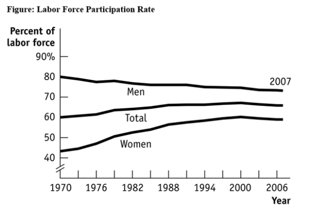 -(Figure: Labour Force Participation Rate)Use Figure: Labour Force Participation Rate.Using the figure,the labour force participation rate for women was _____ during 1970-1985 and _____ during 1998-2006.
(Multiple Choice)
4.8/5 (33)
A _____ graph shows how the value of one or more variables has changed over some period.
(Multiple Choice)
4.8/5 (37)
In a time-series graph,large changes can be made to appear insignificant by:
(Multiple Choice)
4.7/5 (35)
If two variables are negatively related,they will always be represented by a:
(Multiple Choice)
4.8/5 (36)
Use the following to answer question 22: Table: Wages and Hours Willing to Work Point Wage Hours Worked A 6 0 B 8 5 C 12 20 D 20 40 E 30 45
-(Table: Wages and Hours Willing to Work)Use Table: Wages and Hours Willing to Work.If it was graphed,the relationship between wage per hour and hours willing to work would be:
(Multiple Choice)
4.8/5 (25)
Taylor sees a bar graph showing the average weight of adult males over the past 200 years and concludes that men get more obese over time.Taylor's conclusion may be wrong since she did not consider:
(Multiple Choice)
4.8/5 (30)
Use the following to answer questions : Table: Price, Quantity Demanded, and Quantity Supplied Price Quantity demanded 16 8 4 2 1 Quantity supplied 3 5 7 9 11
-(Table: Price,Quantity Demanded,and Quantity Supplied)Use Table: Price,Quantity Demanded,and Quantity Supplied.A linear relationship exists between:
(Multiple Choice)
4.8/5 (31)
Use the following to answer questions : 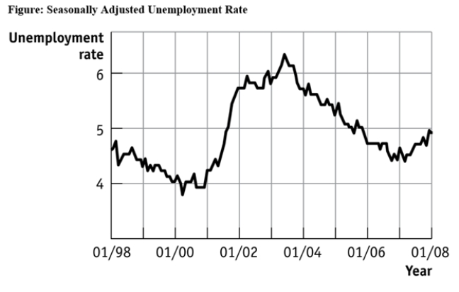 -(Figure: Seasonally Adjusted Unemployment Rate)Use Figure: Seasonally Adjusted Unemployment Rate.The distance between each labeled point on the horizontal axis is 1 year,and the distance between each labeled point on the vertical axis is 1 percentage point of unemployment.Unemployment was _____ between 1/2001 and 1/2003 and _____ between 1/2007 and 1/2008.
(Multiple Choice)
4.8/5 (35)
The relation between two variables that move in opposite directions is said to be:
(Multiple Choice)
4.8/5 (36)
Use the following to answer questions : 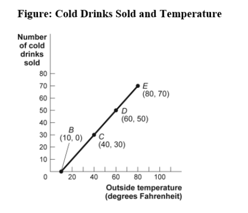 -(Figure: Cold Drinks Sold and Temperature)Use Figure: Cold Drinks Sold and Temperature.If we move from point C to point E in the figure,the outside temperature has _____ degrees and the number of cold drinks sold has _____.
(Multiple Choice)
4.9/5 (42)
Use the following to answer questions : 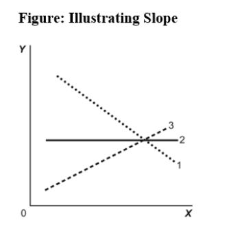 -(Figure: Illustrating Slope)Use Figure: Illustrating Slope.In the graph,line 3 depicts X and Y to be:
(Multiple Choice)
5.0/5 (37)
Professor Macro wants to use a numerical graph to show the percentage of government spending accounted for by its various components.Which graph is MOST suitable for this purpose?
(Multiple Choice)
4.8/5 (38)
Filters
- Essay(0)
- Multiple Choice(0)
- Short Answer(0)
- True False(0)
- Matching(0)