Exam 3: Describing Data Visually
Exam 1: Overview of Statistics54 Questions
Exam 2: Data Collection113 Questions
Exam 3: Describing Data Visually108 Questions
Exam 4: Descriptive Statistics156 Questions
Exam 5: Probability114 Questions
Exam 6: Discrete Probability Distributions111 Questions
Exam 7: Continuous Probability Distributions114 Questions
Exam 8: Sampling Distributions and Estimation107 Questions
Exam 9: One-Sample Hypothesis Tests135 Questions
Exam 10: Two-Sample Hypothesis Tests116 Questions
Exam 11: Analysis of Variance95 Questions
Exam 12: Simple Regression141 Questions
Exam 13: Multiple Regression133 Questions
Exam 14: Chi-Square Tests95 Questions
Select questions type
Scatter plots are used to visualize association in samples of paired data (X,Y).
Free
(True/False)
4.7/5  (41)
(41)
Correct Answer: Verified
True
Briefly list strengths and weaknesses of this display.Cite specific principles of good graphs,as well as offering your own general interpretation. 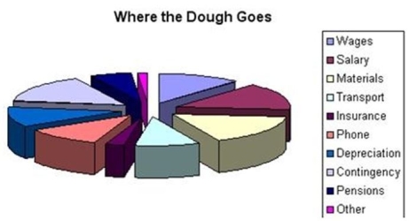
Free
(Essay)
4.8/5 (32)
Correct Answer:Verified
Eye-catching and colorful,but title is vague,units are not given,too many pie slices,3D makes it hard to assess size of slices,no source,and no year.
Effective summary tables generally
Free
(Multiple Choice)
4.9/5 (36)
Correct Answer:Verified
B
Students were given a take-home statistics assignment and were asked to write down how long it took them (in minutes).Their answers are shown below.(a)Make a dot plot.(b)Use your judgment to construct a frequency distribution using whatever classes (bins)you wish.(c)Make a histogram.(d)Describe the distribution.(e)Did your bin choices agree with Sturges' Rule? If not,why not?

(Essay)
4.9/5 (33)
Log scales are common because most people are familiar with them.
(True/False)
4.8/5 (39)
A population has 75 observations.One class interval has a frequency of 15 observations.The relative frequency in this category is
(Multiple Choice)
4.9/5 (31)
Which is not a characteristic of using a log scale to display time series data?
(Multiple Choice)
4.9/5 (25)
Below is a sorted stem-and-leaf diagram for the measured speeds (miles per hour)of 49 randomly chosen vehicles on highway I-80 in Nebraska.How many vehicles were traveling exactly the speed limit (70 mph)? 
(Multiple Choice)
4.8/5 (33)
In a bimodal histogram,the two highest bars will have the same height.
(True/False)
4.8/5 (38)
Craig operates a part-time snow-plowing business using a 2002 GMC 2500 HD extended cab short box truck.Describe Craig's gasoline mileage based on this histogram of 195 tanks of gas. 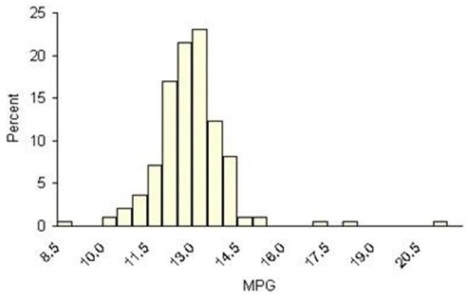
(Essay)
4.9/5 (34)
A dot plot would be useful in visualizing scores on an exam in a class of 30 students.
(True/False)
4.8/5 (34)
It is possible to construct a histogram or frequency polygon with open-ended classes.
(True/False)
4.8/5 (35)
Students were asked to record how many hours they worked at an outside job last week.Their answers are shown below.(a)Make a dot plot.(b)Use your judgment to construct a frequency distribution using whatever classes (bins)you wish.(c)Make a histogram.(d)Describe the distribution.(e)Did your bin choices agree with Sturges' Rule? If not,why not?

(Essay)
4.9/5 (35)
A column chart can sometimes be used instead of a line chart for time series data.
(True/False)
4.8/5 (29)
Filters
- Essay(0)
- Multiple Choice(0)
- Short Answer(0)
- True False(0)
- Matching(0)