Exam 3: Describing Data Visually
Exam 1: Overview of Statistics54 Questions
Exam 2: Data Collection113 Questions
Exam 3: Describing Data Visually108 Questions
Exam 4: Descriptive Statistics156 Questions
Exam 5: Probability114 Questions
Exam 6: Discrete Probability Distributions111 Questions
Exam 7: Continuous Probability Distributions114 Questions
Exam 8: Sampling Distributions and Estimation107 Questions
Exam 9: One-Sample Hypothesis Tests135 Questions
Exam 10: Two-Sample Hypothesis Tests116 Questions
Exam 11: Analysis of Variance95 Questions
Exam 12: Simple Regression141 Questions
Exam 13: Multiple Regression133 Questions
Exam 14: Chi-Square Tests95 Questions
Select questions type
A population is of size 5,500 observations.When the data are represented in a relative frequency distribution,the relative frequency of a given interval is 0.15.The frequency in this interval is equal to
(Multiple Choice)
5.0/5  (24)
(24)
Which is a reason for using a log scale for time series data?
(Multiple Choice)
4.8/5 (34)
Stacked dot plots are useful in understanding the association between two paired quantitative variables (X,Y).
(True/False)
4.7/5 (35)
Which is not a characteristic of a log scale for time series data?
(Multiple Choice)
4.8/5 (36)
Dot plots may not reveal the shape of a distribution when the sample is small.
(True/False)
4.8/5 (38)
This histogram shows Chris's golf scores in his last 77 rounds at Devil's Ridge.Which is not a correct statement? 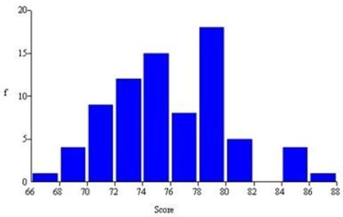
(Multiple Choice)
4.8/5 (42)
It is easier to read the data values on a 3D column chart than on a 2D column chart.
(True/False)
4.9/5 (38)
Pie charts are useful in displaying frequencies that sum to a total.
(True/False)
4.7/5 (33)
The zero origin rule may be waived for column or line charts if the objective is merely to visualize relative change over time.
(True/False)
4.9/5 (40)
Which of the following is least useful in visualizing categorical data?
(Multiple Choice)
4.8/5 (36)
The line chart is appropriate for categorical (qualitative)data.
(True/False)
4.8/5 (31)
Briefly list strengths and weaknesses of this display.Cite specific principles of good graphs,as well as offering your own general interpretation. 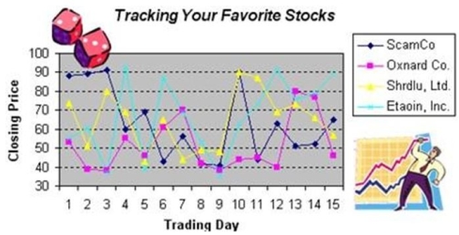
(Essay)
4.8/5 (31)
The column chart should be avoided if you are plotting time series data.
(True/False)
4.8/5 (37)
Filters
- Essay(0)
- Multiple Choice(0)
- Short Answer(0)
- True False(0)
- Matching(0)