Exam 3: Describing Data Visually
Exam 1: Overview of Statistics54 Questions
Exam 2: Data Collection113 Questions
Exam 3: Describing Data Visually108 Questions
Exam 4: Descriptive Statistics156 Questions
Exam 5: Probability114 Questions
Exam 6: Discrete Probability Distributions111 Questions
Exam 7: Continuous Probability Distributions114 Questions
Exam 8: Sampling Distributions and Estimation107 Questions
Exam 9: One-Sample Hypothesis Tests135 Questions
Exam 10: Two-Sample Hypothesis Tests116 Questions
Exam 11: Analysis of Variance95 Questions
Exam 12: Simple Regression141 Questions
Exam 13: Multiple Regression133 Questions
Exam 14: Chi-Square Tests95 Questions
Select questions type
Below is a sorted stem-and-leaf diagram for the measured speeds (miles per hour)of 49 randomly chosen vehicles on highway I-80 in Nebraska.Which is the modal class? 
(Multiple Choice)
4.7/5  (34)
(34)
If you have 32 data points,how many classes (bins)would Sturges' Rule suggest?
(Multiple Choice)
4.9/5 (33)
Below is a sorted stem-and-leaf diagram for the measured speeds (miles per hour)of 49 randomly chosen vehicles on highway I-80 in Nebraska.What is the mode? 
(Multiple Choice)
4.9/5 (30)
Pie charts are attractive to statisticians,but are rarely used in business or general media.
(True/False)
4.8/5 (26)
Sturges' Rule is merely a suggestion,not an ironclad requirement.
(True/False)
5.0/5 (36)
A frequency distribution is a tabulation of n data values into classes called bins.
(True/False)
4.9/5 (31)
Which is not a reason why pie charts are popular in business?
(Multiple Choice)
4.9/5 (34)
Briefly comment on strengths and weaknesses of this display.Cite specific principles of good graphs,as well as offering your own general interpretation. 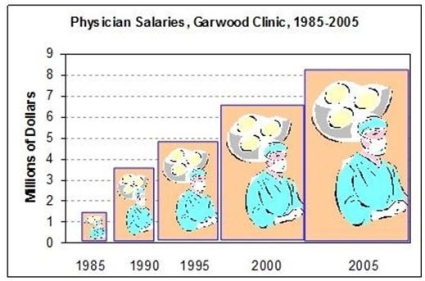
(Essay)
4.9/5 (33)
Except for the Y-axis scaling,a histogram will look the same if we use relative frequencies instead of raw frequencies (with the same bin limits).
(True/False)
4.8/5 (36)
A column chart would be least suitable to display which data?
(Multiple Choice)
4.9/5 (35)
Because most data values are on the left,we would say that this dot plot (burglary rates per 100,000 persons in 350 U.S.cities)shows a distribution that is skewed to the left (negatively skewed). 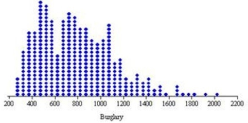
(True/False)
4.8/5 (29)
Briefly list strengths and weaknesses of this display.Cite specific principles of good graphs,as well as offering your own general interpretation. 
(Essay)
4.8/5 (38)
Below is a frequency distribution of earnings of 50 contractors in a country.  Regarding this distribution,which of the following is correct?
(Multiple Choice)
4.8/5 (32)
Filters
- Essay(0)
- Multiple Choice(0)
- Short Answer(0)
- True False(0)
- Matching(0)