Multiple Choice
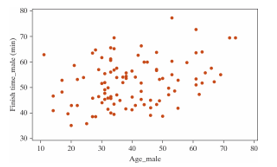
The following scatterplot displays the finish time (in minutes) and age (in years) for the male racers at the 2018 Strawberry Stampede (a 10k race through Arroyo Grande) .
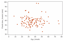
 Below are the same data for the female racers in this year's race.
-Select the best explanation for how one sample would be simulated in order to generate the null distribution for the females.
A) Holding the ages constant, randomize the order of the race finish times. Plot the correlation coefficient of the shuffled data on the null distribution.
B) Add or subtract the appropriate value from each age and race finish time in order to force the null hypothesis to be true. Plot the correlation coefficient of the shifted data on the null distribution.
C) Flip a coin to decide whether to swap the values for age and race finish time or not. Plot the correlation coefficient of the randomized points on the null distribution.
D) Put each pair of (age, race finish time) on a piece of paper. Draw with replacement 40 times. Plot the correlation coefficient of the resampled data on the null distribution.
Correct Answer:

Verified
Correct Answer:
Verified
Q17: The following scatterplot displays the finish time
Q18: Which of the following plots has the
Q19: Annual measurements of the number of powerboat
Q20: The following scatterplot displays the finish time
Q21: A student in an AP Statistics class
Q23: Annual measurements of the number of powerboat
Q24: The least squares regression line minimizes the
Q25: Data from gapminder.org on 184 countries was
Q26: It is commonly expected that as a
Q27: Babies born with low birth weights (less