Multiple Choice
The following table shows the number of payroll jobs the government added during the years its added jobs (since 1973) .The jobs are in thousands. 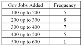 Approximately what percent of the time did the government add 200,000 or more jobs?
A) 19%
B) 50%
C) 77%
D) 81%
Correct Answer:

Verified
Correct Answer:
Verified
Q12: Exhibit 2-8.Consider the following frequency distribution. <img
Q13: The following table lists some of the
Q14: The following table shows average wind speeds
Q15: Exhibit 2-14.In the accompanying stem-and-leaf diagram,the values
Q16: The following histogram represents the number of
Q18: Exhibit 2-14.In the accompanying stem-and-leaf diagram,the values
Q19: Exhibit 2-4.Students in Professor Smith's Business Statistics
Q20: To approximate the width of a class
Q21: Exhibit 2-4.Students in Professor Smith's Business Statistics
Q22: Exhibit 2-11.The accompanying relative frequency distribution represents