Exam 4: Graphical Descriptive Techniques Numerical Data
Exam 1: What Is Statistics16 Questions
Exam 2: Types of Data, Data Collection and Sampling17 Questions
Exam 3: Graphical Descriptive Methods Nominal Data20 Questions
Exam 4: Graphical Descriptive Techniques Numerical Data64 Questions
Exam 5: Numerical Descriptive Measures150 Questions
Exam 6: Probability112 Questions
Exam 7: Random Variables and Discrete Probability Distributions55 Questions
Exam 8: Continuous Probability Distributions118 Questions
Exam 9: Statistical Inference: Introduction8 Questions
Exam 10: Sampling Distributions68 Questions
Exam 11: Estimation: Describing a Single Population132 Questions
Exam 12: Estimation: Comparing Two Populations23 Questions
Exam 13: Hypothesis Testing: Describing a Single Population130 Questions
Exam 14: Hypothesis Testing: Comparing Two Populations81 Questions
Exam 15: Inference About Population Variances47 Questions
Exam 16: Analysis of Variance125 Questions
Exam 17: Additional Tests for Nominal Data: Chi-Squared Tests116 Questions
Exam 18: Simple Linear Regression and Correlation219 Questions
Exam 19: Multiple Regression121 Questions
Exam 20: Model Building100 Questions
Exam 21: Nonparametric Techniques136 Questions
Exam 22: Statistical Inference: Conclusion106 Questions
Exam 23: Time-Series Analysis and Forecasting146 Questions
Exam 24: Index Numbers27 Questions
Exam 25: Decision Analysis51 Questions
Select questions type
The weights in kilograms of a sample of 30 horses are given below:
Weight
165 175 150 155 173 149 145 153 153 153 152 145 164 143 170 175 148 174 171 156 166 168 152 150 173 168 146 155 172 159 a. Construct a cumulative relative frequency distribution for the data.
b. Construct an ogive for the data.
c. What proportion of horses weighs less than 160kgs?
d. What proportion of horses weighs between 145 and 165kgs?
Free
(Essay)
4.8/5  (42)
(42)
Correct Answer: Verified
a. b. 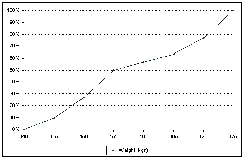 c. 56.67%.
d. 63.3% - 10.0%=53.3%
A frequency distribution is a listing of the individual observations arranged in ascending or descending order.
Free
(True/False)
4.9/5 (33)
Correct Answer:Verified
False
Which of the following statements about histograms is true? A A histogram shows the cumulative relative frequency distribution. B A histogram may be used as a graphical display of ordinal data. C A histogram may be used as a graphical display of categorical data. D A histogram generally has no gaps between rectangles, because it is a graphical display of a numerical variable and the horizontal axis follows a number scale.
Free
(Short Answer)
4.8/5 (25)
Correct Answer:Verified
D
A list of share prices of one Australian company, at the end of a trading day for the period of 30 trading days, would be an example of time-series data.
(True/False)
4.8/5 (34)
A relative frequency distribution describes the number of data values that fall within each class, and may be presented in histogram form.
(True/False)
4.9/5 (33)
For each of the following numerical variables, describe if the distribution of data would be symmetrical, positively skewed or negatively skewed.
a. Annual incomes of employees in a multinational company.
b. Weights of 1kilogram labeled bags of flour, processed by a large manufacturing company.
c. Grades of students in an easy test.
(Essay)
4.9/5 (26)
A frequency distribution shows the number of data values falling within each class.
(True/False)
4.9/5 (38)
Construct a relative frequency histogram for the test grades for a university business statistics class. 63 74 42 65 51 54 36 56 68 57 62 64 76 67 79 61 81 77 59 38 84 68 71 94 71 86 69 75 91 55 48 82 83 54 79 62 68 58 41 47
(Essay)
4.9/5 (43)
The stem-and-leaf display reveals far more information about individual values than does the histogram.
(True/False)
4.8/5 (38)
Class intervals of equal width make the interpretation of a frequency distribution easier.
(True/False)
4.8/5 (39)
With a line graph, the horizontal axis is stretched out to get a deceptive steeper slope.
(True/False)
4.7/5 (36)
Which of the following is the best type of chart for illustrating the GDP of Australia from 1960 to 2010? A A time-series chatt. B A scatter plot. C A histogram D A bar chart.
(Short Answer)
4.8/5 (30)
A list of share prices of 20 Australian companies at the end of a trading day would be an example of time-series data.
(True/False)
4.8/5 (24)
When choosing between a line chart and a bar chart to display a time-series of data, if the main objective is to display the overall general movement, or trend, in the time-series, a line chart is best.
(True/False)
5.0/5 (35)
The graphical format used to display the relationship between two numerical (quantitative) variables is the scatter diagram.
(True/False)
4.9/5 (41)
Describe briefly what the histogram and the stem-and-leaf displays tell you about the test grades for a university business statistics class. 63 74 42 65 51 54 36 56 68 57 62 64 76 67 79 61 81 77 59 38 84 68 71 94 71 86 69 75 91 55 48 82 83 54 79 62 68 58 41 47
(Essay)
4.8/5 (45)
The following data are test grades for a university business statistics class. 63 74 42 65 51 54 36 56 68 57 62 64 76 67 79 61 81 77 59 38 84 68 71 94 71 86 69 75 91 55 48 82 83 54 79 62 68 58 41 47 a. Construct a cumulative frequency distribution and a cumulative relative frequency distribution for the data.
b. What proportion of the grades is less than 60?
c. What proportion of the grades is more than 70?
(Essay)
4.8/5 (27)
Graphical deception is acceptable when the graph displays what the statistician would like the reader to believe, as opposed to the truth about the data.
(True/False)
4.7/5 (30)
Which of the following statements is false? A A frequency distribution counts the number of observations that fall into each of a series of intervals, called classes that cover the complete range of observations. B The intervals in a frequency distributi on must not overlap to ensure that each observation is assigned to an interval. C Although the frequency distribution provides information about how the numbers in the data set are distributed, the information is more easily understood and imparted by drawing a histogram. D The number of class intervals in a frequency distribution must be the same as the number of observations.
(Short Answer)
4.9/5 (38)
A skewed histogram is one with a long tail extending either to the right or left. The former is called negatively skewed, and the latter is called positively skewed.
(True/False)
4.7/5 (33)
Filters
- Essay(0)
- Multiple Choice(0)
- Short Answer(0)
- True False(0)
- Matching(0)