Exam 2: Graphical Summaries of Data
Exam 1: Basic Ideas32 Questions
Exam 2: Graphical Summaries of Data34 Questions
Exam 3: Numerical Summaries of Data62 Questions
Exam 4: Probability30 Questions
Exam 5: Discrete Probability Distributions83 Questions
Exam 6: The Normal Distribution52 Questions
Exam 7: Confidence Intervals65 Questions
Exam 8: Hypothesis Testing46 Questions
Exam 9: Inferences on Two Samples86 Questions
Exam 10: Tests With Qualitative Data33 Questions
Exam 11: Correlation and Regression39 Questions
Exam 12: Statistical Analysis Questions in ANOVA and Rank-Sum Test140 Questions
Select questions type
The following frequency distribution presents the frequency of passenger vehicles that pass through a certain intersection from 8:00 AM to 9:00 AM on a particular day.
Vehicle Type Frequency Motorcycle 7 Sedan 79 SUV 78 Truck 45 What is the relative frequency of the SUV category?
Free
(Multiple Choice)
4.8/5  (34)
(34)
Correct Answer: Verified
C
The following table presents the purchase totals (in dollars) of a random sample of gasoline purchases at a convenience store.
Construct a relative frequency histogram using a class width of 10, and using 0 as the lower class limit for the first class.
22.75 53.99 60.56 86.86 10.98 28.88 77.87 5.04 68.60 40.07 74.42 52.19 94.89 29.08 50.87 13.49 50.49 43.20 55.53 49.59
Free
(Multiple Choice)
4.8/5 (40)
Correct Answer:Verified
B
Construct a stem-and-leaf plot for the following data.
22 38 51 12 57 33 67 20 31 29 19 48 19 31 29 53 54 21 22 55
Free
(Multiple Choice)
4.9/5 (33)
Correct Answer:Verified
B
The following frequency distribution presents the frequency of passenger vehicles that pass through a certain intersection from 8:00 AM to 9:00 AM on a particular day
Vehicle Type Frequency Motorcycle 6 Sedan 26 SUV 30 Truck 21 Construct a pie chart for the data.
(Multiple Choice)
4.8/5 (39)
The following frequency distribution presents the frequency of passenger vehicles that pass through a certain intersection from 8:00 AM to 9:00 AM on a particular day
Vehicle Type Frequency Motorcycle 13 Sedan 78 SUV 88 Truck 35 Construct a relative frequency distribution for the data.
(Multiple Choice)
4.9/5 (40)
Which of the following presents the most honest graphical representation of the ratio "5 to 2"?
(Multiple Choice)
4.7/5 (40)
One hundred students are shown an eight-digit number on a piece of cardboard for three seconds and are asked to then recite the number from memory. The process is repeated until the student accurately recites the entire number from memory. The following histogram presents the number of trials it took each student to memorize the number
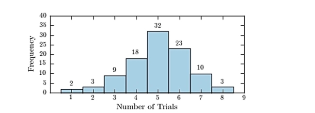 How many students memorized the number in three trials or less?
(Multiple Choice)
4.9/5 (32)
The following frequency distribution presents the weights in pounds (lb) of a sample of visitors to a health clinic.
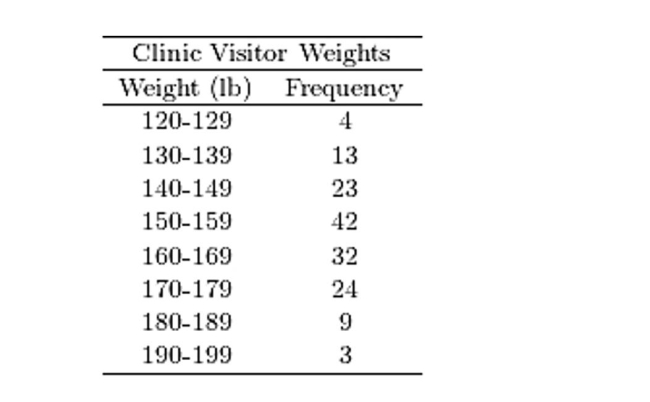 Construct a relative frequency histogram.
(Multiple Choice)
4.9/5 (41)
A sample of 200 high school students were asked how many hours per week they spend watching television.The following frequency distribution presents the results.
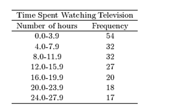 Construct a frequency polygon for the frequency distribution.
(Multiple Choice)
4.7/5 (36)
A sample of 200 high school students were asked how many hours per week they spend watching television.The following frequency distribution presents the results.
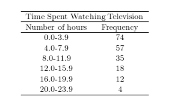 Construct a relative frequency polygon for the frequency distribution.
(Multiple Choice)
4.7/5 (40)
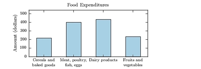
The following bar graph presents the average amount a certain family spent, in dollars, on various food categories in a recent year.
On which food category was the most money spent?
(Multiple Choice)
4.8/5 (27)
A sample of 200 high school students were asked how many hours per week they spend watching television.The following frequency distribution presents the results.
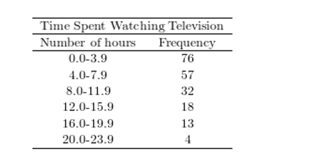 Construct a relative frequency ogive for the frequency distribution.
(Multiple Choice)
4.9/5 (38)
The following table presents the purchase totals (in dollars) of a random sample of gasoline purchases at a convenience store.
Construct a relative frequency distribution using a class width of 10, and using 0 as the lower class limit for the first class.
44.52 72.67 51.20 59.41 64.86 98.05 80.24 56.18 51.93 46.17 88.08 46.49 24.48 50.26 36.77 27.61 6.56 22.75 36.65 74.55
(Multiple Choice)
4.7/5 (33)
Construct a dotplot for the following data.
15 15 15 14 13 13 14 15 13 15 14 15 14 13 17 15 14 12 16 15
(Multiple Choice)
4.9/5 (43)
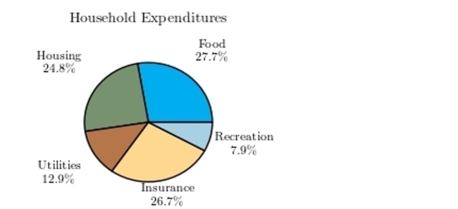
Following is a pie chart that presents the percentages spent by a certain household on its five largest annual expenditures. What percentage of the money spent was spent on food, housing, and utilities?
(Multiple Choice)
5.0/5 (44)
The following frequency distribution presents the weights in pounds (lb) of a sample of visitors to a health clinic.
Weights of Clinic Visitors Weight (lb) Frequency 100-109 1 110-119 3 120-129 3 130-139 4 140-149 7 150-159 7 160-169 13 170-179 6 180-189 3 190-199 3 Construct a frequency histogram.
(Multiple Choice)
4.9/5 (45)
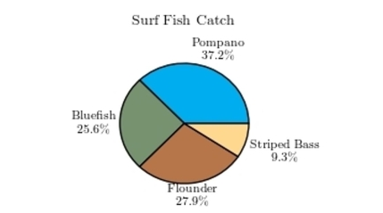
The following pie chart presents the percentages of fish caught in each of four ratings categories.
Match this pie chart with its corresponding Parato chart.
(Multiple Choice)
4.9/5 (40)
Classify the histogram as skewed to the left, skewed to the right, or approximately symmetric. 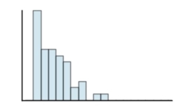
(Multiple Choice)
4.9/5 (44)
Thirty households were surveyed for the number of televisions in each home. Following are the results.
1 0 0 2 1 2 4 2 1 1 0 0 0 0 1 5 0 2 0 0 0 0 2 1 0 0 5 5 3 0
Construct a frequency histogram.
(Multiple Choice)
4.9/5 (37)
Filters
- Essay(0)
- Multiple Choice(0)
- Short Answer(0)
- True False(0)
- Matching(0)