Exam 3: Visual Displays of Data
Exam 1: Speaking of Statistics170 Questions
Exam 2: Measurement in Statistics138 Questions
Exam 3: Visual Displays of Data115 Questions
Exam 4: Describing Data120 Questions
Exam 5: A Normal World54 Questions
Exam 6: Probability in Statistics119 Questions
Exam 7: Correlation and Causality55 Questions
Exam 8: Inferences From Samples to Populations100 Questions
Exam 9: Hypothesis Testing71 Questions
Exam 10: T Tests, Two-Way Tables, and Anova50 Questions
Select questions type
Provide an appropriate response.
-A teacher asked each of her students how many novels they had read in the previous six months. The results are shown below.
0 1 5 4 2 1 3 2 2 7 2 5 0 1 0 1 1 2 6 0 2 3 1 2 7 1 4 2 3 1 7 0 0 2 1 1 0 6 1 7
Determine the appropriate entry in the cumulative frequency table for 7 novels read.
Free
(Multiple Choice)
4.7/5  (43)
(43)
Correct Answer: Verified
A
A nurse measured the blood pressure of each person who visited her clinic. Following is a relative-frequency histogram for the systolic blood pressure readings for those people aged between 25 and 40. Use the histogram to answer the question. The blood pressure readings were given to the nearest whole number. 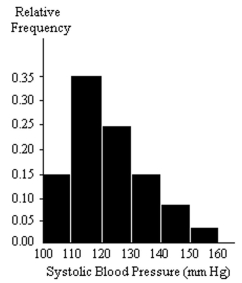 -Approximately what percentage of the people aged 25-40 had a systolic blood pressure reading less than 120?
Free
(Multiple Choice)
4.9/5 (35)
Correct Answer:Verified
C
Create a graphical display for the data given. You may choose any graphic type that you feel is appropriate. Write a few sentences explaining why you chose this type of display and a few sentences describing any interesting patterns in the data.
-The table below shows statistics for AIDS. The first column shows the estimated number of people living with HIV/AIDS worldwide in various years. The second column shows the estimated number of new HIV infections worldwide in various years.
Year Number Living with HIV/AIDS (Millions) New HIV Infections (Millions) 1997 30.6 5.8 1998 33.4 5.8 1999 33.6 5.6 2000 36.1 5.3 2001 40.0 5.0 2002 42.0 5.0
Free
(Essay)
4.9/5 (29)
Correct Answer:Verified
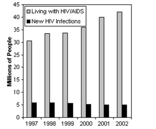 The multiple bar graph shows an increase in people living with HIV/AIDS, but a decrease in new cases of HIV.
A nurse measured the blood pressure of each person who visited her clinic. Following is a relative-frequency histogram for the systolic blood pressure readings for those people aged between 25 and 40. Use the histogram to answer the question. The blood pressure readings were given to the nearest whole number.
-Identify the midpoint of the third class.
(Multiple Choice)
4.9/5 (34)
Create a graphical display for the data given. You may choose any graphic type that you feel is appropriate. Write a few sentences explaining why you chose this type of display and a few sentences describing any interesting patterns in the data.
-The table below gives information about U.S. families with children under the age of 18. The table shows the percentage of these families that are two-parent families, the percentage that are maintained by a single mother, and the percentage that are maintained by a single father.
U.S. Families with Children Under 18 Year Two-parent Single mother Single father 1981 77.6\% 20.0\% 2.4\% 1984 74.2\% 22.9\% 2.8\% 1987 73.0\% 23.7\% 3.2\% 1990 71.9\% 24.2\% 3.9\% 1993 69.8\% 25.9\% 4.3\% 1996 68.4\% 26.6\% 5.0\% 1999 68.2\% 26.3\% 5.5\% 2002 68.3\% 25.9\% 5.8\%
(Essay)
5.0/5 (35)
The graph below shows the approximate annual percentage growth rate in world population for the years 1960 through 2010. Data is estimated by the UN Census Bureau. Annual Growth Rate (Percentage)
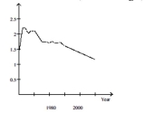 Why must the graph be interpreted with care? If the graph is not interpreted with care what misleading impression might one have of world population during the period 1960-2010? In which year during the period 1960-2010 is estimated world population the greatest? During which years did world population increase at the fastest rate?
Summarize the overall trends in world population during the period 1960-2010.
Why must the graph be interpreted with care? If the graph is not interpreted with care what misleading impression might one have of world population during the period 1960-2010? In which year during the period 1960-2010 is estimated world population the greatest? During which years did world population increase at the fastest rate?
Summarize the overall trends in world population during the period 1960-2010.
(Essay)
4.9/5 (37)
A nurse measured the blood pressure of each person who visited her clinic. Following is a relative-frequency histogram for the systolic blood pressure readings for those people aged between 25 and 40. Use the histogram to answer the question. The blood pressure readings were given to the nearest whole number.
-Approximately what percentage of the people aged 25-40 had a systolic blood pressure reading between 110and 119 inclusive?
(Multiple Choice)
4.9/5 (40)
A nurse measured the blood pressure of each person who visited her clinic. Following is a relative-frequency histogram for the systolic blood pressure readings for those people aged between 25 and 40. Use the histogram to answer the question. The blood pressure readings were given to the nearest whole number.
-Given that 200 people were aged between 25 and 40, approximately how many had a systolic blood pressure reading less than 130?
(Multiple Choice)
5.0/5 (42)
Provide the appropriate response.
-Attendance records at a school show the number of days each student was absent during the year. The days absent for each student were as follows. 8 2 4 3 2 7 6 0 9 3 3 4 2 4 6
Create a dot plot for this data.
(Multiple Choice)
4.9/5 (30)
Answer the question using the graphical display. 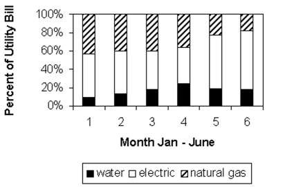 -Identify the utility that decreases as a percentage of the total utility bill from January to June.
(Multiple Choice)
4.8/5 (43)
Provide an appropriate response.
-Suppose that you want to construct a pie chart to represent the following data.
Blood Type Frequenc 90 84 18 8
Explain how you would calculate the angle for the pie-shaped piece corresponding to the blood type O.
(Essay)
4.7/5 (30)
A medical research team studied the ages of patients who had strokes caused by stress. The ages of 34 patients who
Suffered stress strokes were as follows. 29 30 36 41 45 50 57 61 28 50 36 58
60 38 36 47 40 32 58 46 61 40 55 32
61 56 45 46 62 36 38 40 50 27
Create a frequency table for these ages. Use 8 bins and start the first bin at 25.
(Multiple Choice)
4.8/5 (31)
Provide the appropriate response.
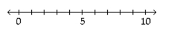
-The following dot plot represents the ages of the people in a sample selected from a group of campaign
Volunteers. 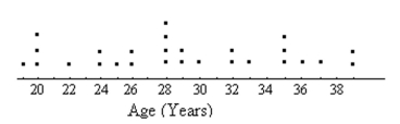 How many people were in the sample?
(Multiple Choice)
4.8/5 (32)
A machine is supposed to fill juice bottles with 16 fluid ounces of juice. The manufacturer picks a sample of bottles which have been filled by the machine and determines the volume of juice in each bottle. The results are shown in the stem-and-leaf diagram below. The leaf unit is 0.1. 15 1 15 3 15 45 15 667777 15 888899999 16 000000011111 16 222223333 16 445 16 66 16 8
How many bottles were sampled?
(Multiple Choice)
4.9/5 (29)
Construct a line chart for the data.
- Weight of Cats Weight (lb) Number of Cats 5-7 2 8-10 9 11-13 18 14-16 13 17-19 4 20-22 1
(Multiple Choice)
4.8/5 (35)
Construct a pie chart representing the given data set.
-The data below represent the results of a poll in which the the following question was asked: "To what degree are you
Satisfied with the outcome of the 2006 mayoral election?"
Very 17\% Somewhat 22\% Not at All 39\% No opinion 22\%
(Multiple Choice)
4.9/5 (31)
Provide an appropriate response.
-A professional tennis player hit one hundred balls and their speeds were recorded.
Speed Number of balls 0-29 4 30-59 16 60-89 60 90-120 20
Create a cumulative frequency table for the data.
(Multiple Choice)
4.7/5 (37)
Construct the requested table. Round relative frequencies to the nearest hundredth of a percent, unless otherwise indicated.
-The following data show the body temperatures (°F)of randomly selected subjects. Construct a relative
Frequency table with seven classes: 96.9 - 97.2, 97.3 - 97.6, 97.7 - 98.0, and so on. 98.4 98.2 97.3 98.6 97.9 98.7 97.2 99.2 98.8 97.5 99.0 97.9 98.8 97.6 98.8 98.2 97.7 98.4 98.7 98.4 98.2 99.4 98.2 97.1 98.6 98.9 97.8 98.2 98.6 98.0 98.6 98.2 98.2 98.8 98.6 98.2 98.7 98.4 98.6 98.7
Round relative frequencies to the nearest tenth of a percent.
(Multiple Choice)
4.8/5 (45)
Construct a pie chart representing the given data set.
-The following figures give the distribution of land (in acres)for a county containing 78,000 acres.
Land Use Acres Relative Frequency Forest 11,700 0.15 Farm 7800 0.10 Urban 58,500 0.75
(Multiple Choice)
4.9/5 (41)
The stacked line chart shows the value of each of Danny's investments. The stacked line chart contains three regions. The uppermost unshaded region represents the value of Danny's investment in individual stocks. The center shaded region represents the value of Danny's investment in mutual funds and the bottom region in black represents the value of Danny's investment in a CD. The thickness of a region at a particular time tells you its value at that time. 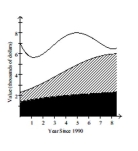 Use the graph to answer the question.
-In the year 1998, what was the approximate value of Danny's investment in mutual funds?
Use the graph to answer the question.
-In the year 1998, what was the approximate value of Danny's investment in mutual funds?
(Multiple Choice)
4.8/5 (38)
Filters
- Essay(0)
- Multiple Choice(0)
- Short Answer(0)
- True False(0)
- Matching(0)