Exam 3: Visual Displays of Data
Exam 1: Speaking of Statistics170 Questions
Exam 2: Measurement in Statistics138 Questions
Exam 3: Visual Displays of Data115 Questions
Exam 4: Describing Data120 Questions
Exam 5: A Normal World54 Questions
Exam 6: Probability in Statistics119 Questions
Exam 7: Correlation and Causality55 Questions
Exam 8: Inferences From Samples to Populations100 Questions
Exam 9: Hypothesis Testing71 Questions
Exam 10: T Tests, Two-Way Tables, and Anova50 Questions
Select questions type
Answer the question using the graphical display. 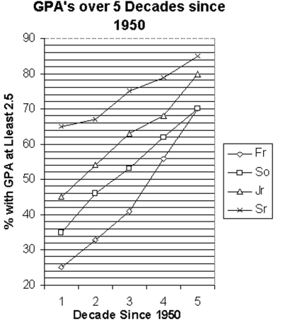 -Identify the class that has the greatest increase in 2.5 or better GPA's over the five decades.
(Multiple Choice)
4.8/5  (39)
(39)
Solve the problem.
-Use the high closing values of Naristar Inc. stock from the years 1990 - 2001 to construct a time-series graph.
(Let x = 0 stand for 1990 and so on...)Identify a trend. Year High Year High 1990 42 1996 47 1991 40 1997 60 1992 31 1998 61 1993 42 1999 57 1994 44 2000 54 1995 47 2001 30
(Essay)
4.8/5 (39)
Use the graph to answer the question.
- In what quarter was the revenue the greatest for 1999?
(Multiple Choice)
4.9/5 (40)
Solve the problem.
-The following data show the number of laps run by each participant in a marathon.
46 65 55 43 51 48 57 30 43 49 32 56
Use the data to construct a stem-and-leaf plot.
(Multiple Choice)
4.8/5 (35)
Provide an appropriate response.
-Construct a frequency table and the corresponding histogram in which the following conditions are satisfied:
- The frequency for the second class is twice the frequency of the first class
- In the histogram, the area of the bar corresponding to the second class is four times the area of the bar corresponding to the first class
(Essay)
4.8/5 (39)
Solve the problem.
-Use the high closing values of Naristar Inc. stock from the years 1992 - 2003 to construct a time-series graph.
(Let x = 0 stand for 1992 and so on...)Identify a trend. Year High Year High 1992 48 1998 62 1993 53 1999 60 1994 47 2000 68 1995 55 2001 42 1996 58 2002 51 1997 61 2003 78
(Essay)
4.8/5 (43)
A nurse measured the blood pressure of each person who visited her clinic. Following is a relative-frequency histogram for the systolic blood pressure readings for those people aged between 25 and 40. Use the histogram to answer the question. The blood pressure readings were given to the nearest whole number. 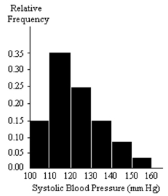 -Approximately what percentage of the people aged 25-40 had a systolic blood pressure reading greater than or equal to 130?
(Multiple Choice)
4.8/5 (37)
The bar graph below shows the average cost of renting a studio in a certain city in each of the years 2002 through 2006.
 By what percentage does the average rental price increase from 2002 to 2003? Obtain a truncated version of the graph by sliding a piece of paper over the bottom portion of the graph so that the scale on the vertical axis starts at 300. In the truncated graph, by what percentage does the price appear to increase from 2002 to 2003? Why is the truncated graph misleading?
(Essay)
4.9/5 (39)
Use the graph to answer the question.
- What was the revenue for the first quarter of 1999?
(Multiple Choice)
4.8/5 (28)
Construct a line chart for the data.
-The ages of employees of a company are summarized in the frequency table. Age in Years Frequency 18-24 11 25-31 38 32-38 35 39-45 27 46-52 22 53-59 14 60-66 5

(Multiple Choice)
4.8/5 (43)
Provide an appropriate response.
-Suppose that a histogram is constructed for the frequency table shown below:
Age Frequency 30-39 11 40-49 23 50-59 17 60-69 12 70-89 6
The class 60-69 has twice the frequency of the class 70-89. In the histogram, will the area of the bar for the class 60-69 be twice the area of the bar for the class 70-89? In other words, will areas be proportional to frequencies in this histogram? Explain your thinking. Are there any conditions under which areas are proportional to frequencies in histograms?
(Essay)
4.9/5 (38)
A television manufacturer sold three times as many televisions in 2006 as it did in 1996. To illustrate this fact, the manufacturer draws a pictogram as shown below. The television on the right is three times as tall and three times as wide as the television on the left.
 Why is this pictogram misleading? What visual impression is portrayed by the pictogram?
(Essay)
4.8/5 (38)
The following data represent the total number of years of formal education for 40 employees of a bank. 13 17 13 14 12 17 19 13 15 13
16 18 13 11 19 19 12 14 13 13
14 15 13 15 17 18 17 14 13 17
12 17 17 16 16 17 15 13 13 14
Create a frequency table for the number of years of education.
(Multiple Choice)
4.8/5 (27)
The graph below shows estimated world population for the perio AD. Note that the
logarithm of the world population and not actual population is plotted on the vertical axis. This means, for example, that when the graph reaches 7 on the vertical scale, world population is \(10 ^ { 7 }\])
and when the graph reaches 9 on the vertical scale, world population is 109.
![The graph below shows estimated world population for the perio 4000 \mathrm { BC } - 2000 AD. Note that the logarithm of the world population and not actual population is plotted on the vertical axis. This means, for example, that when the graph reaches 7 on the vertical scale, world population is \(10 ^ { 7 }\]) and when the graph reaches 9 on the vertical scale, world population is 109. Why must the graph be interpreted with care? If the graph is not interpreted with care what misleading impression might one have of world population during the period 4000 BC - 2000 AD? Why do you think that the graph was presented in this form?](https://storage.examlex.com/TB7023/11eb4375_fb5a_0ff0_9abe_f9672b34e965_TB7023_00.jpg) Why must the graph be interpreted with care? If the graph is not interpreted with care what misleading impression
might one have of world population during the period 4000 BC - 2000 AD? Why do you think that the graph was presented in this form?
Why must the graph be interpreted with care? If the graph is not interpreted with care what misleading impression
might one have of world population during the period 4000 BC - 2000 AD? Why do you think that the graph was presented in this form?
(Essay)
4.8/5 (36)
Provide an appropriate response.
-Suppose that you want to construct a graph to represent the following data.
Blood Type Frequency 90 84 18 8
If you are mostly interested in the number of people in each category as a percentage of the total number of people, would a bar chart or a pie chart be more useful? Explain your thinking.
(Essay)
4.8/5 (44)
Construct a pie chart representing the given data set.
-The following data give the distribution of the types of houses in a town containing 34,000 houses.
House Type Frequency Relative Frequency Cape 8500 0.25 Garrison 13,600 0.35 Split 11,900 0.40
(Multiple Choice)
4.9/5 (32)
Solve the problem.
-The attendance counts for this season's basketball games are listed below.
227 239 215 219
221 233 229 233
235 228 245 231
Use the data to construct a stem-and-leaf plot.
(Multiple Choice)
4.7/5 (31)
Make a bar graph to represent the data.
-Construct a bar graph for the relative frequencies given.
Blood type Frequency Relative frequency 22 0.44 19 0.38 6 0.12 3 0.06
(Essay)
4.8/5 (36)
Construct a line chart for the data.
-
Quiz Scores Frequency 10-14 2 15-19 5 20-24 13 25-29 17 30-34 6
(Multiple Choice)
4.8/5 (45)
Construct the requested histogram.
-Lake County wanted to find the typical size of farms in their county. The data below shows the sizes (in acres)of the 84 farms located in Lake County. Create a histogram of the data using bins that are 50 acres wide.
200 172 52 100 85 100 50 63 16 64 40 54 8 25 212 67 125 250 400 142 65 49 45 9 32 33 41 112 99 50 88 66 135 18 37 38 103 296 98 77 85 29 73 48 48 167 15 100 149 59 80 21 141 33 21 130 49 37 139 17 95 40 5 440 21 60 19 199 147 46 90 26 61 91 28 84 47 159 182 73 71 249 50 92
(Essay)
4.8/5 (43)
Filters
- Essay(0)
- Multiple Choice(0)
- Short Answer(0)
- True False(0)
- Matching(0)