Exam 10: Graphs, Good and Bad
Exam 1: Where Do Data Come From30 Questions
Exam 2: Samples, Good and Bad30 Questions
Exam 3: What Do Samples Tell Us55 Questions
Exam 4: Sample Surveys in the Real World36 Questions
Exam 5: Experiments, Good and Bad50 Questions
Exam 6: Experiments in the Real World32 Questions
Exam 7: Data Ethics21 Questions
Exam 8: Measuring33 Questions
Exam 9: Do the Numbers Make Sense25 Questions
Exam 10: Graphs, Good and Bad30 Questions
Exam 11: Displaying Distributions With Graphs22 Questions
Exam 13: Normal Distributions54 Questions
Exam 14: Describing Relationships: Scatterplots and Correlation56 Questions
Exam 15: Describing Relationships: Regression, Prediction, and Causation37 Questions
Exam 16: The Consumer Price Index and Government Statistics31 Questions
Exam 17: Thinking About Chance25 Questions
Exam 18: Probability Models30 Questions
Exam 19: Simulation20 Questions
Exam 20: The House Edge: Expected Values30 Questions
Exam 21: What Is a Confidence Interval43 Questions
Exam 22: What Is a Test of Significance30 Questions
Exam 23: Use and Abuse of Statistical Inference18 Questions
Exam 24: Two-Way Tables and the Chi-Square Test47 Questions
Select questions type
To illustrate a talk you are giving, you want to make a graph to compare the consumption (in gallons) of alcohol per person for several countries. For example, this is 2.87 gallons per person in France and 1.74 gallons per person in the United States. You should make a
(Multiple Choice)
4.8/5  (45)
(45)
Does using a cell phone while driving make an accident more likely? Researchers compared telephone company and police records to find 699 people who had cell phones and were also involved in an auto accident. Using billing records, they compared cell phone use in the period of the accident with cell phone use the same period on a previous day. Result: The risk of an accident was four times higher when using a cell phone.
The proper graph for showing the distribution of phones by manufacturer (i.e., number of people who own an Apple phone, number of people who own a Samsung phone, etc.) is a
(Multiple Choice)
4.8/5 (44)
Using data on the average national cost of regular grade gasoline by month since 2006, to show clearly how the cost of gasoline has changed over time, the best choice of graph is a:
(Multiple Choice)
4.9/5 (38)
The proper graph for showing the percentage of students in a monogamous relationship, grouped by year in school (freshman, sophomore, etc.) is a
(Multiple Choice)
4.8/5 (44)
Is the level of belief in anthropogenic (human-caused) climate change of state legislators affected by that legislator's political affiliation? A researcher gathers data on level of belief (from 1 = absolutely disbelieve to 5 = absolutely believe) and political affiliation for 702 state legislators from across the country. These measurements are values of:
(Multiple Choice)
4.8/5 (27)
A bar graph compares the size of the armed forces for China, North Korea, Russia, and the United States. To make the graph look nicer, the artist replaces each bar by a proportionally correct picture of a soldier that is enlarged or reduced to be as tall as the bar. This graph is misleading because
(Multiple Choice)
4.7/5 (37)
When a line graph displays data after an expected persistent long-term rise or fall has been removed, it is said that the data have been:
(Multiple Choice)
4.9/5 (39)
In a young woman's study group, 7 percent of the students are from the town where the young woman's school is located, 80 percent are from in-state (but not from the school's town), and the rest are from outside the state.
What percent of study group students is not from the town in which the school is located?
(Multiple Choice)
4.9/5 (41)
Here is a table of the undergraduate enrollment at a large state university, broken down by class:
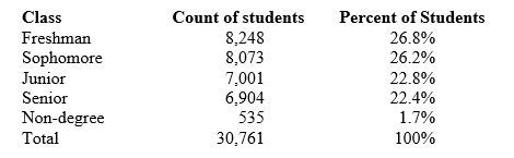 To make a correct graph of the distribution of students by class, you could use a
(Multiple Choice)
4.9/5 (32)
Filters
- Essay(0)
- Multiple Choice(0)
- Short Answer(0)
- True False(0)
- Matching(0)