Exam 35: The Short-Run Trade-Off Between Inflation and Unemployment
Exam 1: Ten Principles of Economics439 Questions
Exam 2: Thinking Like an Economist617 Questions
Exam 3: Interdependence and the Gains From Trade527 Questions
Exam 4: The Market Forces of Supply and Demand697 Questions
Exam 5: Elasticity and Its Application594 Questions
Exam 6: Supply, Demand, and Government Policies645 Questions
Exam 7: Consumers, Producers, and the Efficiency of Markets549 Questions
Exam 8: Application: the Costs of Taxation513 Questions
Exam 9: Application: International Trade492 Questions
Exam 10: Externalities524 Questions
Exam 11: Public Goods and Common Resources433 Questions
Exam 12: The Design of the Tax System549 Questions
Exam 13: The Costs of Production420 Questions
Exam 14: Firms in Competitive Markets543 Questions
Exam 15: Monopoly637 Questions
Exam 16: Monopolistic Competition580 Questions
Exam 17: Oligopoly488 Questions
Exam 18: The Markets for the Factors of Production564 Questions
Exam 19: Earnings and Discrimination490 Questions
Exam 20: Income Inequality and Poverty455 Questions
Exam 21: The Theory of Consumer Choice431 Questions
Exam 22: Frontiers of Microeconomics440 Questions
Exam 23: Measuring a Nations Income520 Questions
Exam 24: Measuring the Cost of Living529 Questions
Exam 25: Production and Growth505 Questions
Exam 26: Saving, Investment, and the Financial System564 Questions
Exam 27: The Basic Tools of Finance500 Questions
Exam 28: Unemployment678 Questions
Exam 29: The Monetary System515 Questions
Exam 30: Money Growth and Inflation481 Questions
Exam 31: Open-Economy Macroeconomics: Basic Concepts522 Questions
Exam 32: A Macroeconomic Theory of the Open Economy475 Questions
Exam 33: Aggregate Demand and Aggregate Supply562 Questions
Exam 34: The Influence of Monetary and Fiscal Policy on Aggregate Demand508 Questions
Exam 35: The Short-Run Trade-Off Between Inflation and Unemployment491 Questions
Exam 36: Six Debates Over Macroeconomic Policy372 Questions
Select questions type
By raising aggregate demand more than anticipated, policymakers
(Multiple Choice)
4.8/5  (41)
(41)
Figure 35-1. The left-hand graph shows a short-run aggregate-supply (SRAS) curve and two aggregate-demand (AD) curves. On the right-hand diagram, U represents the unemployment rate. 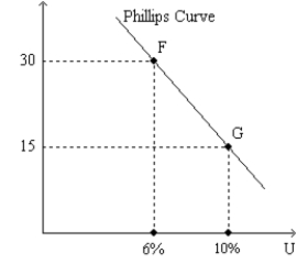
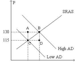 -Refer to Figure 35-1. Assuming the price level in the previous year was 100, point G on the right-hand graph corresponds to
(Multiple Choice)
4.8/5 (38)
If a central bank reduced inflation by 3 percentage points and in the short run this made output fall by 3 percentage points for 3 years and the unemployment rate rise from 3 percent to 9 percent for three years, the sacrifice ratio is
(Multiple Choice)
4.9/5 (38)
In the long run, if the Fed decreases the rate at which it increases the money supply,
(Multiple Choice)
4.8/5 (38)
If policymakers decrease aggregate demand, then in the short run the price level
(Multiple Choice)
4.8/5 (44)
Which of the following leads to a lower level of unemployment in the long run?
(Multiple Choice)
4.8/5 (39)
Figure 35-1. The left-hand graph shows a short-run aggregate-supply (SRAS) curve and two aggregate-demand (AD) curves. On the right-hand diagram, U represents the unemployment rate.
-Refer to Figure 35-1. The curve that is depicted on the righthand graph offers policymakers a "menu" of combinations
(Multiple Choice)
5.0/5 (34)
In the long run, policy that changes aggregate demand changes
(Multiple Choice)
4.7/5 (40)
Which of the following shifts aggregate supply to the right?
(Multiple Choice)
4.7/5 (33)
Samuelson and Solow argued that when unemployment is high,
(Multiple Choice)
4.8/5 (39)
Which of the following scenarios is consistent with typical estimates of the sacrifice ratio?
(Multiple Choice)
4.9/5 (35)
Figure 35-6
Use the graph below to answer the following questions. 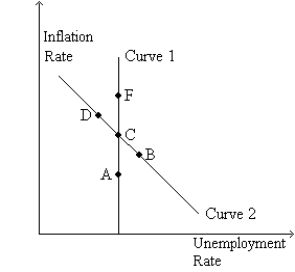 -Refer to Figure 35-6. The money supply growth rate is greatest at
(Multiple Choice)
4.9/5 (33)
Suppose the price level is 115.00 at the end of 2020, 112.02 at the end of 2021, and 109.08 at the end of 2022. Can we accurately describe the period 2021-2022 as a period of disinflation?
(Essay)
4.8/5 (40)
Figure 35-9. The left-hand graph shows a short-run aggregate-supply (SRAS) curve and two aggregate-demand (AD) curves. On the right-hand diagram, "Inf Rate" means "Inflation Rate." 
 -Refer to Figure 35-9. A movement of the economy from point A to point B, and at the same time a movement from point C to point D, would be described as
(Multiple Choice)
4.9/5 (42)
Proponents of rational expectations argued that the sacrifice ratio
(Multiple Choice)
4.8/5 (37)
Suppose that the money supply increases. In the short run this decreases unemployment according to
(Multiple Choice)
5.0/5 (38)
Samuelson and Solow reasoned that when aggregate demand was low, unemployment was
(Multiple Choice)
4.8/5 (35)
A shock increases the costs of production. Given the effects of this shock, if the central bank wants to return the unemployment rate towards its previous level it would
(Multiple Choice)
4.9/5 (31)
Filters
- Essay(0)
- Multiple Choice(0)
- Short Answer(0)
- True False(0)
- Matching(0)