Exam 35: The Short-Run Trade-Off Between Inflation and Unemployment
Exam 1: Ten Principles of Economics439 Questions
Exam 2: Thinking Like an Economist617 Questions
Exam 3: Interdependence and the Gains From Trade527 Questions
Exam 4: The Market Forces of Supply and Demand697 Questions
Exam 5: Elasticity and Its Application594 Questions
Exam 6: Supply, Demand, and Government Policies645 Questions
Exam 7: Consumers, Producers, and the Efficiency of Markets549 Questions
Exam 8: Application: the Costs of Taxation513 Questions
Exam 9: Application: International Trade492 Questions
Exam 10: Externalities524 Questions
Exam 11: Public Goods and Common Resources433 Questions
Exam 12: The Design of the Tax System549 Questions
Exam 13: The Costs of Production420 Questions
Exam 14: Firms in Competitive Markets543 Questions
Exam 15: Monopoly637 Questions
Exam 16: Monopolistic Competition580 Questions
Exam 17: Oligopoly488 Questions
Exam 18: The Markets for the Factors of Production564 Questions
Exam 19: Earnings and Discrimination490 Questions
Exam 20: Income Inequality and Poverty455 Questions
Exam 21: The Theory of Consumer Choice431 Questions
Exam 22: Frontiers of Microeconomics440 Questions
Exam 23: Measuring a Nations Income520 Questions
Exam 24: Measuring the Cost of Living529 Questions
Exam 25: Production and Growth505 Questions
Exam 26: Saving, Investment, and the Financial System564 Questions
Exam 27: The Basic Tools of Finance500 Questions
Exam 28: Unemployment678 Questions
Exam 29: The Monetary System515 Questions
Exam 30: Money Growth and Inflation481 Questions
Exam 31: Open-Economy Macroeconomics: Basic Concepts522 Questions
Exam 32: A Macroeconomic Theory of the Open Economy475 Questions
Exam 33: Aggregate Demand and Aggregate Supply562 Questions
Exam 34: The Influence of Monetary and Fiscal Policy on Aggregate Demand508 Questions
Exam 35: The Short-Run Trade-Off Between Inflation and Unemployment491 Questions
Exam 36: Six Debates Over Macroeconomic Policy372 Questions
Select questions type
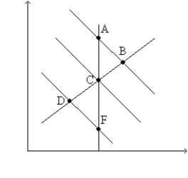
Figure 35-6
Use the graph below to answer the following questions. 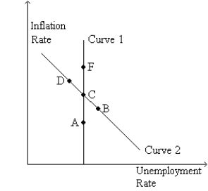 -Refer to Figure 35-6. If the economy starts at C and the money supply growth rate decreases, in the short run the economy moves to
(Multiple Choice)
4.8/5  (34)
(34)
If the long-run Phillips curve shifts to the right, then for any given rate of money growth and inflation the economy has
(Multiple Choice)
4.9/5 (40)
Figure 35-3. The left-hand graph shows a short-run aggregate-supply (SRAS) curve and two aggregate-demand (AD) curves. On the left-hand diagram, Y represents output and on the right-hand diagram, U represents the unemployment rate. 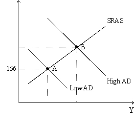
 -Refer to Figure 35-3. Assume the figure charts possible outcomes for the year 2018. In 2018, the economy is at point B on the left-hand graph, which corresponds to point B on the right-hand graph. Also, point A on the left-hand graph corresponds to A on the right-hand graph. The price level in the year 2018 is
(Multiple Choice)
4.9/5 (40)
France has a higher natural rate of unemployment than the United States. This suggests that
(Multiple Choice)
4.9/5 (34)
In the 1970's the Federal Reserve responded to an adverse supply shock. Its policy made
(Multiple Choice)
4.8/5 (44)
If consumer confidence rises and inflation expectations remain unchanged, what happens to inflation and unemployment? Defend your answer.
(Essay)
4.8/5 (33)
If the central bank raises the rate at which it increases the money supply, then in the short run unemployment is
(Multiple Choice)
4.7/5 (29)
If expected inflation increases, which of the following shifts right?
(Multiple Choice)
4.8/5 (36)
Figure 35-2
Use the pair of diagrams below to answer the following questions. 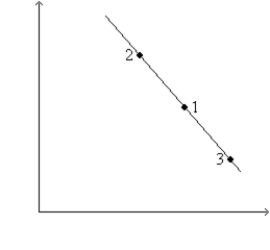
 -Refer to Figure 35-2. If the economy starts at C and 1, then in the short run, a decrease in aggregate demand moves the economy to
(Multiple Choice)
4.9/5 (35)
In the long run, the inflation rate depends primarily on the growth rate of the money supply.
(True/False)
4.8/5 (33)
If there is a decline in business confidence and the Fed desires to return unemployment towards its natural rate, what should it do? If business confidence eventually returns to normal but the Fed does not reverse its policy, what eventually happens to the inflation rate?
(Essay)
4.7/5 (39)
An adverse supply shock shifts the short-run Phillips curve right. If people raise their inflation expectations, the short-run Phillips curve shifts farther right.
(True/False)
4.8/5 (41)
Figure 35-9. The left-hand graph shows a short-run aggregate-supply (SRAS) curve and two aggregate-demand (AD) curves. On the right-hand diagram, "Inf Rate" means "Inflation Rate." 
 -Refer to Figure 35-9. The shift of the aggregate-supply curve from AS1 to AS2
(Multiple Choice)
4.9/5 (40)
If inflation expectations rise, the short-run Phillips curve shifts
(Multiple Choice)
4.9/5 (48)
The analysis of Friedman and Phelps can be summarized in the following equation where a is a positive number:
(Multiple Choice)
4.8/5 (39)
If expected inflation decreases does the short-run Phillips curve shift? If so, what direction does it shift? Does the long-run Phillips curve shift? If so, what direction does it shift?
(Essay)
4.9/5 (28)
If there is a large and sudden but temporary increase in the price of oil, which way does the short-run Phillips curve shift? If the central bank does not respond what happens to inflation and the unemployment rate in the long run?
(Essay)
4.8/5 (35)
Figure 35-3. The left-hand graph shows a short-run aggregate-supply (SRAS) curve and two aggregate-demand (AD) curves. On the left-hand diagram, Y represents output and on the right-hand diagram, U represents the unemployment rate.
-Refer to Figure 35-3. What is measured along the vertical axis of the right-hand graph?
(Multiple Choice)
4.9/5 (35)
Filters
- Essay(0)
- Multiple Choice(0)
- Short Answer(0)
- True False(0)
- Matching(0)