Exam 2: Visualizing Data With Charts and Graphs
Exam 1: Introduction to Statistics and Business Analytics180 Questions
Exam 2: Visualizing Data With Charts and Graphs113 Questions
Exam 3: Descriptive Statistics88 Questions
Exam 4: Probability104 Questions
Exam 5: Discrete Distributions98 Questions
Exam 6: Continuous Distributions105 Questions
Exam 7: Sampling and Sampling Distributions97 Questions
Exam 8: Statistical Inference: Estimation for Single Populations94 Questions
Exam 9: Statistical Inference: Hypothesis Testing for Single Populations123 Questions
Exam 10: Statistical Inferences About Two Populations97 Questions
Exam 11: Analysis of Variance and Design of Experiments133 Questions
Exam 12: Simple Regression Analysis and Correlation111 Questions
Exam 13: Multiple Regression Analysis90 Questions
Exam 14: Building Multiple Regression Models100 Questions
Exam 15: Time-Series Forecasting and Index Numbers103 Questions
Exam 16: Analysis of Categorical Data85 Questions
Exam 17: Nonparametric Statistics110 Questions
Exam 18: Statistical Quality Control99 Questions
Exam 19: Decision Analysis109 Questions
Select questions type
The following pie chart shows the market share of the only three brands in a market at the end of last year: 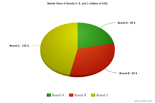 If by the end of the current year, brand C increases its market share to 51%, brand B maintains its market share, and total market sales increase by 15%, then this year's sales for brand A will be
(Multiple Choice)
4.8/5  (25)
(25)
Consider the following stem and leaf plot:
Stem Leaf 1 0,2,5,7 2 2,3,4,8 3 0,4,6,6,9 4 5,8,8,9 5 2,7,8
Suppose that a frequency distribution was developed from this plot, and there were 5 classes (10-under 20, 20-under 30, etc.).What was the lowest number in the data set?
(Multiple Choice)
4.9/5 (33)
The 2010 and 2012 market share data of three competitors (Alston, Baren, and Clemson)in an oligopolistic industry are presented in the following pie charts. 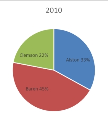
 Which of the following may be a false statement?
(Multiple Choice)
4.8/5 (39)
For a company in a gardening supplies business, the best graphical presentation of the percentage of the total budget spent in each different expense category is the stem and leaf plot.
(True/False)
4.7/5 (27)
Your company is doing market research to assess the feasibility of a new product.The market research team gathers pricing information of all the existing products that would compete with your company's product.The most expensive brand is priced at $22.95, and the least expensive one at $20.59.If a class width of 0.25 is used, then the class mark of the first class interval will be
(Multiple Choice)
4.8/5 (36)
In contrast to quantitative data graphs that are plotted along a numerical scale, qualitative graphs are plotted using non-numerical categories.
(True/False)
4.7/5 (41)
The staff of Mr.Wayne Wertz, VP of Operations at Portland Peoples Bank, prepared a cumulative frequency ogive of waiting time for walk-in customers. 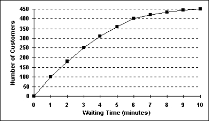 The total number of walk-in customers included in the study was _________.
(Multiple Choice)
4.8/5 (32)
A scatter plot is a two-dimensional graph plot of data containing pairs of observations on two numerical variables.
(True/False)
4.9/5 (37)
The staff of Mr.Wayne Wertz, VP of Operations at Portland Peoples Bank, prepared a cumulative frequency ogive of waiting time for walk-in customers.  The percentage of walk-in customers waiting between 1 and 6 minutes was ___.
(Multiple Choice)
4.9/5 (28)
Each day, the office staff at Oasis Quick Shop prepares a frequency distribution and an ogive of sales transactions by dollar value of the transactions.Saturday's cumulative frequency ogive follows. 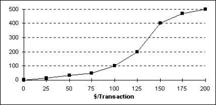 The percentage of sales transactions on Saturday that were under $100 each was _____________.
(Multiple Choice)
4.8/5 (36)
According to the following graphic, the most common cause of PCB Failures is a _____________. 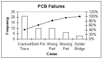
(Multiple Choice)
4.9/5 (36)
Given two class intervals and their respective frequencies and relative frequencies, the ratio of the frequencies _________ the ratio of the relative frequencies.
(Multiple Choice)
4.9/5 (37)
A shirt production company has tracked their sales of red and blue shirts over the past few years.The graph of both is shown below. 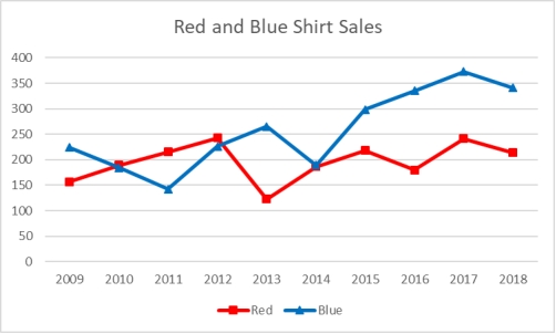 In what years were red shirt sales higher than blue shirt sales?
(Multiple Choice)
4.7/5 (37)
Time-series data should be shown from oldest time period to the most recent.
(True/False)
4.9/5 (36)
The number of phone calls arriving at a switchboard each hour has been recorded, and the following frequency distribution has been developed.
Class Interval Frequency 20 -under 40 30 40 -under 60 45 60 -under 80 80 80 -under 100 45
What is the relative frequency of the second class?
(Multiple Choice)
4.8/5 (42)
If the individual class frequency is divided by the total frequency, the result is the median frequency.
(True/False)
4.9/5 (34)
Consider the following frequency distribution: Class Interval Frequency 100 -under 200 25 200 -under 300 45 300 -under 400 30
What is the cumulative frequency of the second class interval?
(Multiple Choice)
4.7/5 (35)
One advantage of a stem and leaf plot over a frequency distribution is that the values of the original data are retained.
(True/False)
4.9/5 (30)
Consider the following stem and leaf plot:
Stem Leaf 1 0,2,5,7 2 2,3,4,8 3 0,4,6,6,9 4 5,8,8,9 5 2,7,8
Suppose that a frequency distribution was developed from this, and there were 5 classes (10-under 20, 20-under 30, etc.).What is the cumulative frequency for the 30-under 40 class interval?
(Multiple Choice)
4.9/5 (34)
Filters
- Essay(0)
- Multiple Choice(0)
- Short Answer(0)
- True False(0)
- Matching(0)