Exam 2: Visualizing Data With Charts and Graphs
Exam 1: Introduction to Statistics and Business Analytics180 Questions
Exam 2: Visualizing Data With Charts and Graphs113 Questions
Exam 3: Descriptive Statistics88 Questions
Exam 4: Probability104 Questions
Exam 5: Discrete Distributions98 Questions
Exam 6: Continuous Distributions105 Questions
Exam 7: Sampling and Sampling Distributions97 Questions
Exam 8: Statistical Inference: Estimation for Single Populations94 Questions
Exam 9: Statistical Inference: Hypothesis Testing for Single Populations123 Questions
Exam 10: Statistical Inferences About Two Populations97 Questions
Exam 11: Analysis of Variance and Design of Experiments133 Questions
Exam 12: Simple Regression Analysis and Correlation111 Questions
Exam 13: Multiple Regression Analysis90 Questions
Exam 14: Building Multiple Regression Models100 Questions
Exam 15: Time-Series Forecasting and Index Numbers103 Questions
Exam 16: Analysis of Categorical Data85 Questions
Exam 17: Nonparametric Statistics110 Questions
Exam 18: Statistical Quality Control99 Questions
Exam 19: Decision Analysis109 Questions
Select questions type
The following represent the ages of students in a class: 19, 23, 21, 19, 19, 20, 22, 31, 21, 20
If a stem and leaf plot were to be developed from this, how many stems would there be?
Free
(Multiple Choice)
4.8/5  (31)
(31)
Correct Answer: Verified
B
A cross tabulation is a graph that separately displays the frequency counts for two variables.
Free
(True/False)
4.8/5 (45)
Correct Answer:Verified
False
The cumulative frequency for a class is 27.The cumulative frequency for the next (non-empty)class will be _______.
Free
(Multiple Choice)
4.8/5 (37)
Correct Answer:Verified
E
According to the following graphic, "Bent Pins" account for ____% of PCB Failures. Made chart below larger per suggestion 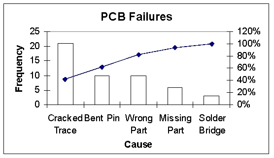
(Multiple Choice)
4.9/5 (41)
The following time-series data shows the average number of vacation days taken each year by employees.
2010 22 2011 25 2012 26 2013 29 2014 24 2015 21 2016 22 2017 20 2018 19
Which of the following would be indicated if these data were shown through a visualization of these data?
(Multiple Choice)
4.8/5 (31)
The following class intervals for a frequency distribution were developed to provide information regarding the starting salaries for students graduating from a particular school: Salary Number of Graduates ( \1 ,000s) 28-under 31 31-under 34 34-under 35 35-under 38 - - - -
Before data were collected, someone questioned the validity of this arrangement.Which of the following represents a problem with this set of intervals?
(Multiple Choice)
4.8/5 (24)
The number of phone calls arriving at a switchboard each hour has been recorded, and the following frequency distribution has been developed.
Class Interval Frequency 20 -under 40 30 40 -under 60 45 60 -under 80 80 80 -under 100 45
What is the cumulative frequency of the third class?
(Multiple Choice)
4.8/5 (29)
Monthly sales were tracked and shown on the graph below. 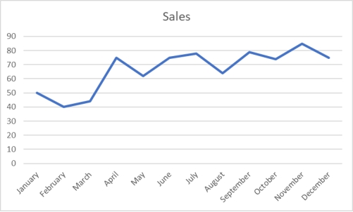 Based on this graph, which month had the highest sales?
(Multiple Choice)
4.8/5 (41)
The difference between the highest number and the lowest number in a set of data is called the differential frequency.
(True/False)
4.8/5 (35)
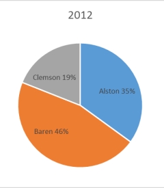
The 2010 and 2012 market share data of three competitors (Alston, Baren, and Clemson)in an oligopolistic industry are presented in the following pie charts.Total sales for this industry were $1.5 billion in 2010 and $1.8 billion in 2012.Clemson's sales in 2010 were ___________. 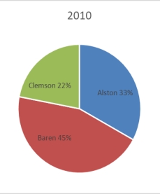
(Multiple Choice)
4.8/5 (42)
Each day, the office staff at Oasis Quick Shop prepares a frequency distribution and an ogive of sales transactions by dollar value of the transactions.Saturday's cumulative frequency ogive follows. 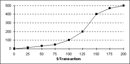 The total number of sales transactions on Saturday was _____________.
(Multiple Choice)
4.8/5 (40)
The staff of Ms.Tamara Hill, VP of Technical Analysis at Blue Sky Brokerage, prepared a frequency histogram of market capitalization of the 937 corporations listed on the American Stock Exchange in January 2016. 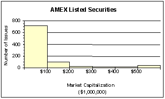 Approximately ________% of corporations had capitalization not exceeding $200,000,000.
(Multiple Choice)
4.7/5 (39)
The customer help center in your company receives calls from customers who need help with some of the customized software solutions your company provides.The staff prepare the following cumulative frequency ogive for waiting times during the last three months.What percentage of customers had waiting times exceeding 6 minutes? 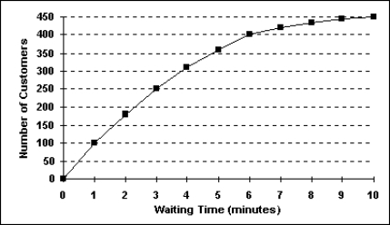
(Multiple Choice)
4.9/5 (37)
The number of phone calls arriving at a switchboard each hour has been recorded, and the following frequency distribution has been developed.
Class Interval Frequency 20 -under 40 30 40 -under 60 45 60 -under 80 80 80 -under 100 45
What is the midpoint of the last class?
(Multiple Choice)
4.9/5 (36)
The following time-series data shows the average number of vacation days taken each year by employees.
2010 22 2011 25 2012 26 2013 29 2014 24 2015 21 2016 22 2017 20 2018 19
The most effective visualization of these data would be:
(Multiple Choice)
4.9/5 (45)
To show differences between different series during the same time periods, different trend lines, each in a different color, and all using the same x axis for graphing.
(True/False)
4.7/5 (33)
A shirt production company has tracked their production and expenses since the company started in 1999.The graph of both is shown. 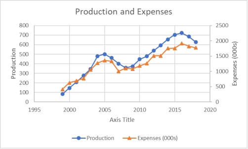 When comparing production and expenses during these years, what conclusion is not true?
(Multiple Choice)
4.8/5 (37)
To consider historical data as part of their decisions, management often uses time-series data.
(True/False)
4.8/5 (36)
Monthly sales were tracked and shown on the graph below. 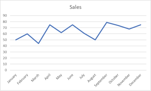 Which of the following would be an incorrect conclusion based on this graph?
(Multiple Choice)
4.9/5 (36)
Filters
- Essay(0)
- Multiple Choice(0)
- Short Answer(0)
- True False(0)
- Matching(0)