Exam 2: Visualizing Data With Charts and Graphs
Exam 1: Introduction to Statistics and Business Analytics180 Questions
Exam 2: Visualizing Data With Charts and Graphs113 Questions
Exam 3: Descriptive Statistics88 Questions
Exam 4: Probability104 Questions
Exam 5: Discrete Distributions98 Questions
Exam 6: Continuous Distributions105 Questions
Exam 7: Sampling and Sampling Distributions97 Questions
Exam 8: Statistical Inference: Estimation for Single Populations94 Questions
Exam 9: Statistical Inference: Hypothesis Testing for Single Populations123 Questions
Exam 10: Statistical Inferences About Two Populations97 Questions
Exam 11: Analysis of Variance and Design of Experiments133 Questions
Exam 12: Simple Regression Analysis and Correlation111 Questions
Exam 13: Multiple Regression Analysis90 Questions
Exam 14: Building Multiple Regression Models100 Questions
Exam 15: Time-Series Forecasting and Index Numbers103 Questions
Exam 16: Analysis of Categorical Data85 Questions
Exam 17: Nonparametric Statistics110 Questions
Exam 18: Statistical Quality Control99 Questions
Exam 19: Decision Analysis109 Questions
Select questions type
If both variables being analyzed are nominal data, the best method to reveal any potential connections between them would be with a __________.
(Multiple Choice)
4.7/5  (33)
(33)
Sales are tracked during the past year in the graph below. 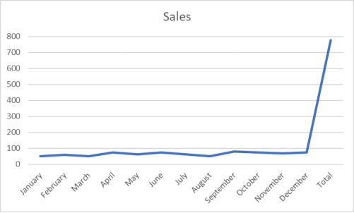 What would be the most effective strategy to allow management to more clearly discern monthly trends in sales?
(Multiple Choice)
4.7/5 (38)
A shirt production company has tracked their production since the company started in 1999.The graph of their annual production is shown. 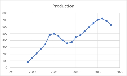 During these years, production has generally _______________.
(Multiple Choice)
4.8/5 (36)
When looking at a scatter plot, if a trend can be discerned between changes in one variable that appear to be related to changes in the other variable, there is likely a relationship between the two variables.
(True/False)
4.9/5 (32)
To show hourly sales throughout a day, a ________ chart would be most effective, and a _________ chart would be more effective at showing what products were sold during that day.
(Multiple Choice)
4.9/5 (34)
A scatter plot indicates that two variables are unrelated as their data are scattered.
(True/False)
4.8/5 (37)
Consider the following frequency distribution: Class Interval Frequency 10 -under 20 15 20 -under 30 25 30 -under 40 10
What is the midpoint of the first class?
(Multiple Choice)
5.0/5 (37)
A summary of data in which raw data are grouped into different ordered intervals and the number of items in each group is noted is called a frequency distribution.
(True/False)
4.9/5 (27)
An instructor made a frequency table of the scores his students got on a test
Score Frequency 30 -under 40 1 40 -under 50 4 50 -under 60 5 60 -under 70 10 70 -under 80 20 80 -under 90 10 90 -under 100 5
Approximately what percent of students got more than 70?
(Multiple Choice)
4.8/5 (34)
The following graphic of cigarettes smoked (sold)per capita (CIG)and deaths per 100K population from lung cancer (LUNG)indicates _________ 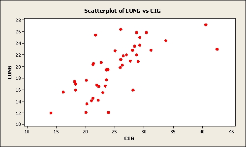
(Multiple Choice)
4.7/5 (26)
Pinky Bauer, Chief Financial Officer of Harrison Haulers, Inc., suspects irregularities in the payroll system and orders an inspection of "each and every payroll voucher issued since January 1, 2000." Each payroll voucher was inspected and the following frequency distribution was compiled. Errors per Voucher 0 -under 2 2-under 4 4-under 6 6-under 8 8-under 10 Number of Vouchers 500 400 300 200 100
The cumulative frequency of the second class interval is _________.
(Multiple Choice)
4.8/5 (35)
Consider the following frequency distribution: Class Interval Frequency 100 -under 200 25 200 -under 300 45 300 -under 400 30
What is the midpoint of the first class?
(Multiple Choice)
4.8/5 (38)
A frequency distribution was developed.The lower endpoint of the first class is 9.30, and the midpoint is 9.35.What is the upper endpoint of this class?
(Multiple Choice)
4.8/5 (26)
Pinky Bauer, Chief Financial Officer of Harrison Haulers, Inc., suspects irregularities in the payroll system and orders an inspection of "each and every payroll voucher issued since January 1, 2000." Each payroll voucher was inspected and the following frequency distribution was compiled. Errors per Voucher 0 -under 2 2-under 4 4-under 6 6-under 8 8-under 10 Number of Vouchers 500 400 300 200 100
The relative frequency of the first class interval is _________.
(Multiple Choice)
4.9/5 (32)
Consider the relative frequency distribution given below:
Class Interval Relative Frequency 20-under 40 0.2 40 -under 60 0.3 60 -under 80 0.4 80-under 100 0.1
There were 60 numbers in the data set.How many numbers were in the interval 40-under 60?
(Multiple Choice)
4.8/5 (36)
The point of "cleaning" time-series data is to be sure all the data are accurate.
(True/False)
4.9/5 (31)
Abel Alonzo, Director of Human Resources, is exploring employee absenteeism at Harrison Haulers, Inc.during the last operating year.A review of all personnel records indicated that absences ranged from zero to twenty-nine days per employee.The following class intervals were proposed for a frequency distribution of absences. Absences (Days) 0 -under 5 5-under 10 10-under 15 20 -under 25 25 -under 30 Number of Employees - - - - -
Which of the following represents a problem with this set of intervals?
(Multiple Choice)
5.0/5 (38)
Consider the following frequency distribution: Class Interval Frequency 100 -under 200 25 200 -under 300 45 300 -under 400 30
What is the relative frequency of the second class interval?
(Multiple Choice)
4.7/5 (36)
The following graphic of residential housing data (selling price and size in square feet)is a _____________. 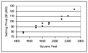
(Multiple Choice)
4.9/5 (36)
Filters
- Essay(0)
- Multiple Choice(0)
- Short Answer(0)
- True False(0)
- Matching(0)