Exam 5: Exploring Data With Graphs
Exam 1: Why Is My Evil Lecturer Forcing Me to Learn Statistics26 Questions
Exam 2: The Spine of Statistics28 Questions
Exam 3: The Phoenix of Statistics16 Questions
Exam 4: The Ibm Spss Statistics Environment27 Questions
Exam 5: Exploring Data With Graphs23 Questions
Exam 6: The Beast of Bias32 Questions
Exam 7: Non-Parametric Models21 Questions
Exam 8: Correlation18 Questions
Exam 9: Regression33 Questions
Exam 10: Comparing Two Means20 Questions
Exam 11: Moderation,mediation and More Regression21 Questions
Exam 12: Glm 1: Comparing Several Independent Means24 Questions
Exam 13: Glm 2: Comparing Means Adjusted for Other Predictors Analysis of Covariance20 Questions
Exam 14: Glm 3: Factorial Designs30 Questions
Exam 15: Glm 4: Repeated-Measures Designs31 Questions
Exam 16: Glm 5: Mixed Designs19 Questions
Exam 17: Multivariate Analysis of Variance Manova20 Questions
Exam 18: Exploratory Factor Analysis19 Questions
Exam 19: Categorical Outcomes: Chi-Square and Loglinear Analysis19 Questions
Exam 20: Categorical Outcomes: Logistic Regression20 Questions
Exam 21: Multilevel Linear Models20 Questions
Select questions type
We took a sample of children who had been learning to play a musical instrument for five years.We measured the number of hours they spent practising each week and assessed their musical skill by how many of 8 increasingly difficult exams they had passed.We also asked them whether their parents forced them to practise or not (were their parents pushy?).What does the graph suggest about children who spend approximately 1 hour practising a week? 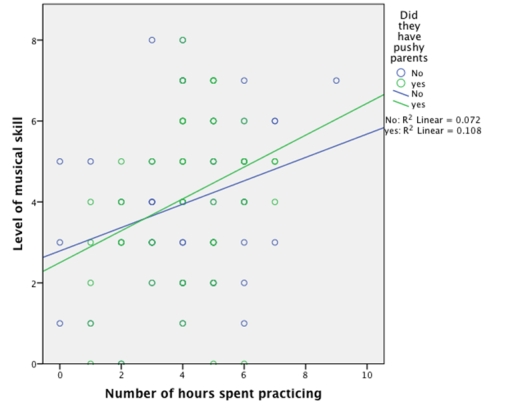
Free
(Multiple Choice)
4.8/5  (34)
(34)
Correct Answer: Verified
C
Looking at the graph below,which of the following statements are correct? 
Free
(Multiple Choice)
4.9/5 (28)
Correct Answer:Verified
C
Approximately what is the mean success score for those who wanted to quit in the hypnosis group? 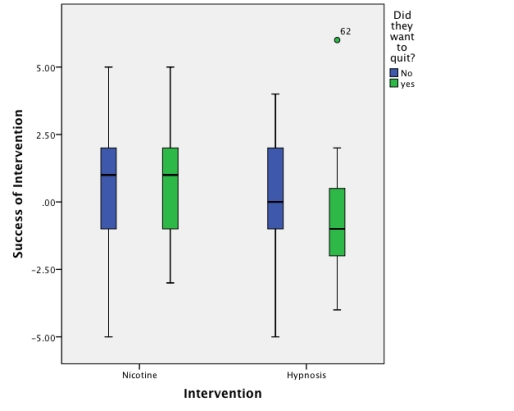
(Multiple Choice)
4.8/5 (29)
The graph below shows the mean success rate of cutting down on smoking (positive score = success)in people who wanted to quit and people who did not want to quit.Which of the following statements is the most true? 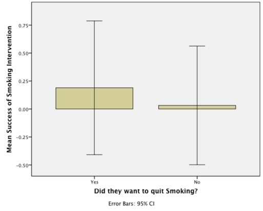
(Multiple Choice)
4.8/5 (35)
Looking at the graph below,approximately what was the median success score for the nicotine group? 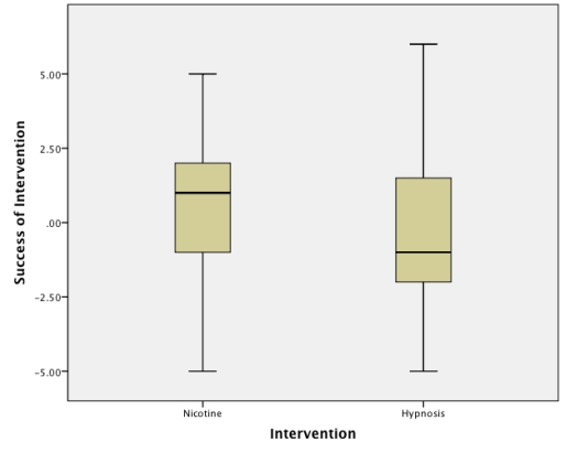
(Multiple Choice)
4.9/5 (39)
We took a sample of children who had been learning to play a musical instrument for five years.We measured the number of hours they spent practising each week and assessed their musical skill by how many of 8 increasingly difficult exams they had passed.We also asked them whether their parents forced them to practise or not (were their parents pushy?).What does the following graph show? 
(Multiple Choice)
4.9/5 (23)
Approximately what is the median success score for those in the hypnosis group who did not want to quit? 
(Multiple Choice)
4.9/5 (33)
Looking at the graph below,which intervention was the most successful at reducing the number of cigarettes smoked each day in those who did not want to quit? 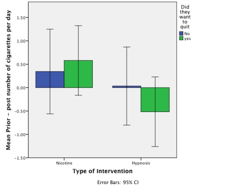
(Multiple Choice)
4.8/5 (26)
A study was done to investigate the effect of 'motivation to quit' on the success rate of a new intervention developed to reduce the number of cigarettes smoked per day in a group of smokers.Looking at the graph below,what can we say about the relationship between motivation to quit and the success rate of the intervention? 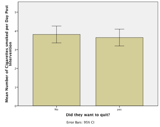
(Multiple Choice)
4.8/5 (31)
Based on the chart,what was the median mark (approximately)? 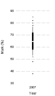
(Multiple Choice)
4.8/5 (20)
Imagine we took a group of smokers,recorded the number of cigarettes they smoked each day,whether they wanted to quit smoking or not,and then split them randomly into one of two 6-week interventions; 'hypnosis' or 'nicotine patch'.After the 6 weeks,we again recorded how many cigarettes they smoked each day and subtracted this number from the number of cigarettes they each smoked pre-intervention,to produce an intervention success score for each participant.Out of the following options,which would be the best method of looking at which intervention was the most successful,taking into account whether the participant wanted to quit or not?
(Multiple Choice)
4.8/5 (33)
Looking at the graph below,which intervention was the most successful at reducing the number of cigarettes smoked each day in those who wanted to quit? 
(Multiple Choice)
4.9/5 (38)
Which of the following statements best describes the graph below? 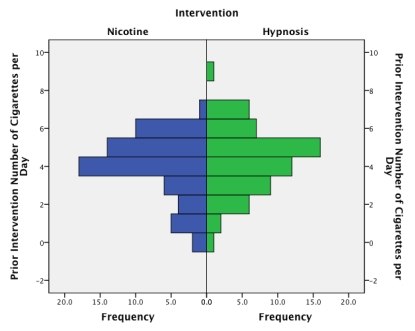
(Multiple Choice)
4.9/5 (34)
Based on the chart,what was the interquartile range of marks (approximately). 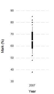
(Multiple Choice)
4.8/5 (31)
Filters
- Essay(0)
- Multiple Choice(0)
- Short Answer(0)
- True False(0)
- Matching(0)