Exam 3: Determining Effective Data Display with Charts
Exam 1: Applying Fundamental Excel Skills and Tools in Problem Solving150 Questions
Exam 2: Solving Problems with Statistical Analysis Tools150 Questions
Exam 3: Determining Effective Data Display with Charts150 Questions
Exam 4: Applying Logic in Decision Making150 Questions
Exam 5: Retrieving Data for Computation, Analysis, and Reference150 Questions
Exam 6: Evaluating the Financial Impact of Loans and Investments150 Questions
Exam 7: Organizing Data for Effective Analysis150 Questions
Exam 8: Using Data Tables and Excel Scenarios for What-If Analysis150 Questions
Exam 9: Enhancing Decision Making with Solver150 Questions
Exam 10: Troubleshooting Workbooks and Automating Excel Applications150 Questions
Select questions type
A ____ is a box that identifies the patterns or colors assigned to the data series in a chart.
(Multiple Choice)
4.7/5  (31)
(31)
The ____ option of splitting a pie data series into a second, smaller pie chart allows you to drag individual pie segments between the two charts so you can include exactly the segments you want in the main pie chart and the second plot.
(Multiple Choice)
4.8/5 (38)
You can modify the location of a chart at any time using the _____ dialog box.
(Multiple Choice)
4.9/5 (39)
Bar and column charts are commonly used to compare values across categories.
(True/False)
4.9/5 (37)
By Columns By Rows
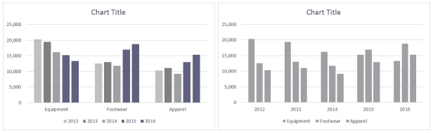 Ross always looks at data in more than one way. He discovered a feature in Excel that allows him to display the chart By Column and By Rows, as shown in the above figure.
-Ross discovers a second way to change the rows and columns without opening a dialog box: He simply clicks the Switch Row/Column button in the Data group on the ____ tab.
Ross always looks at data in more than one way. He discovered a feature in Excel that allows him to display the chart By Column and By Rows, as shown in the above figure.
-Ross discovers a second way to change the rows and columns without opening a dialog box: He simply clicks the Switch Row/Column button in the Data group on the ____ tab.
(Multiple Choice)
4.8/5 (36)
To change the thickness of a pie slice, change the value of the degree in the ____________________ box in the Format Chart Area task pane.
(Short Answer)
4.8/5 (42)
MATCHING
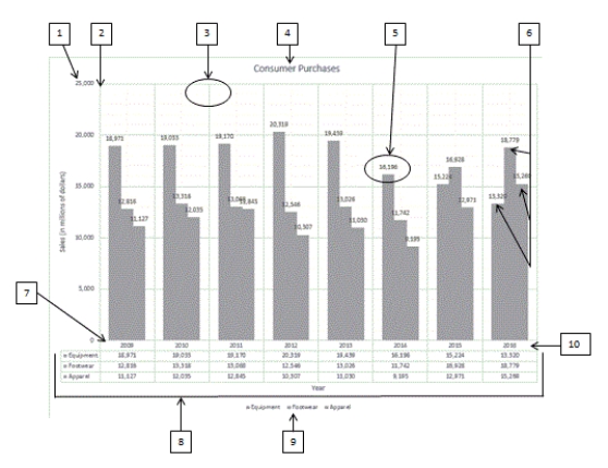 Using the above figure, identify the letter of the choice that best matches the figure.
-#6
Using the above figure, identify the letter of the choice that best matches the figure.
-#6
(Multiple Choice)
4.9/5 (41)
In the Open-High-Low-Close chart sub-type, if the box is white, the stock increased in value for the time period. The white box is referred to as the ____.
(Multiple Choice)
4.8/5 (25)
The groundbreaking book by Edward R. ____________________, The Visual Display of Quantitative Information, gave advice such as "Above all else show the data."
(Short Answer)
4.8/5 (43)
____ of the chart types have 3-D options, but these should be used with caution.
(Multiple Choice)
4.9/5 (41)
In the Format Data Labels task pane, use the ____________________ option to change the appearance of a data label's 3-D format.
(Short Answer)
4.8/5 (32)
Stacked charts do a good job of illustrating the ____ effects of data in categories.
(Multiple Choice)
4.8/5 (32)
____ is a part of the chart that decorates more than informs.
(Multiple Choice)
4.8/5 (32)
Microsoft Excel charts provide a visual representation of quantitative information, giving the viewer an overall picture of a set of data.
(True/False)
4.9/5 (27)
If the source data is dynamic, seeing the effect of the changes in a chart can be very handy. In this case, the chart should be placed ____.
(Multiple Choice)
4.8/5 (24)
The ____ gallery in the Insert Shapes group on the CHART TOOLS FORMAT tab contains a variety of shapes that can be added to a chart.
(Multiple Choice)
4.7/5 (39)
To create a forward forecast in Excel, adding a ____ to a chart may reveal trends in the data.
(Multiple Choice)
4.8/5 (37)
An X Y (Scatter) chart plots numeric values on both the x- and y-axes based on the value of the data.
(True/False)
4.8/5 (35)
Layered charts are known for doing a good job of illustrating the cumulative effects of data in categories. _________________________
(True/False)
4.8/5 (23)
The radar chart is similar in structure to a spider web, with each "web strand" that roughly
Forms a circle representing the ____.
(Multiple Choice)
4.8/5 (39)
Filters
- Essay(0)
- Multiple Choice(0)
- Short Answer(0)
- True False(0)
- Matching(0)