Exam 3: Determining Effective Data Display with Charts
Exam 1: Applying Fundamental Excel Skills and Tools in Problem Solving150 Questions
Exam 2: Solving Problems with Statistical Analysis Tools150 Questions
Exam 3: Determining Effective Data Display with Charts150 Questions
Exam 4: Applying Logic in Decision Making150 Questions
Exam 5: Retrieving Data for Computation, Analysis, and Reference150 Questions
Exam 6: Evaluating the Financial Impact of Loans and Investments150 Questions
Exam 7: Organizing Data for Effective Analysis150 Questions
Exam 8: Using Data Tables and Excel Scenarios for What-If Analysis150 Questions
Exam 9: Enhancing Decision Making with Solver150 Questions
Exam 10: Troubleshooting Workbooks and Automating Excel Applications150 Questions
Select questions type
Charts can be either embedded as an object on the same worksheet as the data, or placed on a separate worksheet referred to as a(n) ____________________.
(Short Answer)
4.9/5  (31)
(31)
Microsoft Excel ____ provide a visual representation of quantitative information, giving the viewer an overall picture of a set of data.
(Multiple Choice)
4.7/5 (28)
Excel provides 10 standard chart types, with 53 sub-types that can be used to present
information graphically. _________________________
(True/False)
4.8/5 (31)
Bubble charts can be problematic to work with since the source data must be selected without including ____.
(Multiple Choice)
4.7/5 (34)
Name and briefly describe five of the eleven chart types listed in the chapter.
(Essay)
4.9/5 (33)
One available chart option is to create a 100% ____________________ chart, in which the plotted values are converted into percentages of the total amount within each category.
(Short Answer)
4.9/5 (33)
By Columns By Rows
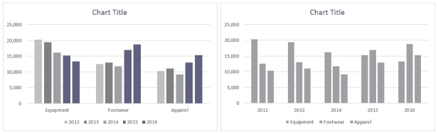 Ross always looks at data in more than one way. He discovered a feature in Excel that allows him to display the chart By Column and By Rows, as shown in the above figure.
-Looking at the column chart, which category/categories is/are decreasing in sales each year?
Ross always looks at data in more than one way. He discovered a feature in Excel that allows him to display the chart By Column and By Rows, as shown in the above figure.
-Looking at the column chart, which category/categories is/are decreasing in sales each year?
(Multiple Choice)
5.0/5 (31)
In a worksheet, the MAX and MIN functions can be used to take care of the highest and lowest stock price, respectively, for each month. _________________________
(True/False)
4.7/5 (38)
____ are the related data points that are plotted on the chart.
(Multiple Choice)
4.8/5 (35)
A data series is composed of related data points that are plotted on a chart.
(True/False)
4.8/5 (38)
In a ____ chart, values are indicated by the size of the slices.
(Multiple Choice)
5.0/5 (36)
Identify the letter of the choice that best matches the phrase or definition.
-Line chart type
(Multiple Choice)
5.0/5 (31)
Excel offers many formatting and display options for changing the layout of chart elements that can be found on the ____ when a chart is selected.
(Multiple Choice)
4.8/5 (28)
The Data Labels category found on the Chart Elements menu provides options for changing the information the label displays as well as the label position. _________________________
(True/False)
4.9/5 (42)
The ____ option of splitting a pie data series into a second, smaller pie chart assigns a specific number of values to the second plot.
(Multiple Choice)
4.8/5 (39)
The ____________________ chart type displays stock price and volume trends over time. Plotted values can include volume, opening price, highest price, lowest price, and closing price.
(Short Answer)
4.9/5 (38)
The Chart Elements menu allows you to control the appearance of the ____.
(Multiple Choice)
4.8/5 (36)
The sum of the value of the categories must total ____ to use a pie chart.
(Multiple Choice)
4.8/5 (35)
Briefly describe the eight common areas of a chart: chart title, y-axis, y-axis labels, x-axis, x-axis labels, data series, data points, and legend.
(Essay)
4.7/5 (38)
Filters
- Essay(0)
- Multiple Choice(0)
- Short Answer(0)
- True False(0)
- Matching(0)