Exam 3: Determining Effective Data Display with Charts
Exam 1: Applying Fundamental Excel Skills and Tools in Problem Solving150 Questions
Exam 2: Solving Problems with Statistical Analysis Tools150 Questions
Exam 3: Determining Effective Data Display with Charts150 Questions
Exam 4: Applying Logic in Decision Making150 Questions
Exam 5: Retrieving Data for Computation, Analysis, and Reference150 Questions
Exam 6: Evaluating the Financial Impact of Loans and Investments150 Questions
Exam 7: Organizing Data for Effective Analysis150 Questions
Exam 8: Using Data Tables and Excel Scenarios for What-If Analysis150 Questions
Exam 9: Enhancing Decision Making with Solver150 Questions
Exam 10: Troubleshooting Workbooks and Automating Excel Applications150 Questions
Select questions type
A ____ chart displays trends in three dimensions, with values in colored or patterned areas on the surface of the chart.
(Multiple Choice)
4.7/5  (39)
(39)
A 100% stacked chart is similar to a ____ chart except that the pieces are in a column.
(Multiple Choice)
4.8/5 (35)
Use the Label options on the Chart Elements menu to display a table of values for each data series in a grid below the chart. _________________________
(True/False)
4.9/5 (34)
Generally, when a stock price moves above the moving average trendline, it is a good indicator
Of ____.
(Multiple Choice)
4.8/5 (40)
A ____ is a word-sized chart embedded in context with the data it represents.
(Multiple Choice)
4.8/5 (34)
The chart title is the descriptive text that identifies the chart's contents.
_________________________
(True/False)
4.8/5 (28)
Excel offers two pie chart sub-types, Pie of Pie and Bar of Bar, that can be used to combine many smaller segments of a pie chart into a separate smaller chart. ________________________
(True/False)
4.9/5 (42)
One of the features of 100% stacked charts is that they show ____ percentages.
(Multiple Choice)
4.9/5 (30)
Doughnut charts are a way to show the information contained in a pie chart for ____.
(Multiple Choice)
5.0/5 (30)
List and explain briefly the five guidelines given by Edward R. Tufte.
(Essay)
4.8/5 (38)
Case-Based Critical Thinking Questions
Case 3-1
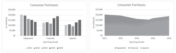 Column Chart Area Chart
Sarah has put together the same information in two different charts, shown in the figure above, to present to her boss. She is thinking through the pros and cons of each chart type.
-What is one of the weaknesses of the column chart shown above?
Column Chart Area Chart
Sarah has put together the same information in two different charts, shown in the figure above, to present to her boss. She is thinking through the pros and cons of each chart type.
-What is one of the weaknesses of the column chart shown above?
(Multiple Choice)
4.8/5 (32)
The ____________________ chart type displays value trends in three dimensions. Values are indicated by areas with colors or patterns on the surface of the chart.
(Short Answer)
4.9/5 (31)
Radar charts are like area charts-but whereas area charts emphasize the amount of the contribution, radar charts emphasize ____.
(Multiple Choice)
5.0/5 (28)
An X Y (____________________) chart plots numeric values on both the x- and y-axes based on the value of the data.
(Short Answer)
4.8/5 (28)
The ____ is the descriptive text that identifies the chart's contents.
(Multiple Choice)
4.9/5 (41)
MATCHING
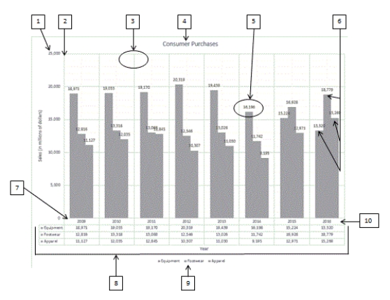 Using the above figure, identify the letter of the choice that best matches the figure.
-#1
Using the above figure, identify the letter of the choice that best matches the figure.
-#1
(Multiple Choice)
4.9/5 (24)
Any changes to the data label content must be made using the Format Data Labels task pane. _________________________
(True/False)
4.8/5 (32)
MATCHING
Using the above figure, identify the letter of the choice that best matches the figure.
-#7
(Multiple Choice)
4.8/5 (33)
Bubble charts allow three-dimensional data to be plotted in three dimensions on two axes. _________________________
(True/False)
4.9/5 (41)
In a ____ chart, values are indicated by the distance from a center point.
(Multiple Choice)
4.8/5 (44)
Filters
- Essay(0)
- Multiple Choice(0)
- Short Answer(0)
- True False(0)
- Matching(0)