Exam 3: Determining Effective Data Display with Charts
Exam 1: Applying Fundamental Excel Skills and Tools in Problem Solving150 Questions
Exam 2: Solving Problems with Statistical Analysis Tools150 Questions
Exam 3: Determining Effective Data Display with Charts150 Questions
Exam 4: Applying Logic in Decision Making150 Questions
Exam 5: Retrieving Data for Computation, Analysis, and Reference150 Questions
Exam 6: Evaluating the Financial Impact of Loans and Investments150 Questions
Exam 7: Organizing Data for Effective Analysis150 Questions
Exam 8: Using Data Tables and Excel Scenarios for What-If Analysis150 Questions
Exam 9: Enhancing Decision Making with Solver150 Questions
Exam 10: Troubleshooting Workbooks and Automating Excel Applications150 Questions
Select questions type
The Description options on the Chart Elements menu control the display and placement of the chart legend.
(True/False)
4.8/5  (40)
(40)
The ____ trendline is used to smooth out the data, making it easier to spot trends.
(Multiple Choice)
4.8/5 (29)
An Excel chart requires ____ numeric data series in one chart.
(Multiple Choice)
4.9/5 (36)
Data series are points in a data set at which the x-axis and y-axis values intersect.
(True/False)
4.8/5 (34)
By Columns By Rows
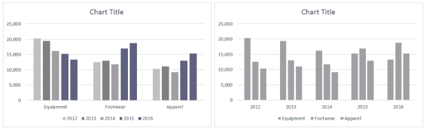 Ross always looks at data in more than one way. He discovered a feature in Excel that allows him to display the chart By Column and By Rows, as shown in the above figure.
-When the chart is plotted by rows, what information does it emphasize?
Ross always looks at data in more than one way. He discovered a feature in Excel that allows him to display the chart By Column and By Rows, as shown in the above figure.
-When the chart is plotted by rows, what information does it emphasize?
(Multiple Choice)
4.9/5 (31)
Case-Based Critical Thinking Questions
Case 3-1
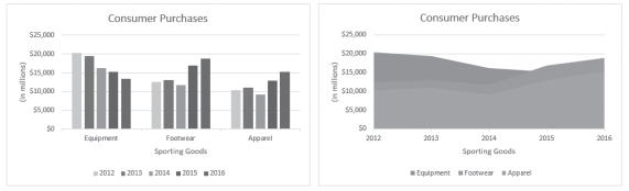 Column Chart Area Chart
Sarah has put together the same information in two different charts, shown in the figure above, to present to her boss. She is thinking through the pros and cons of each chart type.
-If Sarah wanted to focus on and display the percentage contribution that each category makes to the whole, which chart type would work best?
Column Chart Area Chart
Sarah has put together the same information in two different charts, shown in the figure above, to present to her boss. She is thinking through the pros and cons of each chart type.
-If Sarah wanted to focus on and display the percentage contribution that each category makes to the whole, which chart type would work best?
(Multiple Choice)
4.7/5 (27)
Case-Based Critical Thinking Questions
Case 3-1
Column Chart Area Chart
Sarah has put together the same information in two different charts, shown in the figure above, to present to her boss. She is thinking through the pros and cons of each chart type.
-An area chart combines the features of a ____ by filling in the area below the line, and displaying the trend of values over time or categories.
(Multiple Choice)
4.9/5 (33)
In the Format Data Labels task pane, use the options in the ____ category to specify the alignment (horizontal or vertical), orientation, position, and direction of the data labels.
(Multiple Choice)
5.0/5 (36)
The ____________________ dialog box, which is available from the shortcut menu for a selected chart, provides options for modifying the values used to generate a chart.
(Short Answer)
4.8/5 (37)
Identify the letter of the choice that best matches the phrase or definition.
-Doughnut chart type
(Multiple Choice)
4.7/5 (34)
MATCHING
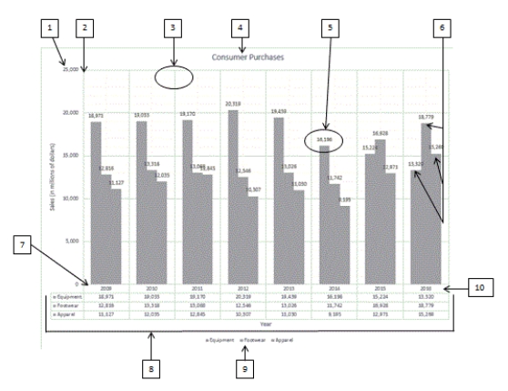 Using the above figure, identify the letter of the choice that best matches the figure.
-#8
Using the above figure, identify the letter of the choice that best matches the figure.
-#8
(Multiple Choice)
4.9/5 (27)
A(n) ____________________ combines the features of a line chart with a bar or column chart by filling in the area below the line, and displaying the trend of values over time or categories.
(Short Answer)
4.9/5 (36)
To compare the contribution each value in a single data series makes to the whole, or 100%, use a pie chart.
(True/False)
4.8/5 (35)
The pie chart has two chart sub-types, ____ and Bar of Pie, which are smaller charts that are displayed next to the original chart.
(Multiple Choice)
4.8/5 (36)
To change the chart sub-type, click the chart to display the CHART TOOLS contextual tabs on the ribbon, click the CHART TOOLS ___________ tab, and then click the Change Chart Type button in the Type group.
(Short Answer)
4.9/5 (28)
In the ____ chart type, values are indicated by areas with colors or patterns on the surface of the chart.
(Multiple Choice)
4.9/5 (27)
The ____ chart sub-type adds information on the opening price of the stock to the High-Low-Close information for the time period.
(Multiple Choice)
4.7/5 (33)
____ charts allow three-dimensional data to be plotted in 2-D on two axes.
(Multiple Choice)
4.9/5 (25)
____ charts are named for their resemblance to the plots on radar screens as they scan a 360-degree circle.
(Multiple Choice)
4.8/5 (33)
Filters
- Essay(0)
- Multiple Choice(0)
- Short Answer(0)
- True False(0)
- Matching(0)