Exam 3: Determining Effective Data Display with Charts
Exam 1: Applying Fundamental Excel Skills and Tools in Problem Solving150 Questions
Exam 2: Solving Problems with Statistical Analysis Tools150 Questions
Exam 3: Determining Effective Data Display with Charts150 Questions
Exam 4: Applying Logic in Decision Making150 Questions
Exam 5: Retrieving Data for Computation, Analysis, and Reference150 Questions
Exam 6: Evaluating the Financial Impact of Loans and Investments150 Questions
Exam 7: Organizing Data for Effective Analysis150 Questions
Exam 8: Using Data Tables and Excel Scenarios for What-If Analysis150 Questions
Exam 9: Enhancing Decision Making with Solver150 Questions
Exam 10: Troubleshooting Workbooks and Automating Excel Applications150 Questions
Select questions type
____ got their name because they display performance indicators in a fashion similar to the instrument panel in a car's dashboard.
(Multiple Choice)
4.9/5  (33)
(33)
____ graphically illustrate trends in the data using a statistical technique known as regression.
(Multiple Choice)
4.9/5 (31)
The ____________________ chart type compares sets of three values. Values are indicated by the size of the filled circles.
(Short Answer)
4.8/5 (41)
Many element-related Excel chart options are found on the Chart ____________________ menu.
(Short Answer)
4.9/5 (24)
To emphasize categories of data and each category's contribution to the total, create a(n) ____________________ pie chart by dragging a pie slice away from the other slices in the pie.
(Short Answer)
4.9/5 (37)
The ____ option of splitting a pie data series into a second, smaller pie chart allows you to select a cutoff point that assigns all the values below that point to the second plot.
(Multiple Choice)
4.8/5 (30)
In a worksheet, you can add up the stock traded during the month by using the ADD function.
_________________________
(True/False)
4.7/5 (32)
The ____ chart type displays stock price and volume trends over time.
(Multiple Choice)
4.9/5 (34)
By Columns By Rows
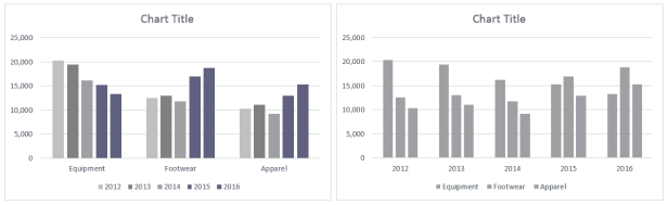 Ross always looks at data in more than one way. He discovered a feature in Excel that allows him to display the chart By Column and By Rows, as shown in the above figure.
-To create the comparison shown in the above figure, Ross used the Switch Row/Column button in the ____ group.
Ross always looks at data in more than one way. He discovered a feature in Excel that allows him to display the chart By Column and By Rows, as shown in the above figure.
-To create the comparison shown in the above figure, Ross used the Switch Row/Column button in the ____ group.
(Multiple Choice)
4.8/5 (35)
The ____ is the vertical axis where data values are plotted.
(Multiple Choice)
4.9/5 (27)
According to Tufte, ____ can make charts difficult to read, use, and interpret.
(Multiple Choice)
4.7/5 (29)
The ____ is the horizontal axis where categories are plotted.
(Multiple Choice)
4.9/5 (38)
Use a pie chart when it's most important to show relative percentages rather than values.
(True/False)
4.7/5 (32)
By Columns By Rows
Ross always looks at data in more than one way. He discovered a feature in Excel that allows him to display the chart By Column and By Rows, as shown in the above figure.
-When the chart is plotted by columns, what information does it emphasize?
(Multiple Choice)
4.8/5 (35)
The design of statistical graphics is the combined use of points, lines, numbers, words, shading, and color to present quantitative information.
(True/False)
4.9/5 (35)
Use the Trendline options on the Chart Elements menu to specify whether the x- and y-axes are displayed.
(True/False)
4.8/5 (42)
In business, charts are typically used to summarize information so that it can be used by one person making a decision.
(True/False)
4.8/5 (30)
You must make changes to the content of data labels using buttons in the Format Data Labels task pane.
(True/False)
4.9/5 (38)
MATCHING
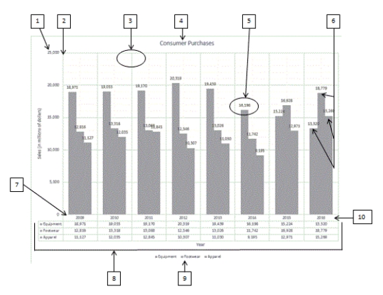 Using the above figure, identify the letter of the choice that best matches the figure.
-#4
Using the above figure, identify the letter of the choice that best matches the figure.
-#4
(Multiple Choice)
4.9/5 (35)
The Switch Row/Column button provides settings for swapping a data series between rows or columns.
(True/False)
4.9/5 (30)
Filters
- Essay(0)
- Multiple Choice(0)
- Short Answer(0)
- True False(0)
- Matching(0)