Exam 3: Determining Effective Data Display with Charts
Exam 1: Applying Fundamental Excel Skills and Tools in Problem Solving150 Questions
Exam 2: Solving Problems with Statistical Analysis Tools150 Questions
Exam 3: Determining Effective Data Display with Charts150 Questions
Exam 4: Applying Logic in Decision Making150 Questions
Exam 5: Retrieving Data for Computation, Analysis, and Reference150 Questions
Exam 6: Evaluating the Financial Impact of Loans and Investments150 Questions
Exam 7: Organizing Data for Effective Analysis150 Questions
Exam 8: Using Data Tables and Excel Scenarios for What-If Analysis150 Questions
Exam 9: Enhancing Decision Making with Solver150 Questions
Exam 10: Troubleshooting Workbooks and Automating Excel Applications150 Questions
Select questions type
A(n) ____ chart plots numeric values on both the x- and y-axes based on the value of the data.
(Multiple Choice)
4.9/5  (45)
(45)
Identify the letter of the choice that best matches the phrase or definition.
-Bar chart type
(Multiple Choice)
4.9/5 (31)
To change the chart sub-type, click the Change Chart Type button in the ____ group on the CHART TOOLS DESIGN tab.
(Multiple Choice)
4.9/5 (32)
The column chart's default column chart sub-type is the _____ sub-type.
(Multiple Choice)
4.9/5 (29)
The ____ option of splitting a pie data series into a second, smaller pie chart allows you to select a cutoff point by percentage, rather than value, and assign all the percentages below that point to the second plot.
(Multiple Choice)
4.8/5 (33)
Regresslines graphically illustrate trends in the data using a statistical technique known as regression. _________________________
(True/False)
4.8/5 (40)
Tufte's first principle, "Above all else show the data," is a reminder to show as large a range of data as possible.
(True/False)
4.9/5 (30)
To display a moving average along with your chart data, use the ____________________ option in Chart Elements.
(Short Answer)
4.7/5 (32)
Microsoft Excel can be used to provide a visual representation of ____________________ information, giving the viewer an overall picture of a set of data.
(Short Answer)
4.8/5 (33)
MATCHING
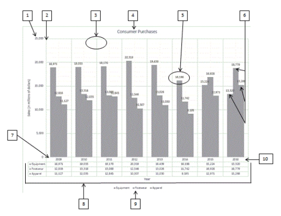 Using the above figure, identify the letter of the choice that best matches the figure.
-#5
Using the above figure, identify the letter of the choice that best matches the figure.
-#5
(Multiple Choice)
4.7/5 (37)
A management console shows a visual summary of various performance data that a company's managers use on a regular basis. _________________________
(True/False)
4.7/5 (38)
As a general rule, you should place charts that are developed for presentation and printing on a chart sheet.
(True/False)
4.8/5 (31)
MATCHING
Using the above figure, identify the letter of the choice that best matches the figure.
-#9
(Multiple Choice)
4.8/5 (37)
Using the ____ in a chart is a common way to include widely differing sets of data from the same time period.
(Multiple Choice)
4.9/5 (31)
When tracking stock prices, the term crawling average is used because the average is calculated each day for the last 30 days-moving the average along the chart.
_________________________
(True/False)
4.7/5 (31)
In a(n) ____ chart, values are indicated by the height of the columns.
(Multiple Choice)
4.8/5 (33)
A line chart plots numeric values on one axis and category labels equidistantly on the other axis.
(True/False)
4.9/5 (30)
To create a chart in Excel, you first select the data you want to display in the chart, and then click the ____ tab on the ribbon.
(Multiple Choice)
4.8/5 (36)
MATCHING
Using the above figure, identify the letter of the choice that best matches the figure.
-#2
(Multiple Choice)
4.9/5 (34)
Radar charts are named for their resemblance to the plots on radar screens as they scan a 360-degree circle. _________________________
(True/False)
4.9/5 (29)
Filters
- Essay(0)
- Multiple Choice(0)
- Short Answer(0)
- True False(0)
- Matching(0)