Exam 3: Data Visualization
Exam 1: Introduction49 Questions
Exam 2: Descriptive Statistics84 Questions
Exam 3: Data Visualization69 Questions
Exam 4: Descriptive Data Mining56 Questions
Exam 5: Probability: an Introduction to Modeling Uncertainty62 Questions
Exam 6: Statistical Inference62 Questions
Exam 7: Linear Regression71 Questions
Exam 8: Time Series Analysis and Forecasting58 Questions
Exam 9: Predictive Data Mining40 Questions
Exam 10: Spreadsheet Models64 Questions
Exam 11: Linear Optimization Models58 Questions
Exam 12: Integer Linear Optimization Models56 Questions
Exam 13: Nonlinear Optimization Models55 Questions
Exam 14: Monte Carlo Simulation59 Questions
Exam 15: Decision Analysis58 Questions
Select questions type
A chart that is recommended as an alternative to a pie chart is a
(Multiple Choice)
4.8/5  (48)
(48)
Data are show below on the quality rating, volume, average wait time from pull-up to completion, average unit purchase, and revenue tier for franchises of a certain fast food restaurant in Area 6.
Using the table below, complete the crosstabulation chart of Volume Category and Revenue Tier.
Crosstabulation of Quality Rating and Daily Units for Area 6 Franchises
Revenue Tier
Volume Category Tier 1 Tier 2 Tier 3 Tier 4 Total Low Medium High Total
(Essay)
4.9/5 (31)
_____ merges maps and statistics to present data collected over different geographies.
(Multiple Choice)
4.7/5 (30)
Which one of the following statements is not true concerning PivotTables in Excel?
(Multiple Choice)
4.7/5 (37)
A graphical presentation that uses vertical bars to display the magnitude of quantitative data is known as a
(Multiple Choice)
4.9/5 (33)
Consider the following survey results regarding marital status by age. Age Category Never Married (\%) Married (\%) Divorced (\%) 18-24 49 35 16 25-34 44 35 21 35-44 28 45 27 45-54 22 58 20
a. Construct a stacked-column chart to display the survey data on marital status. Use Age Category as the variable on the horizontal axis.
b. Construct a clustered-column chart to display the survey data. Use Age Category as the variable on the horizontal axis.
c. What can you infer about the relationship between age and marital status from the column charts in parts (a) and (b)? Which column chart (stacked or clustered) is best for interpreting this relationship? Why?
(Essay)
4.9/5 (44)
The software package most commonly used for creating simple charts is
(Multiple Choice)
4.9/5 (29)
The following table shows the average monthly distance travelled (in Billion Miles) by vehicles on urban highways for five different years.
Years Jan Feb Mar Apr May jun july aug sep oct nov dec Year 1 4.22 5.32 5.21 5.12 4.92 4.49 4.55 4.49 4.44 4.39 4.37 4.35 Year 2 4.31 5.44 5.34 5.24 4.98 4.59 4.68 4.65 4.61 4.68 4.74 4.79 Year 3 4.38 5.51 5.41 5.36 4.98 4.63 4.71 4.78 4.82 4.88 4.85 4.89 Year 4 4.45 5.59 5.5 5.41 5.01 4.72 4.78 4.79 4.82 4.92 5.06 5.11 Year 5 4.51 5.65 5.62 5.49 5.12 4.8 4.88 4.82 4.95 5.12 5.22 5.44
a. Use Excel to create sparklines for the average monthly vehicle distance travelled each year.
b. Which year has decreasing trend of the average distance travelled? Which year has increasing
trend of the average distance travelled?
c. Use Excel to create a heat map for the average distance travelled by vehicles. Do you find the
heat map or the sparklines to be better at communicating the trend of the average vehicle distance
travelled over different years? Why?
(Essay)
4.9/5 (29)
Fields may be chosen to represent all of the following except ____________ in the body of a PivotTable.
(Multiple Choice)
4.9/5 (34)
The ratio of the amount of ink used in a table or chart that is necessary to convey information to the total amount of ink used in the table and chart is known as data-ink ratio. Using additional ink that is not necessary to convey information has what effect on the data-ink ratio?
(Multiple Choice)
4.8/5 (32)
Consider the clustered bar chart of the dashboard developed to monitor the performance of a call center: 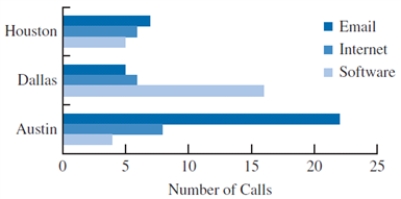 This chart allows the IT manager to
(Multiple Choice)
4.8/5 (38)
The charts that are helpful in making comparisons between categorical variables are
(Multiple Choice)
4.8/5 (39)
A survey on the average pass percentage achieved by four of the top-ranked colleges of a city for five different years was conducted to rate the quality of teaching in each of these colleges. Colleges Year 1 Year 2 Year 3 Year 4 Year 5 College 1 65 67 63 68 70 College 2 70 75 77 82 75 College 3 88 95 90 97 98 College 4 55 57 53 59 55
a. Construct a line chart for the time series data for years 1 through 5 showing the average pass percentage in each college. Show the time series for all four colleges on the same graph.
b. What does the line chart indicate about the average pass percentage of the colleges between years 1 through 5? Discuss.
c. Construct a clustered column chart showing average pass percentage in each college using the years 1 through 5 data. Represent the years along the horizontal axis, and cluster the average pass percentages for the four colleges in each year. Which college is leading in each year?
(Essay)
4.7/5 (31)
To summarize and analyze data with both a crosstabulation and charting, Excel typically pairs
(Multiple Choice)
4.8/5 (32)
A ______________ is useful for visualizing hierarchical data along multiple dimensions.
(Multiple Choice)
4.9/5 (39)
A line chart that has no axes but is used to provide information on overall trends for time series data is called a
(Multiple Choice)
4.9/5 (38)
The data on the ranks assigned to a random sample of students in a competitive exam based on scores and three different veteran statuses are given below. Name Score Rank Status Steve 80 1 DV Joshua 75 2 DV John 95 3 V Alex 90 4 V Jeff 85 5 V Matt 80 6 NV Chris 75 7 NV
a. Create a parallel-coordinates plot using XLMiner for these data. Include vertical axes for the name, score, and rank. Color the lines by the type of status.
b. According to the parallel-coordinates plot, how are disabled veterans differentiated from veterans?
(Essay)
4.7/5 (34)
The income levels vary by race and educational attainment. To examine this inequality in the income, data have been collected for seven different years on the median income earned by an individual based on the race and education.
a. Sort the PivotTable data to display the years with the smallest sum of median income on top and the largest on the bottom. Which year had the smallest sum of median income? What is the total income in the year with the smallest sum of median income?
b. Add the Racial Demographic to the Row Labels in the PivotTable. Sort the Racial Demographic by Sum of Median Income with the lowest values on top and the highest values on bottom. Filter the Row Labels so that only the year 2003 is displayed. Which Racial demography had the smallest sum of median income in the year 2003? Which Racial demography had the largest sum of median income in the year 2003?
(Essay)
4.8/5 (21)
Filters
- Essay(0)
- Multiple Choice(0)
- Short Answer(0)
- True False(0)
- Matching(0)