Exam 3: Data Visualization
Exam 1: Introduction49 Questions
Exam 2: Descriptive Statistics84 Questions
Exam 3: Data Visualization69 Questions
Exam 4: Descriptive Data Mining56 Questions
Exam 5: Probability: an Introduction to Modeling Uncertainty62 Questions
Exam 6: Statistical Inference62 Questions
Exam 7: Linear Regression71 Questions
Exam 8: Time Series Analysis and Forecasting58 Questions
Exam 9: Predictive Data Mining40 Questions
Exam 10: Spreadsheet Models64 Questions
Exam 11: Linear Optimization Models58 Questions
Exam 12: Integer Linear Optimization Models56 Questions
Exam 13: Nonlinear Optimization Models55 Questions
Exam 14: Monte Carlo Simulation59 Questions
Exam 15: Decision Analysis58 Questions
Select questions type
DJ needs to display data over time. Which of the following charts should he use?
(Multiple Choice)
4.8/5  (28)
(28)
This Excel bar chart displays the demographics of a Business Analysis class. Approximately how many students are in the class? 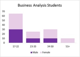
(Multiple Choice)
4.7/5 (32)
The data on the distance walked per week by 20 people of different age groups are given in the table below. Age Distance walked/week 18 25 20 22 21 20 25 23 26 18 29 15 38 19 34 16 42 14 23 21 32 24 45 13 50 11 53 9 44 10 19 28 28 26 35 17 49 12 27 27
a. Create a scatter chart for these 20 observations.
b. Fit a linear trendline to the 20 observations. What can you say about the relationship between the two quantitative variables?
(Essay)
4.9/5 (32)
A consumer electronics company, after three months of the launch of five new products in the market, arrived at the following results.
a. Create a bubble chart where the market share is along the horizontal axis, the profit is on the vertical axis, and the size of the bubbles represents the cost. Format this chart for best presentation by adding axes labels and labelling each bubble with the product name.
b. The manager of the company is interested in producing the product that increases the profit for a given level of market share and cost. From the bubble chart in part a, identify the product which needs to be produced in larger quantity.
c. From the bubble chart in part (a), now identify the product which needs to be produced in larger quantity taking into account its market share, cost, increase in profit.
(Essay)
4.9/5 (40)
The project lead in an MNC decides to assign every member of his team to a new project and monitors their performance on a customized scale of scores. The data on their performance over a period of six months are shown below
a. Create a heat map in Excel that shades the cells with negative performance scores. Use Excel's Conditional Formatting function to create this heat map.
b. For each month, identify the team members who scored negative. Which month has the highest negative performance scores?
(Essay)
4.8/5 (34)
DJ needs to display data over time. Which of the following charts should DJ use?
(Multiple Choice)
4.9/5 (31)
Filters
- Essay(0)
- Multiple Choice(0)
- Short Answer(0)
- True False(0)
- Matching(0)