Exam 2: Summarizing and Graphing Data
Exam 1: Introduction to Statistics106 Questions
Exam 2: Summarizing and Graphing Data85 Questions
Exam 3: Statistics for Describing, Exploring, and Comparing Data187 Questions
Exam 4: Probability186 Questions
Exam 5: Discrete Probability Distributions155 Questions
Exam 6: Normal Probability Distributions227 Questions
Exam 7: Estimates and Sample Size141 Questions
Exam 8: Hypothesis Testing139 Questions
Exam 9: Inferences From Two Samples133 Questions
Exam 10: Correlation and Regression104 Questions
Exam 11: Chi-Square and Analysis of Variance65 Questions
Select questions type
The normal monthly precipitation (in inches) for August is listed for 39 different U.S. cities. Construct an expanded stemplot with about 9 rows. 3.5 1.6 2.4 3.7 4.1 3.9 1.0 3.6 1.7 0.4 3.2 4.2 4.1 4.2 3.4 3.7 2.2 1.5 4.2 3.4 2.7 4.0 2.0 0.8 3.6 3.7 0.4 3.7 2.0 3.6 3.8 1.2 4.0 3.1 0.5 3.9 0.1 3.5 3.4
(Multiple Choice)
4.9/5  (34)
(34)
A manufacturer records the number of errors each work station makes during the week. The data are as follows.
6 3 2 3 5 2 0 2 5 4 2 0 1
(Multiple Choice)
4.8/5 (34)
Using a strict interpretation of the relevant criteria characterizing a normal
distribution,does the frequency distribution below appear to have a normal distribution?
Does the distribution appear to be normal if the criteria are interpreted very loosely? Closing Share Price Frequency 0-5 2 6-10 5 11-15 15 16-20 27
(Essay)
4.7/5 (37)
Suppose that you construct a histogram and a relative frequency histogram corresponding to a particular frequency table. In what ways will the two histograms be similar? In what ways will they differ?
(Essay)
4.9/5 (39)
Construct the cumulative frequency distribution that corresponds to the given frequency distribution.
- Weight (oz) Number of Stones 1.2-1.6 5 1.7-2.1 2 2.2-2.6 5 2.7-3.1 5 3.2-3.6 13
(Multiple Choice)
4.8/5 (29)
Suppose that a histogram is constructed for the frequency distribution shown below: Age Frequency 30-39 11 40-49 23 50-59 17 60-69 12 70-89 6 The class 60-69 has twice the frequency of the class 70-89. In the histogram, will the area of the bar for the class 60-69 be twice the area of the bar for the class 70-89? In other words, will areas be proportional to frequencies in this histogram? Explain your thinking. Are there any conditions under which areas are proportional to frequencies in histograms?
(Essay)
4.7/5 (38)
The frequency table below shows the amount of weight loss during the first month of a diet program for a group of men. Constructing a frequency polygon. Applying a loose interpretation of the requirements for a normal distribution, do the pounds of weight loss appear to be normally distributed?
Why or why not? Weight (lb) Frequency 5-7 2 8-10 9 11-13 18 14-16 13 17-19 4 20-22 1 
(Essay)
4.9/5 (39)
The following data show the number of laps run by each participant in a marathon. 46 65 55 43 51 48 57 30 43 49 32 56
(Multiple Choice)
4.9/5 (27)
The following data represent the number of cars passing through a toll booth during a certain time period over a number of days.
38 39 37 37 44 38 41 38 39 35 42 39 43 37 41
(Multiple Choice)
4.9/5 (33)
The following histogram shows average SO2 (sulfur dioxide) boiler emission rates from selected utility companies. The data was collected from a voluntary response sample of utility companies. Does the distribution depicted in the histogram reflect the true distribution of the population? Why or why not? 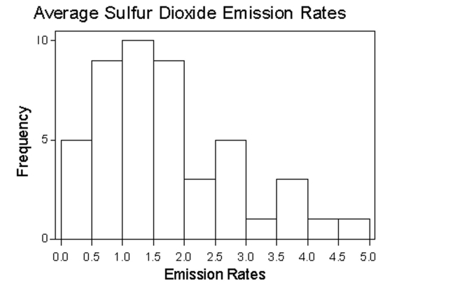
(Essay)
4.9/5 (33)
Histograms and Pareto charts are both bar charts. What is the significant difference between the two?
(Essay)
4.9/5 (36)
The attendance counts for this season's basketball games are listed below. 227 239 215 219 221 233 229 233 235 228 245 231
(Multiple Choice)
4.9/5 (42)
Use the high closing values of Naristar Inc. stock from the years to construct a time-series graph. (Let represent 1990 and so on.) Identify a trend.
Year High Year High 1990 42 1996 47 1991 40 1997 60 1992 31 1998 61 1993 42 1999 57 1994 44 2000 54 1995 47 2001 30
(Essay)
4.7/5 (29)
Construct one table that includes relative frequencies based on the two frequency distributions below. Do those weights appear to be about the same or are they substantially different.? Round to the nearest tenth of a percent if necessary. Weight (lb) of Discarded Metal Frequency 0.00-0.99 6 1.00-1.99 20 2.00-2.99 12 3.00-3.99 9 4.00-4.99 6 Weight (lb) of Discarded Plastic Frequency 0.00-0.99 11 1.00-1.99 16 2.00-2.99 15 3.00-3.99 6 4.00-4.99 4 5.00-5.99 1
(Essay)
4.8/5 (27)
Use the given data to construct a frequency distribution.
-A medical research team studied the ages of patients who had strokes caused by stress. The ages of 34 patients who suffered stress strokes were as follows.
29 30 36 41 45 50 57 61 28 50 36 58 60 38 36 47 40 32 58 46 61 40 55 32 61 56 45 46 62 36 38 40 50 27
Construct a frequency distribution for these ages. Use 8 classes beginning with a lower class limit of 25.
Age Frequency
(Essay)
4.7/5 (42)
Construct the cumulative frequency distribution that corresponds to the given frequency distribution.
- Height (inches) Frequency 69.0-71.9 18 72.0-74.9 22 75.0-77.9 20 78.0-80.9 16 81.0-83.9 4
(Multiple Choice)
4.8/5 (46)
An airline checked 7 of its flights into a regional airport and found that 1 was early, 4 were on time, and 2 were late. Why does it not make sense to construct a histogram for this data set?
(Essay)
4.8/5 (40)
Construct a pie chart representing the given data set.
-After reviewing a movie, 700 people rated the movie as excellent, good, or fair. The following data give the rating distribution.
Excellent Good Fair 140 350 210
(Multiple Choice)
4.9/5 (36)
A medical research team studied the ages of 34 patients who had strokes caused by stress.
The frequency distribution below summarizes the results. When trying to understand the stroke data, what would be the advantage of looking at a histogram instead of this frequency distribution?
Age Frequency 25-29 3 30-34 3 35-39 6 40-44 4 45-49 5 50-54 3 55-59 5 60-64 5
(Essay)
4.7/5 (33)
Consider the frequency distribution below, which has single values as classes:
Value Frequency 10 1 11 3 12 7 13 18 14 10 15 4 16 2 17 7 18 16 19 10 20 6 21 2
Describe the distribution of the data. Use this frequency distribution to create two new frequency distributions for the data, one with four classes of equal width and one with six classes of equal width. Does the frequency distribution with four classes capture the distribution of the data? Does the frequency distribution with six classes capture the distribution of the data? Explain your thinking.
(Essay)
4.8/5 (39)
Filters
- Essay(0)
- Multiple Choice(0)
- Short Answer(0)
- True False(0)
- Matching(0)