Exam 2: Charts and Graphs
Exam 1: Introduction to Statistics130 Questions
Exam 2: Charts and Graphs94 Questions
Exam 3: Descriptive Statistics105 Questions
Exam 4: Probability122 Questions
Exam 5: Discrete Distributions75 Questions
Exam 6: Continuous Distributions107 Questions
Exam 7: Sampling and Sampling Distributions101 Questions
Exam 8: Statistical Inference: Estimation for Single Populations75 Questions
Exam 9: Statistical Inference: Hypothesis Testing for Single Populations73 Questions
Exam 10: Statistical Inferences About Two Populations73 Questions
Exam 11: Analysis of Variance and Design of Experiments75 Questions
Exam 12: Simple Regression Analysis and Correlation75 Questions
Exam 13: Multiple Regression Analysis75 Questions
Exam 14: Building Multiple Regression Models75 Questions
Exam 15: Time-Series Forecasting and Index Numbers74 Questions
Exam 16: Analysis of Categorical Data74 Questions
Exam 17: Nonparametric Statistics79 Questions
Exam 18: Statistical Quality Control75 Questions
Exam 19: Decision Analysis77 Questions
Select questions type
A cumulative frequency distribution provides a running total of the frequencies in the classes.
(True/False)
4.8/5  (30)
(30)
To show hourly sales throughout a day, a ________ chart would be most effective, and a _________ chart would be more effective at showing what products were sold during that day.
(Multiple Choice)
4.9/5 (38)
An instructor has decided to graphically represent the grades on a test.The instructor uses a plus/minus grading system (i.e., she gives grades of A-, B+, etc.).Which of the following would provide the most information for the students?
(Multiple Choice)
4.8/5 (45)
The 2019 and 2020 market share data of the three competitors (A, B, and C)in an oligopolistic industry are presented in the following pie charts.Total sales for this industry were $1.5 billion in 2019 and $1.8 billion in 2020.Company C's sales in 2020 were ___. 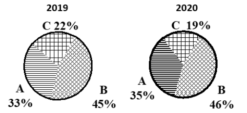
(Multiple Choice)
4.8/5 (35)
Consider the following stem and leaf plot: Stem Leaf
1 0, 2, 5, 7
2 2, 3, 4, 8
3 0, 4, 6, 6, 9
4 5, 8, 8, 9
5 2, 7, 8
Suppose that a frequency distribution was developed from this, and there were 5 classes (10-under 20, 20-under 30, etc.).What was the highest number in the data set?
(Multiple Choice)
4.7/5 (27)
A Pareto chart and a pie chart are both types of qualitative graphs.
(True/False)
4.9/5 (28)
If the individual class frequency is divided by the total frequency, the result is the median frequency.
(True/False)
4.9/5 (37)
A shirt production company has tracked their production since the company started in 1999.The graph of their annual production is shown. 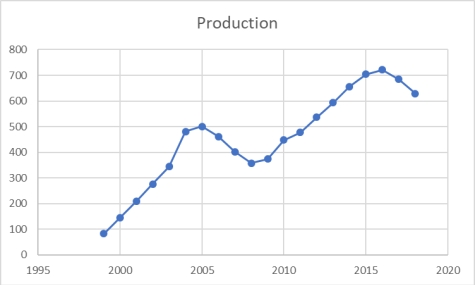 After 2005, in what year did production recover and surpass the production level of 2005?
(Multiple Choice)
4.9/5 (39)
Pinky Bauer, Chief Financial Officer of Harrison Haulers, Inc., suspects irregularities in the payroll system, and orders an inspection of "each and every payroll voucher issued since January 1, 2000." Each payroll voucher was inspected and the following frequency distribution was compiled. Errors per Voucher Number of Vouchers
0-under 2 500
2-under 4 400
4-under 6 300
6-under 8 200
8-under 10 100
The relative frequency of the first class interval is ___.
(Multiple Choice)
4.8/5 (36)
The point of "cleaning" time-series data is to be sure all the data are accurate.
(True/False)
4.9/5 (34)
The staff of Mr.Wayne Wertz, VP of Operations at Portland Peoples Bank, prepared a cumulative frequency ogive of waiting time for walk-in customers. 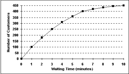 The percentage of walk-in customers waiting one minute or less was ___.
(Multiple Choice)
4.8/5 (36)
Consider the following stem and leaf plot: Stem Leaf
1 0, 2, 5, 7
2 2, 3, 4, 4
3 0, 4, 6, 6, 9
4 5, 8, 8, 9
5 2, 7, 8
Suppose that a frequency distribution was developed from this, and there were 5 classes (10-under 20, 20-under 30, etc.).What would the frequency be for class 30-under 40?
(Multiple Choice)
4.8/5 (32)
Visualization of time-series data is considered descriptive business analytics.
(True/False)
4.8/5 (36)
Each day, the office staff at Oasis Quick Shop prepares a frequency distribution and an ogive of sales transactions by dollar value of the transactions.Saturday's cumulative frequency ogive follows: 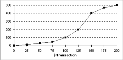 The percentage of sales transactions on Saturday that were at least $100 each was ___.
(Multiple Choice)
4.7/5 (32)
Consider the following frequency distribution: Class Interval Frequency
100-under 200 25
200-under 300 45
300-under 400 30
What is the relative frequency of the second class interval?
(Multiple Choice)
4.8/5 (37)
For any given data set, a frequency distribution with a larger number of classes will always be better than the one with a smaller number of classes.
(True/False)
4.9/5 (40)
A graphical representation of a frequency distribution is called a pie chart.
(True/False)
4.8/5 (29)
The following time-series data shows the average number of vacation days taken each year by employees. 2010 22
2011 25
2012 26
2013 29
2014 24
2015 21
2016 22
2017 20
2018 19
The most effective visualization of these data would be:
(Multiple Choice)
4.8/5 (30)
A person has decided to construct a frequency distribution for a set of data containing 60 numbers.The lowest number is 23 and the highest number is 68.If 7 classes are used, the class width should be approximately ___.
(Multiple Choice)
4.7/5 (35)
When looking at a scatter plot, if a trend can be discerned between changes in one variable that appear to be related to changes in the other variable, there is likely a relationship between the two variables.
(True/False)
4.9/5 (30)
Filters
- Essay(0)
- Multiple Choice(0)
- Short Answer(0)
- True False(0)
- Matching(0)