Exam 16: Inserting and Formatting Charts
Exam 1: Introduction to Computers and the Internet74 Questions
Exam 2: Computer Hardware78 Questions
Exam 3: Computer Software75 Questions
Exam 4: Computer Networks75 Questions
Exam 5: The Internet and Email75 Questions
Exam 6: Security and Privacy74 Questions
Exam 7: Exploring Windows 10 and Managing Files82 Questions
Exam 8: Using Edge Mail and People74 Questions
Exam 9: Introducing Microsoft Office 201674 Questions
Exam 10: Creating a Document74 Questions
Exam 11: Formatting a Long Document74 Questions
Exam 12: Enhancing a Document74 Questions
Exam 13: Creating a Workbook74 Questions
Exam 14: Working With Formulas and Functions77 Questions
Exam 15: Creating an Advanced Workbook74 Questions
Exam 16: Inserting and Formatting Charts74 Questions
Exam 17: Creating a Database74 Questions
Exam 18: Maintaining and Querying a Database74 Questions
Exam 19: Creating Forms and Reports74 Questions
Exam 20: Creating Apresentation76 Questions
Exam 21: Enhancing a Presentation74 Questions
Exam 22: Integrating Word, Excel, Access and Powerpoint74 Questions
Select questions type
In Microsoft Excel, a(n) _________ is a page in a workbook that contains only a graph and no worksheet cells.
A)optical mark recognition sheet
B)perspex sheet
C)data sheet
D)chart sheet
Free
(Short Answer)
4.9/5  (45)
(45)
Correct Answer: Verified
chart sheet
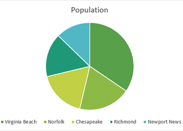
Han, a realtor, wants to create a chart representing the price variation of land in three different states across the period 2011-2015. For this, she has to present three data series in a single chart. In this scenario, which of the following types of charts would be most suitable for Han's purpose?
Free
(Multiple Choice)
4.8/5 (36)
Correct Answer:Verified
B
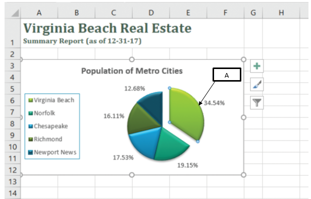
In the accompanying image of Microsoft Excel 2016, box "A" points to the _____.
Free
(Multiple Choice)
4.8/5 (42)
Correct Answer:Verified
B
Case 16-2 Since extensive data in the form of numbers can be difficult to assimilate, such data are better represented as charts. There are several types of charts available in Microsoft Excel. Choosing the right chart type to represent a data source is important to effectively illustrate a data. A chart type should be chosen based on the number of data series, range of data series values, type of data series etc.
Natalia, a weather reporter, wants to plot a graph using the rainfall data in the past 20 years in a particular state. She intends to present the graph in a single cell to identify the maximum and minimum rainfall. In this scenario, Natalia should use a _____ to represent her data.
(Multiple Choice)
4.8/5 (37)
Which of the following is a difference between column charts and pie charts?
(Multiple Choice)
4.9/5 (39)
In the accompanying image of Microsoft Excel 2016, box "A" points to a(n) _____.
(Multiple Choice)
4.9/5 (42)
Volya, a Human Resource manager, creates a pie chart in Excel representing the productivity of each team in her company in the last quarter. The team that achieved maximum productivity should standout from the rest of the teams. In this case, Volya should _____ to emphasize the team that has achieved maximum productivity.
(Multiple Choice)
4.8/5 (38)
Priya, a financial analyst, intends to graphically represent the household income of people in five cities over the past 10 years. The data that she presents in a chart is not relative to the whole household income. In this case, which of the following types of charts is most suited for Priya to illustrate the data series in a chart?
(Multiple Choice)
4.7/5 (36)
Which of the following is true of a plot area in the chart?
(Multiple Choice)
4.8/5 (35)
Column and bar charts differ from pie charts in that bar charts:
(Multiple Choice)
5.0/5 (41)
In Microsoft Excel Charts, _________ are individual parts of a chart such as the chart area, the chart title, the plot area, data markers, and a legend.
A)chart sectors
B)chart elements
C)chart metrics
D)chart plotters
(Short Answer)
4.9/5 (44)
Which of the following is a method to move a chart from one worksheet to another in a Microsoft Excel workbook?
(Multiple Choice)
4.9/5 (41)
Changing a value in a data source after creating a chart does not reflect on the existing chart.
(True/False)
4.7/5 (44)
What is a sparkline? Explain how a sparkline can be inserted and its use.
(Essay)
4.8/5 (36)
Karlo, an environmentalist, collects data on the endangered species and their declining numbers. He presents this data in the form of a bar graph on an Excel sheet. Since this graph needs to be presented to a large audience, Karlo decides to enhance the graph by changing the colors of the bars. In this scenario, Karlo should click the _____ in the Excel sheet.
(Multiple Choice)
4.8/5 (41)
Sparklines can be inserted anywhere within the workbook and can represent data from several rows or columns.
(True/False)
4.9/5 (35)
The _________ button next to the selected chart displays a list of the data series and category values used in the chart .
A)Chart Elements
B)Chart Styles
C)Chart Filters
D)Chart Layouts
(Short Answer)
4.8/5 (43)
A combination chart can combine only two chart types in a single graph.
(True/False)
4.8/5 (35)
Filters
- Essay(0)
- Multiple Choice(0)
- Short Answer(0)
- True False(0)
- Matching(0)