Exam 16: Inserting and Formatting Charts
Exam 1: Introduction to Computers and the Internet74 Questions
Exam 2: Computer Hardware78 Questions
Exam 3: Computer Software75 Questions
Exam 4: Computer Networks75 Questions
Exam 5: The Internet and Email75 Questions
Exam 6: Security and Privacy74 Questions
Exam 7: Exploring Windows 10 and Managing Files82 Questions
Exam 8: Using Edge Mail and People74 Questions
Exam 9: Introducing Microsoft Office 201674 Questions
Exam 10: Creating a Document74 Questions
Exam 11: Formatting a Long Document74 Questions
Exam 12: Enhancing a Document74 Questions
Exam 13: Creating a Workbook74 Questions
Exam 14: Working With Formulas and Functions77 Questions
Exam 15: Creating an Advanced Workbook74 Questions
Exam 16: Inserting and Formatting Charts74 Questions
Exam 17: Creating a Database74 Questions
Exam 18: Maintaining and Querying a Database74 Questions
Exam 19: Creating Forms and Reports74 Questions
Exam 20: Creating Apresentation76 Questions
Exam 21: Enhancing a Presentation74 Questions
Exam 22: Integrating Word, Excel, Access and Powerpoint74 Questions
Select questions type
Bernard, the Chief Executive Officer (CEO) of Where We Go Travels, intends to create a graph representing the growth of his company. After creating the graph, Bernard decides to change the descriptive label of a chart. In this scenario, which of the following chart elements does Bernard want to change?
(Multiple Choice)
4.7/5  (38)
(38)
In a Microsoft Excel worksheet, a(n) _________ is a chart that is an object in a worksheet.
A)place value chart
B)embedded chart
C)album chart
D)size chart
(Short Answer)
4.9/5 (32)
Case 16-2 Since extensive data in the form of numbers can be difficult to assimilate, such data are better represented as charts. There are several types of charts available in Microsoft Excel. Choosing the right chart type to represent a data source is important to effectively illustrate a data. A chart type should be chosen based on the number of data series, range of data series values, type of data series etc.
Benjamin, a nuclear physicist, needs to represent electron decay at five time intervals for ten different elements. Benjamin thus has five data series for ten category values. In this scenario, Benjamin can use a _____ to represent the data.
(Multiple Choice)
4.7/5 (37)
A bar chart is a column chart turned on its side so that the length of each bar is based on its value.
(True/False)
4.8/5 (30)
Which of the following is a true statement about charts in Excel?
(Multiple Choice)
4.8/5 (43)
In Microsoft Excel charts, which of the following is a function of leader lines?
(Multiple Choice)
4.8/5 (36)
Wayne, a senior software engineer, creates a chart using Microsoft Excel that represents the number of projects and types of projects undertaken by a team in the past five years. The chart presents the chart legend below the chart by default. Wayne wants to change the position of the chart legend to the left of the chart. In this scenario, Wayne should click the _____ to change the position of the legend.
(Multiple Choice)
4.8/5 (41)
Which of the following is a true statement about chart elements in Microsoft Excel?
(Multiple Choice)
4.9/5 (42)
Zelda, a mechanical engineer, creates a line graph to illustrate the productivity and quality improvement in her company. She intends to add a glowing effect to the line in the graph. In this scenario, Zelda should:
(Multiple Choice)
4.8/5 (38)
Case 16-2 Since extensive data in the form of numbers can be difficult to assimilate, such data are better represented as charts. There are several types of charts available in Microsoft Excel. Choosing the right chart type to represent a data source is important to effectively illustrate data. A chart type should be chosen based on the number of data series, range of data series values, type of data series etc.
John, a senior scientist, is involved in a population study. He needs to create a graph based on the data he has collected for the population study. John's data source consists of a single data series whose values should be represented as relative to the whole. In this scenario, John should use a _____ to illustrate his data.
(Multiple Choice)
4.9/5 (44)
If you select a chart's sequence, the formula displayed in the formula bar uses the _________ function.
A)SERIES
B)QUARTILE
C)LOOKUP
D)AREAS
(Short Answer)
5.0/5 (31)
The horizontal axis is the axis along the side of the chart that shows the range of values from all of the data series plotted on the chart.
(True/False)
4.9/5 (46)
Explain how to edit a chart data and add a data series to an existing chart.
(Essay)
4.8/5 (34)
Case 16-1 George, an environmental scientist, collects information on the types and amount of gases emitted by a cheese processing factory.
George enters the types of gases and the amount of gases emitted in two columns of an Excel sheet. Based on this data he creates a pie chart. In this case, the information typed out by George in the two columns of an Excel sheet is known as a _____.
(Multiple Choice)
4.9/5 (40)
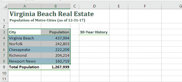
In the accompanying image of Microsoft Excel 2016, box "A" points to the _____.

(Multiple Choice)
4.8/5 (34)
Michael, the Chief Executive Officer (CEO) of a company, needs to create a graph representing the company's quarterly revenue between the years 2005 and 2015. The data Michael has follows a sequential order which he intends to represent in evenly spaced intervals. In this scenario, which of the following types of graph will be most appropriate for Michael to use?
(Multiple Choice)
4.7/5 (27)
In the accompanying image of Microsoft Excel 2016, the selected range of cells represents a _____.
(Multiple Choice)
4.9/5 (33)
Filters
- Essay(0)
- Multiple Choice(0)
- Short Answer(0)
- True False(0)
- Matching(0)