Exam 3: Data Visualization
Exam 1: Introduction30 Questions
Exam 2: Descriptive Statistics60 Questions
Exam 3: Data Visualization61 Questions
Exam 4: Linear Regression60 Questions
Exam 5: Time Series Analysis and Forecasting58 Questions
Exam 6: Data Mining60 Questions
Exam 7: Spreadsheet Models60 Questions
Exam 8: Linear Optimization Models60 Questions
Exam 9: Integer Linear Optimization Models60 Questions
Exam 10: Nonlinear Optimization Models60 Questions
Exam 11: Monte Carlo Simulation59 Questions
Exam 12: Decision Analysis60 Questions
Select questions type
To generate scatter chart matrix, we use
Free
(Multiple Choice)
4.8/5  (30)
(30)
Correct Answer: Verified
B
If the scatter chart indicates a positive linear relationship between two variables, then their correlation coefficient is
Free
(Multiple Choice)
4.8/5 (32)
Correct Answer:Verified
C
A survey on the average pass percentage achieved by 4 of the top-ranked colleges of a city for 5 different years was conducted to rate the quality of teaching in each of these colleges.
 a. Construct a line chart for the time series data for years 1 through 5 showing the average pass percentage in each college. Show the time series for all four colleges on the same graph.
b. What does the line chart indicate about the average pass percentage of the colleges between years 1 through 5? Discuss.
c. Construct a clustered column chart showing average pass percentage in each college using the years 1 through 5 data. Represent the years along the horizontal axis, and cluster the average pass percentages for the four colleges in each year. Which college is leading in each year?
a. Construct a line chart for the time series data for years 1 through 5 showing the average pass percentage in each college. Show the time series for all four colleges on the same graph.
b. What does the line chart indicate about the average pass percentage of the colleges between years 1 through 5? Discuss.
c. Construct a clustered column chart showing average pass percentage in each college using the years 1 through 5 data. Represent the years along the horizontal axis, and cluster the average pass percentages for the four colleges in each year. Which college is leading in each year?
Free
(Essay)
4.7/5 (40)
Correct Answer:Verified
a.
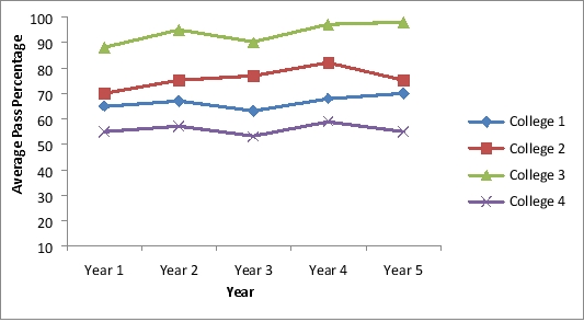
b. College 3 has the highest average pass percentage between years 1 through 5 followed by College 2, College 1, and College 4. This performance has been consistent throughout the 5 years.
c.
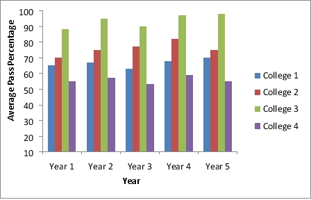 We observe that, College 3 is leading in each year consistently.
The owner of the grocery store is interested in providing a better service to his customers with respect to the wait time at the billing counter. The data on 20 waiting customers are given below:
 a. Use XLMiner to create a scatter chart matrix for these data. Include the variables wait time, purchase amount, customer age, and credit score.
b. What can you infer about the relationships between these variables from the scatter chart matrix?
a. Use XLMiner to create a scatter chart matrix for these data. Include the variables wait time, purchase amount, customer age, and credit score.
b. What can you infer about the relationships between these variables from the scatter chart matrix?
(Essay)
4.9/5 (37)
To avoid problems in interpreting the differences in color, _____ can be added.
(Multiple Choice)
4.8/5 (37)
A research was conducted on a sample of 1000 males and 1000 females to study the kind of movie most men and women prefer to watch. The results are shown in the table below:
 a. Construct a clustered column chart with the type of movie as the horizontal variable.
b. What can we infer from the clustered bar chart in part a?
a. Construct a clustered column chart with the type of movie as the horizontal variable.
b. What can we infer from the clustered bar chart in part a?
(Essay)
4.8/5 (26)
A _____ is useful for visualizing hierarchical data along multiple dimensions.
(Multiple Choice)
4.9/5 (39)
The following table is an example on the profit made by Hydro America, a water servicing company, for 5 different years.
 Reformat the table to improve readability and to help the manager identify the year with the highest profit.
(Essay)
4.8/5 (31)
Consider the below data on 30 different investments and their maturity values after 15 years.
 a. Prepare a scatter diagram to show the relationship between the variables Investment and Future value. Comment on any relationship between the variables.
b. Create a trendline for the relationship between Investment and Future value.
What does the trendline indicate about this relationship?
a. Prepare a scatter diagram to show the relationship between the variables Investment and Future value. Comment on any relationship between the variables.
b. Create a trendline for the relationship between Investment and Future value.
What does the trendline indicate about this relationship?
(Essay)
4.8/5 (28)
A line chart that has no axes but is used to provide information on overall trends for time series data is called a
(Multiple Choice)
4.7/5 (37)
_____ helps in designing effective tables and charts for data visualization.
(Multiple Choice)
4.8/5 (41)
An alternative for a stacked column chart when comparing more than a couple of quantitative variables in each category is a
(Multiple Choice)
4.8/5 (32)
The software package most commonly used for creating simple charts is
(Multiple Choice)
4.8/5 (28)
The data dashboard for a marketing manager may have KPIs related to
(Multiple Choice)
4.8/5 (31)
Filters
- Essay(0)
- Multiple Choice(0)
- Short Answer(0)
- True False(0)
- Matching(0)