Exam 3: Data Visualization
Exam 1: Introduction30 Questions
Exam 2: Descriptive Statistics60 Questions
Exam 3: Data Visualization61 Questions
Exam 4: Linear Regression60 Questions
Exam 5: Time Series Analysis and Forecasting58 Questions
Exam 6: Data Mining60 Questions
Exam 7: Spreadsheet Models60 Questions
Exam 8: Linear Optimization Models60 Questions
Exam 9: Integer Linear Optimization Models60 Questions
Exam 10: Nonlinear Optimization Models60 Questions
Exam 11: Monte Carlo Simulation59 Questions
Exam 12: Decision Analysis60 Questions
Select questions type
A _____ is used for examining data with more than two variables and it includes a different vertical axis for each variable.
(Multiple Choice)
5.0/5  (37)
(37)
Consider the below table and the line chart on the temperatures in 11 different states of the United States:

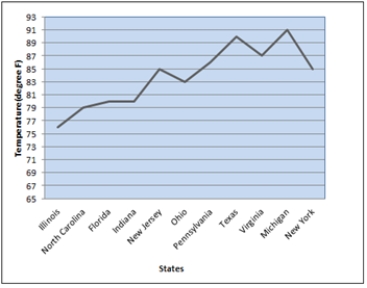 a. What are the problems with the layout and display of this line chart?
b. Create a new line chart for the given data. Format the chart to make it easy to read and interpret.
a. What are the problems with the layout and display of this line chart?
b. Create a new line chart for the given data. Format the chart to make it easy to read and interpret.
(Essay)
4.8/5 (31)
The data on the distance walked per week by 20 people of different age groups are given in the table below:
 a. Create a scatter chart for these 20 observations.
b. Fit a linear trendline to the 20 observations. What can you say about the relationship between the two quantitative variables?
a. Create a scatter chart for these 20 observations.
b. Fit a linear trendline to the 20 observations. What can you say about the relationship between the two quantitative variables?
(Essay)
4.9/5 (43)
A consumer electronics company, after three months of the launch of 5 new products in the market, arrived at the following results:
 a. Create a bubble chart where the market share is along the horizontal axis, the profit is on the vertical axis, and the size of the bubbles represents the cost. Format this chart for best presentation by adding axes labels and labelling each bubble with the product name.
b. The manager of the company is interested in producing the product that increases the profit for a given level of market share and cost. From the bubble chart in part a, identify the product which needs to be produced in larger quantity.
c. From the bubble chart in part a, now identify the product which needs to be produced in larger quantity taking into account both its market share and cost and that can increase the profit.
a. Create a bubble chart where the market share is along the horizontal axis, the profit is on the vertical axis, and the size of the bubbles represents the cost. Format this chart for best presentation by adding axes labels and labelling each bubble with the product name.
b. The manager of the company is interested in producing the product that increases the profit for a given level of market share and cost. From the bubble chart in part a, identify the product which needs to be produced in larger quantity.
c. From the bubble chart in part a, now identify the product which needs to be produced in larger quantity taking into account both its market share and cost and that can increase the profit.
(Essay)
4.7/5 (38)
A summary on commodities below lists the change in price on a particular day for each commodity belonging to 3 categories - Base Metals, Precious Metals, and Agricultural & Cattle Futures.
 a. Prepare a PivotTable that gives the frequency count of the data by Commodity Type (rows) and the Change (columns). Use classes of -0.25-(-0.15), -0.15-(-0.05), -0.05-0.05, 0.05-0.15, and 0.25-0.35 for the Change (%).
b. What conclusions can you draw about the commodity type and the change (%) in price for that particular day?
a. Prepare a PivotTable that gives the frequency count of the data by Commodity Type (rows) and the Change (columns). Use classes of -0.25-(-0.15), -0.15-(-0.05), -0.05-0.05, 0.05-0.15, and 0.25-0.35 for the Change (%).
b. What conclusions can you draw about the commodity type and the change (%) in price for that particular day?
(Essay)
4.7/5 (32)
In a business, the values indicating the business's current operating characteristics, such as its financial position, the inventory on hand, customer service metrics, are typically known as
(Multiple Choice)
4.7/5 (27)
A local search service company surveys on the number of service centres available in 3 major cities for different brands of automobiles with an objective to improve the services to its customers. The data on the 20 automobile brands and the number of service centres are given below:
 a. How many automobile brands have centres between 20 and 29 in these 3 cities?
b. How many automobile brands have more than 40 centres in these cities?
a. How many automobile brands have centres between 20 and 29 in these 3 cities?
b. How many automobile brands have more than 40 centres in these cities?
(Essay)
4.8/5 (33)
The project lead in an MNC decides to assign every member of his team to a new project and monitors their performance on a customized scale of scores. The data on their performance over a period of six months are shown below:
 a. Create a heat map in Excel that shades the cells with negative performance scores. Use Excel's Conditional Formatting function to create this heat map.
b. For each month, identify the team member who scored negative? Which month has the highest negative performance scores?
a. Create a heat map in Excel that shades the cells with negative performance scores. Use Excel's Conditional Formatting function to create this heat map.
b. For each month, identify the team member who scored negative? Which month has the highest negative performance scores?
(Essay)
4.8/5 (26)
Making visual comparisons between categorical variables is difficult in a
(Multiple Choice)
4.7/5 (35)
A two-dimensional graph representing the data using different shades of color to indicate magnitude is called a ______.
(Multiple Choice)
4.7/5 (38)
A chart that is recommended as an alternative to a pie chart is a
(Multiple Choice)
4.8/5 (40)
Growth is the primary focus for all companies. A factor that acts as a key term while analysing the growth of a company is the number of resources/ employees working for the company over a period of time. One such study about a start-up company's growth, in terms of the increase in the number of employees per month in a span of 2 years is shown below:
 a. Create a line chart for these time series data. What interpretations can you make about the increase in the number of employees over these 24 months?
b. Fit a linear trendline to the data. What does the trendline indicate about the increase in the number of employees over these 24 months?
a. Create a line chart for these time series data. What interpretations can you make about the increase in the number of employees over these 24 months?
b. Fit a linear trendline to the data. What does the trendline indicate about the increase in the number of employees over these 24 months?
(Essay)
4.8/5 (37)
Deleting the grid lines in the table and the horizontal lines in the chart
(Multiple Choice)
4.8/5 (35)
The regional manager of a company wishes to determine the time spent at each division in the car production process. A study was undertaken over a month that resulted in the following data related to the percentage of time spent at three divisions - Car body construction, Paint shop, and Assembly, at four locations of production plants.
 a. Create a stacked bar chart with production plants along the vertical axis. Reformat the bar chart to best display these data by adding required labels and chart title.
b. Create a clustered bar chart with production plants along the vertical axis and clusters of divisions. Reformat the bar chart to best display these data by adding required labels and chart title.
c. Create multiple bar charts where each production plant becomes a single bar chart showing the percentage of time spent at the divisions. Reformat the bar charts to best display these data by adding required labels and chart title.
d. Which form of bar chart (stacked, clustered, or multiple) is preferable for these data? Why?
a. Create a stacked bar chart with production plants along the vertical axis. Reformat the bar chart to best display these data by adding required labels and chart title.
b. Create a clustered bar chart with production plants along the vertical axis and clusters of divisions. Reformat the bar chart to best display these data by adding required labels and chart title.
c. Create multiple bar charts where each production plant becomes a single bar chart showing the percentage of time spent at the divisions. Reformat the bar charts to best display these data by adding required labels and chart title.
d. Which form of bar chart (stacked, clustered, or multiple) is preferable for these data? Why?
(Essay)
4.8/5 (29)
The data on the ranks assigned to a random sample of students in a competitive exam based on scores and three different statuses are given below:
 a. Create a parallel coordinates plot using XLMiner for these data. Include vertical axes for the name, score, and rank. Color the lines by the type of status.
b. According to the parallel coordinates plot, how are disable veterans differentiated from veterans?
a. Create a parallel coordinates plot using XLMiner for these data. Include vertical axes for the name, score, and rank. Color the lines by the type of status.
b. According to the parallel coordinates plot, how are disable veterans differentiated from veterans?
(Essay)
4.8/5 (37)
To summarize and analyze data with both a crosstabulation and charting, Excel typically pairs
(Multiple Choice)
4.8/5 (33)
The following table shows the average monthly distance travelled (in Billion Miles) by vehicles on urban highways for five different years.
 a. Use Excel to create sparklines for the average monthly vehicle distance travelled each year.
b. Which year has decreasing trend of the average distance travelled? Which year has increasing trend of the average distance travelled?
c. Use Excel to create a heat map for the average distance travelled by vehicles. Do you find the heat map or the sparklines to be better at communicating the trend of the average vehicle distance travelled over different years? Why?
a. Use Excel to create sparklines for the average monthly vehicle distance travelled each year.
b. Which year has decreasing trend of the average distance travelled? Which year has increasing trend of the average distance travelled?
c. Use Excel to create a heat map for the average distance travelled by vehicles. Do you find the heat map or the sparklines to be better at communicating the trend of the average vehicle distance travelled over different years? Why?
(Essay)
4.9/5 (36)
Filters
- Essay(0)
- Multiple Choice(0)
- Short Answer(0)
- True False(0)
- Matching(0)