Exam 3: Data Visualization
Exam 1: Introduction30 Questions
Exam 2: Descriptive Statistics60 Questions
Exam 3: Data Visualization61 Questions
Exam 4: Linear Regression60 Questions
Exam 5: Time Series Analysis and Forecasting58 Questions
Exam 6: Data Mining60 Questions
Exam 7: Spreadsheet Models60 Questions
Exam 8: Linear Optimization Models60 Questions
Exam 9: Integer Linear Optimization Models60 Questions
Exam 10: Nonlinear Optimization Models60 Questions
Exam 11: Monte Carlo Simulation59 Questions
Exam 12: Decision Analysis60 Questions
Select questions type
Consider the clustered bar chart of the dashboard developed to monitor the performance of a call center: 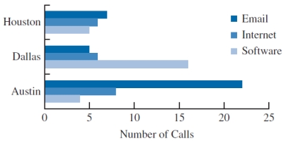 This chart allows the IT manager to
(Multiple Choice)
4.8/5  (32)
(32)
A _____ is a graphical presentation of the relationship between two quantitative variables.
(Multiple Choice)
4.8/5 (32)
Consider the following survey results regarding marital status by age:
 a. Construct a stacked column chart to display the survey data on marital status. Use Age Category as the variable on the horizontal axis.
b. Construct a clustered column chart to display the survey data. Use Age Category as the variable on the horizontal axis.
c. What can you infer about the relationship between age and marital status from the column charts in parts a and b? Which column chart (stacked or clustered) is best for interpreting this relationship? Why?
a. Construct a stacked column chart to display the survey data on marital status. Use Age Category as the variable on the horizontal axis.
b. Construct a clustered column chart to display the survey data. Use Age Category as the variable on the horizontal axis.
c. What can you infer about the relationship between age and marital status from the column charts in parts a and b? Which column chart (stacked or clustered) is best for interpreting this relationship? Why?
(Essay)
4.9/5 (36)
An effective way to show both trend and magnitude is achieved by using a combination of a
(Multiple Choice)
4.8/5 (39)
The charts that are helpful in making comparisons between categorical variables are
(Multiple Choice)
4.8/5 (38)
A useful type of table for describing data of two variables is a
(Multiple Choice)
4.8/5 (31)
_____ merges maps and statistics to present data collected over different geographies.
(Multiple Choice)
4.9/5 (40)
A line chart displaying the data values collected over a period of time is termed as a
(Multiple Choice)
4.8/5 (45)
The income levels vary by race and educational attainment. To examine this inequality in the income, data have been collected for 7 different years on the median income earned by an individual based on the race and education.

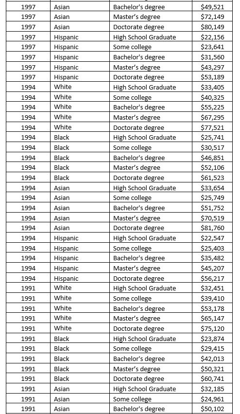
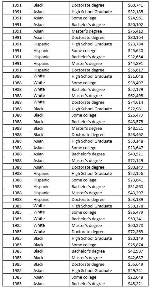
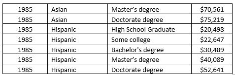 a. Sort the PivotTable data to display the years with the smallest sum of median income on top and the largest on the bottom. Which year had the smallest sum of median income? What is the total income in the year with the smallest sum of median income?
b. Add the Racial Demographic to the Row Labels in the PivotTable. Sort the Racial Demographic by Sum of Median Income with the lowest values on top and the highest values on bottom. Filter the Row Labels so that only the year 2003 is displayed. Which Racial demography had the smallest sum of median income in the year 2003? Which Racial demography had the largest sum of median income in the year 2003?
a. Sort the PivotTable data to display the years with the smallest sum of median income on top and the largest on the bottom. Which year had the smallest sum of median income? What is the total income in the year with the smallest sum of median income?
b. Add the Racial Demographic to the Row Labels in the PivotTable. Sort the Racial Demographic by Sum of Median Income with the lowest values on top and the highest values on bottom. Filter the Row Labels so that only the year 2003 is displayed. Which Racial demography had the smallest sum of median income in the year 2003? Which Racial demography had the largest sum of median income in the year 2003?
(Essay)
4.8/5 (35)
A _____ is a line that provides an approximation of the relationship between the variables.
(Multiple Choice)
4.9/5 (32)
A data visualization tool that updates in real time and gives multiple outputs is called
(Multiple Choice)
4.9/5 (25)
The total number of runs scored by the players in the previous problem is 198. The following pie chart shows the percentage of runs scored by each player:
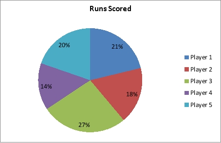 a. What are the problems with using a pie chart to display these data?
b. What type of chart would be preferred for displaying the data in this pie chart?
c. Use a different type of chart to display the percentage of runs scored by each player that conveys the data better than the pie chart. Format the chart and add data labels to improve the chart's readability.
a. What are the problems with using a pie chart to display these data?
b. What type of chart would be preferred for displaying the data in this pie chart?
c. Use a different type of chart to display the percentage of runs scored by each player that conveys the data better than the pie chart. Format the chart and add data labels to improve the chart's readability.
(Essay)
4.9/5 (30)
Using multiple lines on a line chart or employing multiple charts is an alternative to a
(Multiple Choice)
4.7/5 (29)
In order to visualize three variables in two-dimensional graph, we use a
(Multiple Choice)
5.0/5 (39)
The data on the runs scored in a match by top 5 players of a cricket team are given below:
 a. Create a column chart to display the information in the table above. Format the column chart to best display the data by adding axes labels, a chart title, etc.
b. Sort the values in Excel so that the column chart is ordered from most runs scored to fewest.
c. Insert data labels to display the runs scored by each player above the columns in the column chart obtained in part b.
a. Create a column chart to display the information in the table above. Format the column chart to best display the data by adding axes labels, a chart title, etc.
b. Sort the values in Excel so that the column chart is ordered from most runs scored to fewest.
c. Insert data labels to display the runs scored by each player above the columns in the column chart obtained in part b.
(Essay)
4.8/5 (36)
A chart similar to a scatter chart, but uses a line to connect the points in the chart is called the
(Multiple Choice)
4.9/5 (28)
Filters
- Essay(0)
- Multiple Choice(0)
- Short Answer(0)
- True False(0)
- Matching(0)