Exam 2: Exploring Data: Frequency Distributions and Graphs
Exam 1: Introduction211 Questions
Exam 2: Exploring Data: Frequency Distributions and Graphs94 Questions
Exam 3: Exploring Data: Central Tendency103 Questions
Exam 4: Exploring Data: Variability137 Questions
Exam 5: Other Descriptive Statistics188 Questions
Exam 6: Correlation and Regression170 Questions
Exam 7: Theoretical Distributions Including the Normal Distribution138 Questions
Exam 8: Samples, Sampling Distributions, and Confidence Intervals162 Questions
Exam 9: Hypothesis Testing and Effect Size: One-Sample Designs157 Questions
Exam 10: Hypothesis Testing, Effect Size, and and Confidence Intervals: Two-Sample Designs206 Questions
Exam 11: Analysis of Variance: One-Way Classification176 Questions
Exam 12: Analysis of Variance: One-Factor Repeated Measures105 Questions
Exam 13: Analysis of Variance: Factorial Design148 Questions
Exam 14: Chi Square Tests147 Questions
Exam 15: More Nonparametric Tests150 Questions
Exam 16: Appendix: Grouped Frequency Distributions and Central Tendency21 Questions
Select questions type
The numbers in this problem are senior-year averages for each of the 25 honor graduates at Psmallton High School. Arrange them into a simple frequency distribution, and draw a frequency polygon from the data. Tell the direction of the skew. 92 97 94 93 93 100 95 93 96 95 97 94 94 96 97 93 95 93 94 95 93 94 95 94 93
(Essay)
4.8/5  (29)
(29)
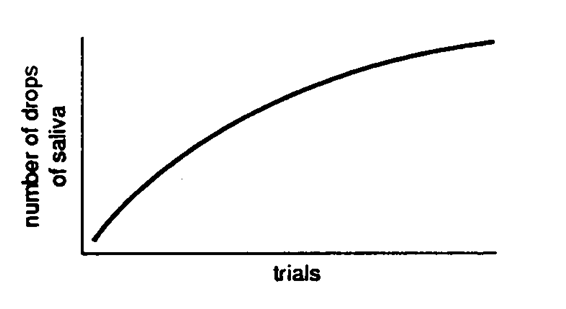
Describe each graph below as correct or incorrect. Tell what is wrong with the incorrect one(s).
-
(Multiple Choice)
4.8/5 (38)
The graphic in the text showing the majors of college graduates was a
(Multiple Choice)
4.9/5 (41)
A frequency polygon and a histogram are alike in that they both
(Multiple Choice)
4.9/5 (43)
Which of the following class intervals has a midpoint of 45?
(Multiple Choice)
4.9/5 (51)
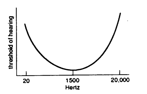
Describe each figure below as a frequency polygon, histogram, or line graph.
-
(Multiple Choice)
4.9/5 (36)
The cheerleaders at Rock Valley Tech had a problem. Spectator participation during yells was just terrible. They decided to find out which yells were unpopular and drop them from their repertoire. Accordingly, at the next game they passed out to the students a questionnaire designed to find out the most unpopular yell. (Since they knew that this question was not likely to be interesting by itself, they added other questions about the cheerleaders but these answers were ignored.) Five yells were named: Abba-dabba by 5 students, E. Coli by 12, Doggy by 27, Coatimonday by 23, Barse, Barse, Keya by 19. Arrange these data into a graph.
(Essay)
4.9/5 (45)
The best way to determine if a graph is a histogram or a bar graph is to look at
(Multiple Choice)
5.0/5 (31)
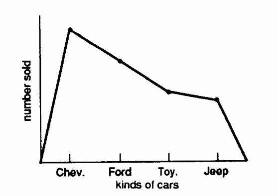
Identify each graph below as correct or incorrect. Describe what is wrong with each incorrect one.
-
(Multiple Choice)
4.9/5 (37)
Grouped frequency distributions have class intervals that cover two or more scores.
(True/False)
4.9/5 (49)
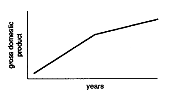
Describe each figure below as a frequency polygon, histogram, or line graph.
-
(Multiple Choice)
4.9/5 (24)
Suppose you had frequency counts of people who were listening to one of four radio stations. The appropriate graph for such data would be a
(Multiple Choice)
4.8/5 (37)
Filters
- Essay(0)
- Multiple Choice(0)
- Short Answer(0)
- True False(0)
- Matching(0)