Exam 9: Analyzing and Charting Financial Data
Exam 1: Creating a Database100 Questions
Exam 2: Building a Database and Defining Table Relationships98 Questions
Exam 3: Maintaining and Querying a Database100 Questions
Exam 4: Creating Forms and Reports100 Questions
Exam 5: Essential Computer Concepts100 Questions
Exam 6: Getting Started With Excel100 Questions
Exam 7: Formatting Workbook Text and Data100 Questions
Exam 8: Calculating Data With Formulas and Functions100 Questions
Exam 9: Analyzing and Charting Financial Data100 Questions
Exam 10: Exploring the Basics of Windows 8100 Questions
Exam 11: Integrating Word, Excel, Access, and Powerpoint100 Questions
Exam 12: Internet Basics and Information Literacy100 Questions
Exam 13: Introduction to Cloud Computing50 Questions
Exam 14: Managing Your Files100 Questions
Exam 15: Creating a Presentation100 Questions
Exam 16: Adding Media and Special Effects100 Questions
Exam 17: Creating and Editing a Document100 Questions
Exam 18: Navigating and Formatting a Document100 Questions
Exam 19: Creating Tables and a Multipage Report100 Questions
Exam 20: Enhancing Page Layout and Design100 Questions
Select questions type
In the figure above, pv stands for the ____.
Free
(Multiple Choice)
4.8/5  (32)
(32)
Correct Answer: Verified
C
A chart sheet can contain ____.
Free
(Multiple Choice)
4.8/5 (30)
Correct Answer:Verified
A
Placing a chart in a ____ displays only the chart and no worksheet cells.
Free
(Multiple Choice)
4.7/5 (25)
Correct Answer:Verified
D
A chart that compares three set of values in a three-dimensional chart is _____.
(Multiple Choice)
4.8/5 (45)
MATCHING
Identify the letter of the chart type that best matches the phrase or definition.
-Compares a collection of values from several different data sets.
(Multiple Choice)
4.7/5 (36)
____ is the amount added to the prinicpal of a loan by the lender.
(Multiple Choice)
4.9/5 (38)
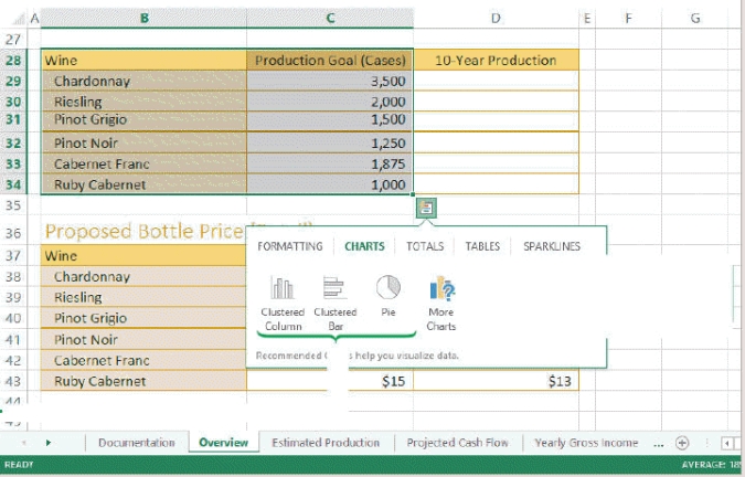 -In the figure above, the biggest slice is the cases of _______.
(Multiple Choice)
4.7/5 (27)
The _______ displays the data series in separate columns side-by-side so that you can compare the relative heights of the columns in the three series.
(Multiple Choice)
4.7/5 (33)
Consider the impact of a poorly designed chart. Explain why it is important to have a well-designed chart, and name at least four tips for creating a good chart.
(Essay)
4.8/5 (33)
To reposition the legend to the left-hand side of a chart, click the _________ button, point to Legend, click the right arrow icon, and click Left.
(Multiple Choice)
4.9/5 (32)
Mya has just surveyed 100 students to get their reaction to a new textbook she is reviewing. She has one data series that she wants to represent graphically, and she needs to display her data in a way that lets her visually compate the data values and see how much contributes to the whole.
-Mya has decided she needs to move her chart so that it appears below her data source. Before she can move or resize her chart she must ______.
(Multiple Choice)
4.9/5 (33)
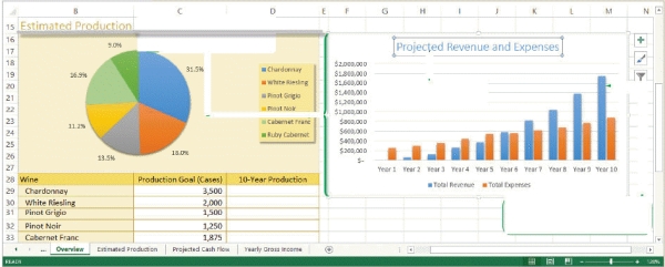 -Referring to the figure above, the chart title for the pie chart is ____.
(Multiple Choice)
4.8/5 (40)
-Referring to the figure above, in the column chart, the values along the left side ($200,000, $400,000, $600,000, etc.) are ____.
(Multiple Choice)
4.9/5 (29)
You can move a chart from one worksheet to another, or you can place the chart in its own chart sheet.
(True/False)
4.8/5 (42)
The _______ covers the entire background of the chart, whereas the plot area includes
only that portion of the chart in which the data markers, such as the columns in a
column chart, have been placed or plotted.
(Short Answer)
4.8/5 (34)
The range of values, or ___________________, of an axis is based on the values in the data source.
(Short Answer)
4.7/5 (33)
Mya has just surveyed 100 students to get their reaction to a new textbook she is reviewing. She has one data series that she wants to represent graphically, and she needs to display her data in a way that lets her visually compate the data values and see how much contributes to the whole.
-Since Mya is still reviewing her data, she wants to make sure that her chart reflects any changes she makes in her data source. She should ____.
(Multiple Choice)
4.9/5 (31)
Each data source is a collection of ____________________, which is a range of values plotted as a single unit on a chart.
(Short Answer)
5.0/5 (40)
Filters
- Essay(0)
- Multiple Choice(0)
- Short Answer(0)
- True False(0)
- Matching(0)