Exam 9: Analyzing and Charting Financial Data
Exam 1: Creating a Database100 Questions
Exam 2: Building a Database and Defining Table Relationships98 Questions
Exam 3: Maintaining and Querying a Database100 Questions
Exam 4: Creating Forms and Reports100 Questions
Exam 5: Essential Computer Concepts100 Questions
Exam 6: Getting Started With Excel100 Questions
Exam 7: Formatting Workbook Text and Data100 Questions
Exam 8: Calculating Data With Formulas and Functions100 Questions
Exam 9: Analyzing and Charting Financial Data100 Questions
Exam 10: Exploring the Basics of Windows 8100 Questions
Exam 11: Integrating Word, Excel, Access, and Powerpoint100 Questions
Exam 12: Internet Basics and Information Literacy100 Questions
Exam 13: Introduction to Cloud Computing50 Questions
Exam 14: Managing Your Files100 Questions
Exam 15: Creating a Presentation100 Questions
Exam 16: Adding Media and Special Effects100 Questions
Exam 17: Creating and Editing a Document100 Questions
Exam 18: Navigating and Formatting a Document100 Questions
Exam 19: Creating Tables and a Multipage Report100 Questions
Exam 20: Enhancing Page Layout and Design100 Questions
Select questions type
You already created a line chart, but now decide that you want to change this chart to a pie chart. To do this, you click ____ from the Type group in the Chart Tools Design tab.
(Multiple Choice)
4.8/5  (31)
(31)
Excel charts are either placed in their own chart sheets or embedded in a worksheet.
(True/False)
4.8/5 (27)
Category values are usually located in the ____ of the data source.
(Multiple Choice)
4.9/5 (41)
MATCHING
Identify the letter of the chart type that best matches the phrase or definition.
-Compares relative values of different categories to the whole. A value is indicated by the area of a(n) ____
(Multiple Choice)
4.8/5 (37)
Mya has just surveyed 100 students to get their reaction to a new textbook she is reviewing. She has one data series that she wants to represent graphically, and she needs to display her data in a way that lets her visually compate the data values and see how much contributes to the whole.
-Mya needs to call attention to one category above all others. For this purpose, she should use a(n) ____.
(Multiple Choice)
4.8/5 (44)
When combination charts have data series with vastly different values, you can create ____ charts.
(Multiple Choice)
5.0/5 (38)
The ____ identifies which data markers are associated with each data series.
(Multiple Choice)
5.0/5 (40)
The PMT function calculates the payment required in each period to pay back the loan.
(True/False)
4.8/5 (31)
MATCHING
Identify the letter of the chart type that best matches the phrase or definition.
-Compares values from different categories. A value is indicated by the length of the ____
(Multiple Choice)
4.9/5 (44)
A chart that combines two or more chart types into a single graph is called a(n) ____________________ chart.
(Short Answer)
4.8/5 (30)
Simon has just started a job with the police department. His director has given him the last six months of test results from four local precincts. Simon has organized the results as four data series and needs to display the trends in a graphic format.
-Simon's boss wants him to compare the values in this chart with several different data sets. Simon should prepare a(n) ____ for his boss.
(Multiple Choice)
4.9/5 (47)
Mya has just surveyed 100 students to get their reaction to a new textbook she is reviewing. She has one data series that she wants to represent graphically, and she needs to display her data in a way that lets her visually compate the data values and see how much contributes to the whole.
-Mya has asked for your advice. A colleague told her to remove the legend from her pie chart because it takes up too much space. What would be a better piece of advice to give Mya?
(Multiple Choice)
4.8/5 (35)
A ________ contains the actual values that are plotted on the chart
(Multiple Choice)
4.7/5 (31)
MATCHING
Identify the letter of the chart type that best matches the phrase or definition.
-Often used to show trends and changes over time
(Multiple Choice)
4.8/5 (32)
You can choose Center, Inside End, Outside End, or Best Fit for the data label positions in the in the ____ pane.
(Multiple Choice)
4.8/5 (39)
Simon has just started a job with the police department. His director has given him the last six months of test results from four local precincts. Simon has organized the results as four data series and needs to display the trends in a graphic format.
-It's difficult to read the exact scale on some of Simon's data. Adding ____ would make it easier to read.
(Multiple Choice)
4.8/5 (26)
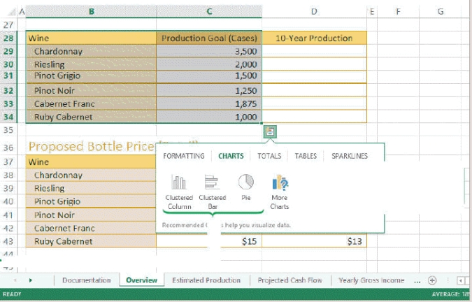 -Referring to the figure above, if you were to create a Wine Production Chart pie chart using the information in B28:C34, the data source for that chart would be ____.
(Multiple Choice)
4.7/5 (43)
A color bar is a conditional format that adds a horizontal bar to the background of a cell containing a numeric value. _________________________
(True/False)
4.9/5 (38)
The cell with the largest value contains a data marker that extends across the entire width of the cell, and the lengths of the other bars in the selected range are determined relative to that bar. _________________________
(True/False)
5.0/5 (36)
Filters
- Essay(0)
- Multiple Choice(0)
- Short Answer(0)
- True False(0)
- Matching(0)