Exam 3: Describing Data Visually
Exam 1: Overview of Statistics50 Questions
Exam 2: Data Collection95 Questions
Exam 3: Describing Data Visually108 Questions
Exam 4: Descriptive Statistics134 Questions
Exam 5: Probability121 Questions
Exam 6: Discrete Probability Distributions127 Questions
Exam 7: Continuous Probability Distributions112 Questions
Exam 8: Sampling Distributions and Estimation99 Questions
Exam 9: One-Sample Hypothesis Tests136 Questions
Exam 10: Two-Sample Hypothesis Tests115 Questions
Exam 11: Analysis of Variance141 Questions
Exam 12: Simple Regression120 Questions
Exam 13: Multiple Regression111 Questions
Exam 14: Time-Series Analysis111 Questions
Exam 15: Chi-Square Tests94 Questions
Exam 16: Nonparametric Tests84 Questions
Exam 17: Quality Management103 Questions
Select questions type
The Pareto chart is used to display the "vital few" causes of problems.
(True/False)
4.9/5  (35)
(35)
Briefly list strengths and weaknesses of this display.Cite specific principles of good graphs,as well as offering your own general interpretation. 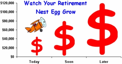
(Essay)
4.8/5 (37)
Craig operates a part-time snow-plowing business using a 2002 GMC 2500 HD extended cab short box truck.Describe Craig's gasoline mileage based on this histogram of 195 tanks of gas. 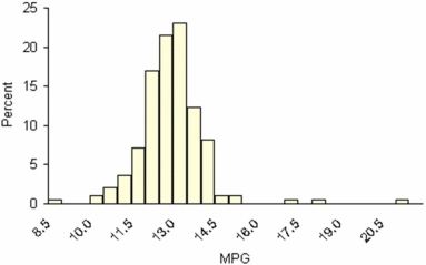
(Essay)
4.7/5 (37)
Briefly list strengths and weaknesses of this display.Cite specific principles of good graphs,as well as offering your own general interpretation. 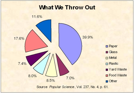
(Essay)
4.8/5 (33)
Bob found an error in the following frequency distribution.What is it? 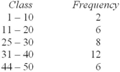
(Multiple Choice)
4.8/5 (36)
Briefly comment on strengths and weaknesses of this display.Cite specific principles of good graphs,as well as offering your own general interpretation. 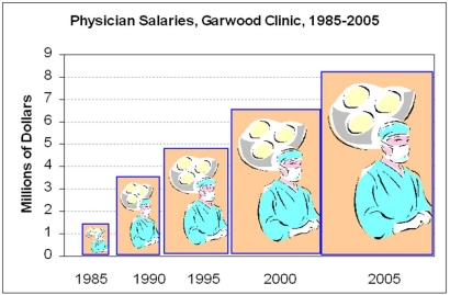
(Essay)
4.7/5 (27)
A frequency distribution is a tabulation of n data values into classes called bins.
(True/False)
4.9/5 (33)
Compared to a dot plot,we lose some detail when we present data in a frequency distribution.
(True/False)
4.9/5 (35)
Which of these deficiencies would be considered a major graphical deception?
(Multiple Choice)
4.8/5 (31)
Which criterion is least likely to be used in choosing bins (classes)in a frequency distribution?
(Multiple Choice)
4.9/5 (33)
Except for the Y-axis scaling,a histogram will look the same if we use relative frequencies instead of raw frequencies (with the same bin limits).
(True/False)
4.8/5 (39)
Briefly list strengths and weaknesses of this display.Cite specific principles of good graphs,as well as offering your own general interpretation. 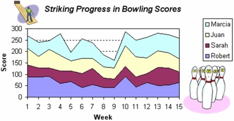
(Essay)
4.7/5 (38)
Sturges' Rule is merely a suggestion,not an ironclad requirement.
(True/False)
4.8/5 (31)
Filters
- Essay(0)
- Multiple Choice(0)
- Short Answer(0)
- True False(0)
- Matching(0)