Exam 3: Describing Data Visually
Exam 1: Overview of Statistics50 Questions
Exam 2: Data Collection95 Questions
Exam 3: Describing Data Visually108 Questions
Exam 4: Descriptive Statistics134 Questions
Exam 5: Probability121 Questions
Exam 6: Discrete Probability Distributions127 Questions
Exam 7: Continuous Probability Distributions112 Questions
Exam 8: Sampling Distributions and Estimation99 Questions
Exam 9: One-Sample Hypothesis Tests136 Questions
Exam 10: Two-Sample Hypothesis Tests115 Questions
Exam 11: Analysis of Variance141 Questions
Exam 12: Simple Regression120 Questions
Exam 13: Multiple Regression111 Questions
Exam 14: Time-Series Analysis111 Questions
Exam 15: Chi-Square Tests94 Questions
Exam 16: Nonparametric Tests84 Questions
Exam 17: Quality Management103 Questions
Select questions type
Dot plots may not reveal the shape of a distribution when the sample is small.
Free
(True/False)
4.8/5  (32)
(32)
Correct Answer: Verified
True
Which is not a tip for effective line charts?
Free
(Multiple Choice)
4.9/5 (40)
Correct Answer:Verified
A
A pie chart can generally be used instead of a bar chart.
Free
(True/False)
4.9/5 (34)
Correct Answer:Verified
False
A population has 75 observations.One class interval has a frequency of 15 observations.The relative frequency in this category is:
(Multiple Choice)
4.9/5 (32)
It is easier to read the data values on a 3D column chart than on a 2D column chart.
(True/False)
4.8/5 (40)
Below is a sorted stem-and-leaf diagram for the measured speeds (miles per hour)of 49 randomly chosen vehicles on highway I-80 in Nebraska.The modal class is: 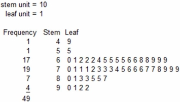
(Multiple Choice)
4.8/5 (33)
An open-ended bin (e.g. ,"50 and over")might be seen in a frequency distribution when:
(Multiple Choice)
4.8/5 (30)
Which is a reason for using a log scale for time series data?
(Multiple Choice)
4.9/5 (39)
This histogram shows Chris's golf scores in his last 77 rounds at Devil's Ridge.Which is not a correct statement? 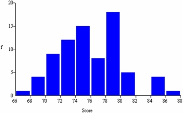
(Multiple Choice)
4.9/5 (28)
Stacked dot plots are useful in understanding the association between two paired quantitative variables (X,Y).
(True/False)
4.8/5 (42)
Which is not a characteristic of using a log scale to display time series data?
(Multiple Choice)
4.7/5 (29)
Because most data values are on the left,we would say that this dot plot (burglary rates per 100,000 persons in 350 U.S.cities)shows a distribution that is skewed to the left (negatively skewed). 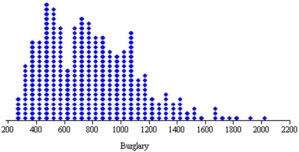
(True/False)
5.0/5 (35)
Which of the following is least useful in visualizing categorical data?
(Multiple Choice)
4.9/5 (37)
Briefly list strengths and weaknesses of this display.Cite specific principles of good graphs,as well as offering your own general interpretation. 
(Essay)
4.8/5 (39)
Below is a sorted stem-and-leaf diagram for the measured speeds (miles per hour)of 49 randomly chosen vehicles on highway I-80 in Nebraska.What is the highest observed speed? 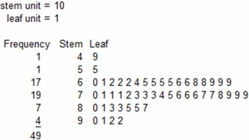
(Multiple Choice)
4.8/5 (34)
Below is a frequency distribution of earnings of 50 contractors in a country. 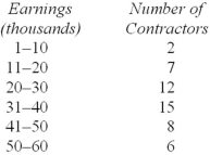 Regarding this distribution,which of the following is correct?
(Multiple Choice)
4.9/5 (40)
Below is a sorted stem-and-leaf diagram for the measured speeds (miles per hour)of 49 randomly chosen vehicles on highway I-80 in Nebraska.What is the mode? 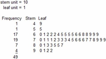
(Multiple Choice)
4.8/5 (36)
Filters
- Essay(0)
- Multiple Choice(0)
- Short Answer(0)
- True False(0)
- Matching(0)