Exam 4: Graphical Descriptive Techniques Numerical Data
Exam 1: What Is Statistics14 Questions
Exam 2: Types of Data, Data Collection and Sampling16 Questions
Exam 3: Graphical Descriptive Methods Nominal Data19 Questions
Exam 4: Graphical Descriptive Techniques Numerical Data64 Questions
Exam 5: Numerical Descriptive Measures147 Questions
Exam 6: Probability106 Questions
Exam 7: Random Variables and Discrete Probability Distributions55 Questions
Exam 8: Continuous Probability Distributions117 Questions
Exam 9: Statistical Inference: Introduction8 Questions
Exam 10: Sampling Distributions65 Questions
Exam 11: Estimation: Describing a Single Population127 Questions
Exam 12: Estimation: Comparing Two Populations22 Questions
Exam 13: Hypothesis Testing: Describing a Single Population129 Questions
Exam 14: Hypothesis Testing: Comparing Two Populations78 Questions
Exam 15: Inference About Population Variances49 Questions
Exam 16: Analysis of Variance115 Questions
Exam 17: Additional Tests for Nominal Data: Chi-Squared Tests110 Questions
Exam 18: Simple Linear Regression and Correlation213 Questions
Exam 19: Multiple Regression121 Questions
Exam 20: Model Building92 Questions
Exam 21: Nonparametric Techniques126 Questions
Exam 22: Statistical Inference: Conclusion103 Questions
Exam 23: Time-Series Analysis and Forecasting145 Questions
Exam 24: Index Numbers25 Questions
Exam 25: Decision Analysis51 Questions
Select questions type
The following table shows the annual incomes (in thousands of dollars) and weekly rent payments (dollars) of a sample of 10 individuals in country New South Wales: Income 45 51 40 44 48 35 51 55 49 47 Rent 230 280 190 220 270 200 300 310 260 250 a. Draw a scatter diagram for these data with rent payment on the vertical axis.
b. Describe the relationship between rent payment and income.
Free
(Essay)
4.8/5  (34)
(34)
Correct Answer: Verified
a. 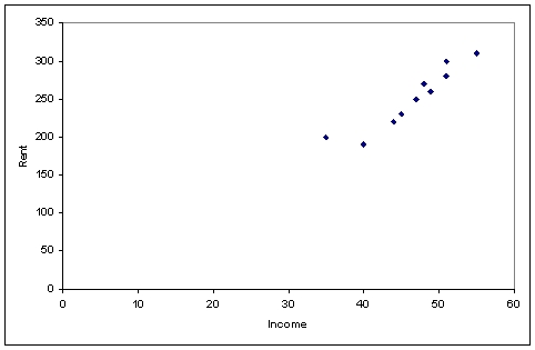 b. There is a very strong positive relationship between rent and income; as income increases, rent payment tends also to increase.
The modal class (classes) of a frequency distribution is the class (are the classes) with the highest frequency.
Free
(True/False)
4.8/5 (36)
Correct Answer:Verified
True
Compared to the frequency distribution, the stem-and-leaf display provides more details, since it can describe the individual data values as well as show how many are in each group, or stem.
Free
(True/False)
4.8/5 (37)
Correct Answer:Verified
True
The weights in kilograms of a sample of 30 horses are given below:
Weight
165
175
150
155
173
149
145
153
153
153
152
145
164
143
170
175
148
174
171
156
166
168
152
150
173
168
146
155
172
159
a. Construct a cumulative relative frequency distribution for the data.
b. Construct an ogive for the data.
c. What proportion of horses weighs less than 160kgs?
d. What proportion of horses weighs between 145 and 165kgs?
(Essay)
4.8/5 (28)
For each of the following numerical variables, describe if the distribution of data would be symmetrical, positively skewed or negatively skewed.
a. Annual incomes of employees in a multinational company.
b. Weights of 1kilogram labeled bags of flour, processed by a large manufacturing company.
c. Grades of students in an easy test.
(Essay)
4.9/5 (37)
The following data are test grades for a university business statistics class. 63 74 42 65 51 54 36 56 68 57 62 64 76 67 79 61 81 77 59 38 84 68 71 94 71 86 69 75 91 55 48 82 83 54 79 62 68 58 41 47 a. Construct a cumulative frequency distribution and a cumulative relative frequency distribution for the data.
b. What proportion of the grades is less than 60?
c. What proportion of the grades is more than 70?
(Essay)
4.8/5 (29)
A relative frequency distribution describes the proportion of data values that fall within each category.
(True/False)
4.7/5 (37)
The difference between a histogram and a bar chart is that the histogram represents numerical (quantitative) data while the bar chart represents nominal (categorical) data.
(True/False)
5.0/5 (32)
Frequency polygons are useful for obtaining a general idea of the shape of the distribution, because they are a bar chart.
(True/False)
4.8/5 (43)
The numbers of defective items produced by a machine over the last 25 days are as follows: 19 6 15 20 17 16 17 12 15 29 23 17 7 10 14 14 27 22 8 5 23 19 9 28 5 a. Construct a frequency distribution and a relative frequency distribution for these data. Use five class intervals, with the lower boundary of the first class being five items.
b. Construct a relative frequency histogram for these data.
c. What is the relationship between the total area under the histogram you have constructed and the relative frequencies of observations?
(Essay)
4.7/5 (34)
A frequency distribution shows the number of data values falling within each class.
(True/False)
4.9/5 (38)
Which of the following is the most appropriate type of chart for determining the number of observations at or below a specific value?
(Multiple Choice)
5.0/5 (35)
When income increases, expenditure on imports tend to increase. Which of the following best describes this relationship?
(Multiple Choice)
4.8/5 (43)
Which of the following best describes the shape of the distribution of incomes of all employees in large company?
(Multiple Choice)
4.8/5 (27)
Which of the following graphical display is can be used to describe relationship between two numerical (quantitative) variables?
(Multiple Choice)
4.8/5 (33)
Construct a stem-and-leaf display of the test grades for a university business statistics class, given below. 63 74 42 65 51 54 36 56 68 57 62 64 76 67 79 61 81 77 59 38 84 68 71 94 71 86 69 75 91 55 48 82 83 54 79 62 68 58 41 47
(Essay)
4.9/5 (31)
The number of houses sold in a suburb in Sydney and the average monthly mortgage rates for 18 months randomly selected are shown in the following table. Mortgage rate (\%) Number of houses sold Mortgage rate (\%) Number of houses sold 7.5 90 9.5 68 9.0 72 6.5 97 7.0 89 8.0 79 10.5 62 9.0 75 10.0 58 10.5 53 9.5 70 9.5 73 8.5 74 11.0 50 10.0 65 7.5 82 11.0 51 8.5 70 a. Draw a scatter diagram with the number of houses sold on the vertical axis.
b. Describe the relationship between mortgage rate and number of houses sold.
(Essay)
4.9/5 (30)
A scatter diagram which has points widely dispersed, where no clear line is visible, indicates no linear relationship between the variables.
(True/False)
4.9/5 (37)
A cumulative frequency distribution lists the proportion of observations that are within or below each of the classes.
(True/False)
4.9/5 (33)
If we draw a straight line through the points in a scatter diagram and most of the points fall relatively close to the line, we say that there is a linear relationship between the two variables.
(True/False)
4.9/5 (35)
Filters
- Essay(0)
- Multiple Choice(0)
- Short Answer(0)
- True False(0)
- Matching(0)