Exam 4: Graphical Descriptive Techniques Numerical Data
Exam 1: What Is Statistics14 Questions
Exam 2: Types of Data, Data Collection and Sampling16 Questions
Exam 3: Graphical Descriptive Methods Nominal Data19 Questions
Exam 4: Graphical Descriptive Techniques Numerical Data64 Questions
Exam 5: Numerical Descriptive Measures147 Questions
Exam 6: Probability106 Questions
Exam 7: Random Variables and Discrete Probability Distributions55 Questions
Exam 8: Continuous Probability Distributions117 Questions
Exam 9: Statistical Inference: Introduction8 Questions
Exam 10: Sampling Distributions65 Questions
Exam 11: Estimation: Describing a Single Population127 Questions
Exam 12: Estimation: Comparing Two Populations22 Questions
Exam 13: Hypothesis Testing: Describing a Single Population129 Questions
Exam 14: Hypothesis Testing: Comparing Two Populations78 Questions
Exam 15: Inference About Population Variances49 Questions
Exam 16: Analysis of Variance115 Questions
Exam 17: Additional Tests for Nominal Data: Chi-Squared Tests110 Questions
Exam 18: Simple Linear Regression and Correlation213 Questions
Exam 19: Multiple Regression121 Questions
Exam 20: Model Building92 Questions
Exam 21: Nonparametric Techniques126 Questions
Exam 22: Statistical Inference: Conclusion103 Questions
Exam 23: Time-Series Analysis and Forecasting145 Questions
Exam 24: Index Numbers25 Questions
Exam 25: Decision Analysis51 Questions
Select questions type
Construct a relative frequency histogram for the test grades for a university business statistics class. 63 74 42 65 51 54 36 56 68 57 62 64 76 67 79 61 81 77 59 38 84 68 71 94 71 86 69 75 91 55 48 82 83 54 79 62 68 58 41 47
(Essay)
4.8/5  (25)
(25)
A cumulative frequency distribution presented in graphical form is called an ogive.
(True/False)
4.8/5 (32)
Class intervals of equal width make the interpretation of a frequency distribution easier.
(True/False)
4.9/5 (37)
Which of the following statements about histograms is true?
(Multiple Choice)
4.8/5 (40)
The stem-and-leaf display reveals far more information about individual values than does the histogram.
(True/False)
4.8/5 (29)
The relationship between expenditure on imports and household income may be described as a positive linear relationship.
(True/False)
4.8/5 (33)
Which of the following is the best type of chart for illustrating the GDP of Australia from 1960 to 2010?
(Multiple Choice)
4.9/5 (26)
For a bar chart to show graphical excellence, the bars must be the same width irrespective of each bar's height.
(Essay)
4.9/5 (36)
When choosing between a line chart and a bar chart to display a time-series of data, if the main objective is to display the overall general movement, or trend, in the time-series, a line chart is best.
(True/False)
4.8/5 (28)
The bar chart below is of the colour of motor vehicles in a random sample. A student commented that the distribution was negatively skewed. Explain what is wrong with this statement.
Motor Vehicle Colour Relative Frequency Bar Chart 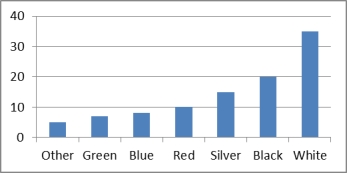
(Essay)
4.9/5 (41)
Which of the following statements best describes a stem-and-leaf display? A. A stem-and-leaf display is similar to a histogram turned on its side. but the display holds the advantage of retaining the original observations. B. A stem-and-leaf display holds the advantage of retaining the original observations. C. A stem-and-leaf display is similar to a histogram turned on its side, but the display holds the advantage of retaining the original observations and holds the advantage of retaining the original observations. D. A stem-and-leaf display may be used for nominal variables.
(Short Answer)
4.7/5 (34)
Graphical excellence is displayed when a graph has a proper scale, the axis are marked correctly are the graph chosen appropriately tells the truth about the data.
(True/False)
4.8/5 (40)
If two numerical variables are linearly related, then it means that one variable is causing the other variable to react in a particular way.
(True/False)
4.9/5 (35)
A skewed histogram is one with a long tail extending either to the right or left. The former is called negatively skewed, and the latter is called positively skewed.
(True/False)
4.8/5 (35)
In any relative frequency distribution, the sum of all the relative frequencies is always equal to 1.
(True/False)
4.8/5 (35)
Describe briefly what the histogram and the stem-and-leaf displays tell you about the test grades for a university business statistics class. 63 74 42 65 51 54 36 56 68 57 62 64 76 67 79 61 81 77 59 38 84 68 71 94 71 86 69 75 91 55 48 82 83 54 79 62 68 58 41 47
(Essay)
4.8/5 (36)
A histogram is said to be symmetric if, when we draw a vertical line down the center of the histogram, the two sides are mirror images of each other.
(True/False)
4.7/5 (36)
Construct a cumulative relative frequency distribution for the number of years of service for 100 employees, given the frequency distribution of the number of years of service for 100 employees is shown below. Years Frequency 0 up to 5 12 5 up to 10 16 10 up to 15 42 15up to 20 20 20 up to 25 10 Total 100
(Essay)
4.8/5 (37)
A frequency distribution is a listing of the individual observations arranged in ascending or descending order.
(True/False)
4.9/5 (29)
Time-series data may be graphically depicted on a line chart or a bar chart.
(True/False)
4.7/5 (35)
Filters
- Essay(0)
- Multiple Choice(0)
- Short Answer(0)
- True False(0)
- Matching(0)