Exam 2: Summarizing and Graphing Data
Construct the dot plot for the given data.
-The weights of 22 members of the varsity football team are listed below. 144 152 142 151 160 152 131 164 141 153 140
144 175 156 147 133 172 159 135 159 148 171
A
Provide an appropriate response.
-Suppose you are comparing frequency data for two different groups, 25 managers and 150 blue collar workers. Why would a relative frequency distribution be better than a frequency distribution?
When comparing frequency data for two different groups of different sizes, such as 25 managers and 150 blue collar workers, a relative frequency distribution is often more informative than a simple frequency distribution. This is because a relative frequency distribution takes into account the size of the group when presenting the data, which allows for a more accurate comparison between groups of different sizes.
A frequency distribution simply counts the number of occurrences of each value or category within the data set. For example, if you were looking at the frequency of certain decisions made by managers versus blue collar workers, the frequency distribution would show the raw counts. However, because the group of blue collar workers is much larger (150) than the group of managers (25), the raw counts would likely be higher for the blue collar workers simply due to their greater number, not necessarily because their behavior or choices are inherently different.
On the other hand, a relative frequency distribution calculates the proportion or percentage of the total that each category represents. This is done by dividing the frequency of each category by the total number of observations in the group. By using relative frequencies, you can compare the behavior or choices of the two groups on a more equal footing, as each group's data is scaled according to its size.
For example, if 10 out of 25 managers (40%) made a certain decision, and 60 out of 150 blue collar workers (40%) made the same decision, the relative frequency distribution would show that the proportion is the same across both groups, despite the raw frequency being different. This allows for a fair comparison and can provide insights that might be overlooked if only raw frequencies were considered.
In summary, a relative frequency distribution is better than a frequency distribution for comparing groups of different sizes because it normalizes the data, allowing for a direct comparison of the proportions or percentages across the groups, which is a more accurate reflection of the underlying patterns or trends.
Solve the problem.
-Use the high closing values of Naristar Inc. stock from the years 1990 - 2001 to construct a time-series graph. (Let x = 0 stand for 1990 and so on...)Identify a trend. Year High Year High 1990 42 1996 47 1991 40 1997 60 1992 31 1998 61 1993 42 1999 57 1994 44 2000 54 1995 47 2001 30
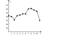
There seems to be a general upward trend with a period of decline in the later years.
Construct the dot plot for the given data.
-The attendance counts for this season's basketball games are listed below. 227 239 215 219 221 233 229 233 235 228 245 231
Provide an appropriate response.
-Describe at least two advantages to using stemplots rather than frequency distributions.
Use the data to create a stemplot.
-The following data give the distribution of the types of houses in a town containing 30,000 houses.
Capes Garrisons Splits 7500 10,500 12,000
Provide an appropriate response.
-Draw one histogram to illustrate bell-shaped data, another for uniform data, and a third for skewed data. Which of these shapes matches the histogram for the first 100 digits of π? Does changing the number of classes alter your answer? (Below is the frequency table for the first 100 digits of π.) 0 1 2 3 4 5 6 7 8 9 8 8 12 11 10 8 9 8 12 14
Solve the problem.
-Using the employment information in the table on Alpha Corporation, determine the width of each class. Years employed at Alpha Corporation Class Limits (years of service) Frequency (No. of employees) 1-5 5 6-10 20 11-15 25 16-20 10 21-25 5 26-30 3
Construct the cumulative frequency distribution that corresponds to the given frequency distribution.
-A manufacturer records the number of errors each work station makes during the week. The data are as follows.
6 3 2 3 5 2 0 2 5 4 2 0 1
Use the circle graph to solve the problem.
-A survey of the 5589 vehicles on the campus of State University yielded the following pie chart. 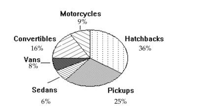 What percent of the vehicles are hatchbacks?
Solve the problem.
-260 casino patrons, were interviewed as they left the casino. 78 of them said they spent most of the time playing the slots. 78 of them said they played blackjack. 39 said they played craps. 13 said roulette. 13 said poker. The rest were not sure what they played the most. Construct a Pareto chart to depict the gaming practices of the group of casino goers. Choose the vertical scale so that the relative frequencies are represented.
Solve the problem.
-Wagenlucht Ice Cream Company is always trying to create new flavors of ice cream. They are market testing three kinds to find out which one has the best chance of becoming popular. They give small samples of each to 50 people at a grocery store. 10 ice cream tasters preferred the Strawberry Cream, 30 preferred Choco-Nuts, and 10 loved the Orange Mint. Construct a Pareto chart to represent these preferences. Choose the vertical scale so that the relative frequencies are represented.
Construct the cumulative frequency distribution that corresponds to the given frequency distribution.
- Stem Leaves 4-5 1 6-7 8 8-9 18
Find the original data from the stem-and-leaf plot.
- Stem Leaves 3 59 4 19 5 55
Solve the problem.
-Suppose that you construct a histogram and a relative frequency histogram corresponding to a particular frequency table. In what ways will the two histograms be similar? In what ways will they differ?
A nurse measured the blood pressure of each person who visited her clinic. Following is a relative-frequency histogram
for the systolic blood pressure readings for those people aged between 25 and 40. Use the histogram to answer the
question. The blood pressure readings were given to the nearest whole number. 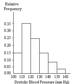 -Approximately what percentage of the people aged 25-40 had a systolic blood pressure reading between 110 and 119 inclusive?
Use the given data to construct a frequency distribution.
-A medical research team studied the ages of patients who had strokes caused by stress. The ages of 34 patients who suffered stress strokes were as follows.
293036414550576128503658 603836474032584661405532 61564546623638405027
Construct a frequency table for these ages. Use 8 classes beginning with a lower class limit of 25.
Age Frequency
Use the circle graph to solve the problem.
-The pie chart below gives the inventory of the women's department of a store. 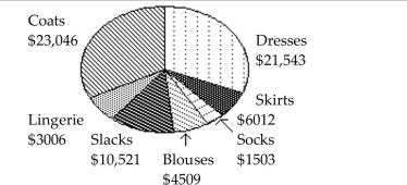 What is the total inventory?
A nurse measured the blood pressure of each person who visited her clinic. Following is a relative-frequency histogram
for the systolic blood pressure readings for those people aged between 25 and 40. Use the histogram to answer the
question. The blood pressure readings were given to the nearest whole number.
-Identify the center of the third class.
Use the given data to construct a frequency distribution.
-The following figures represent Jennifer's monthly charges for long distance telephone calls for the past twelve months. 8.10 11.85 14.28 16.03 12.53 17.68 9.97 15.96 15.86 14.09 14.67 11.10
Construct a frequency table with 4 classes.
Charges Frequency
Filters
- Essay(0)
- Multiple Choice(0)
- Short Answer(0)
- True False(0)
- Matching(0)