Exam 2: Summarizing and Graphing Data
Exam 1: Introduction to Statistics85 Questions
Exam 2: Summarizing and Graphing Data82 Questions
Exam 3: Statistics for Describing, Exploring, and Comparing Data149 Questions
Exam 4: Probability170 Questions
Exam 5: Probability Distributions158 Questions
Exam 6: Normal Probability Distributions173 Questions
Exam 7: Estimates and Sample Sizes139 Questions
Exam 8: Hypothesis Testing130 Questions
Exam 9: Inferences From Two Samples105 Questions
Exam 10: Correlation and Regression129 Questions
Exam 11: Multinomial Experiments and Contingency Tables31 Questions
Exam 12: Analysis of Variance60 Questions
Exam 13: Nonparametric Statistics64 Questions
Exam 14: Statistical Process Control38 Questions
Select questions type
Construct a boxplot for the given data. Include values of the 5-number summary in all boxplots.
- Incomes Frequency 200-300 75 301-400 51 401-500 95 501-600 92 >600 14
(Multiple Choice)
4.8/5  (28)
(28)
Use the circle graph to solve the problem.
-A survey of the 4960 vehicles on the campus of State University yielded the following pie chart. 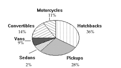 Together, what percent of the vehicles are either vans or convertibles?
(Multiple Choice)
4.9/5 (31)
A nurse measured the blood pressure of each person who visited her clinic. Following is a relative-frequency histogram
for the systolic blood pressure readings for those people aged between 25 and 40. Use the histogram to answer the
question. The blood pressure readings were given to the nearest whole number. 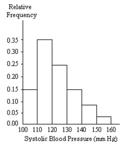 -What common class width was used to construct the frequency distribution?
(Multiple Choice)
4.8/5 (41)
Solve the problem.
-The following frequency distribution analyzes the scores on a math test. Find the indicated class midpoint or boundaries. score Number of Students 40-59 2 60-75 4 76-82 6 83-94 15 95-99 5 The class midpoint of scores interval 95-99
(Multiple Choice)
4.9/5 (26)
Construct the dot plot for the given data.
-The following data consists of the weights (in pounds)of 15 randomly selected women and the weights of 15 randomly selected men. Construct a back-to-back stemplot for the data. Women: 128 150 118 166 142 122 137 110 175 152 145 126 139 111 170 Men: 140 153 199 186 169 136 176 162 196 155 173 190 141 166 153
(Multiple Choice)
4.8/5 (33)
A nurse measured the blood pressure of each person who visited her clinic. Following is a relative-frequency histogram
for the systolic blood pressure readings for those people aged between 25 and 40. Use the histogram to answer the
question. The blood pressure readings were given to the nearest whole number.
-Approximately what percentage of the people aged 25-40 had a systolic blood pressure reading between 110 and 139 inclusive?
(Multiple Choice)
4.9/5 (33)
Use the given data to construct a frequency distribution.
-Lori asked 24 students how many hours they had spent doing homework during the previous week. The results are shown below. 10 10 10 9 10 10 14 13 10 9 12 10 10 12 10 10 12 10 10 13 10 12 13 9
Construct a frequency table. Use 4 classes, a class width of 2 hours, and a lower limit of 8 for class 1.
Hours Frequency
(Essay)
4.8/5 (40)
Provide an appropriate response.
-Consider the frequency distribution below, which has single values as classes: Value Frequency 10 1 11 3 12 7 13 18 14 10 15 4 16 2 17 7 18 16 19 10 20 6 21 2
Describe the distribution of the data. Use this frequency distribution to create two new frequency distributions for the data, one with four classes of equal width and one with six classes of equal width. Does the frequency distribution with four classes capture the distribution of the data? Does the frequency distribution with six classes capture the distribution of the data? Explain your thinking.
(Essay)
4.7/5 (35)
Solve the problem.
-The Kappa Iota Sigma Fraternity polled its members on the weekend party theme. The vote was as follows: six for toga, four for hayride, eight for beer bash, and two for masquerade. Display the vote count in a Pareto chart.
(Multiple Choice)
4.9/5 (41)
Find the original data from the stem-and-leaf plot.
- Stem Leaves 6 17 7 1135 8 13379 9 35
(Multiple Choice)
4.8/5 (37)
Find the original data from the stem-and-leaf plot.
- stem Leaves 49 158 50 139 51 18
(Multiple Choice)
4.9/5 (35)
Provide an appropriate response.
-Histograms and Pareto charts are both bar charts. What is the significant difference between the two?
(Short Answer)
4.9/5 (30)
Solve the problem.
-Using the employment information in the table on Alpha Corporation, find the class boundaries for class 26-30. Years employed at Alpha Corporation Class Limits (years of service) Frequency (No. of employees) 1-5 5 6-10 20 11-15 25 16-20 10 21-25 5 26-30 3
(Multiple Choice)
4.9/5 (42)
Use the circle graph to solve the problem.
-The pie chart below gives the inventory of the men's department of a store. 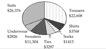 In which item of apparel does the store have the smallest investment?
(Multiple Choice)
4.8/5 (40)
Solve the problem.
-Using the information in the table on home sale prices in the city of Summerhill for the month of June, determine the width of each class. Class Limits Frequency (Sale price in thousands) (No. of homes sold) 80.0-110.9 2 111.0-141.9 5 142.0-172.9 7 173.0-203.9 10 204.0-234.9 3 235.0-265.9 1
(Multiple Choice)
4.8/5 (27)
Solve the problem.
-Using the information in the table on home sale prices in the city of Summerhill for the month of June, find the class midpoint for class 235.0-265.9. Class Limits Frequency (Sale price in thousands) (No. of homes sold) 80.0-110.9 2 111.0-141.9 5 142.0-172.9 7 173.0-203.9 10 204.0-234.9 3 235.0-265.9 1
(Multiple Choice)
4.8/5 (33)
Construct the dot plot for the given data.
-The frequency chart shows the distribution of defects for the machines used to produce a product.
Defects Frequency 0 1 1 3 2 0 3 2 4 4 5 0
(Multiple Choice)
4.8/5 (29)
Provide an appropriate response.
-Create an example displaying data in a pie chart. Display the same data in a Pareto chart. Which graph is more effective? List at least two reasons in support of your choice.
(Essay)
4.8/5 (28)
Provide an appropriate response.
-Explain the difference between a frequency distribution and a relative frequency distribution. Comment on the differences on the vertical axis scale. Given the same data set and the same classes, will the shapes of the frequency distribution and the relative frequency distribution be the same? You may draw a diagram to support your answer.
(Not Answered)
This question doesn't have any answer yet
Construct a pie chart representing the given data set.
- x -6 7 7 7 5 6 2 -1 -6 y 2 7 11 8 9 11 6 3 2
(Multiple Choice)
5.0/5 (22)
Filters
- Essay(0)
- Multiple Choice(0)
- Short Answer(0)
- True False(0)
- Matching(0)