Exam 4: Enhancing a Workbook With Charts and Graphs
Exam 1: Getting Started With Excel150 Questions
Exam 2: Formatting a Workbook150 Questions
Exam 3: Working With Formulas and Functions150 Questions
Exam 4: Enhancing a Workbook With Charts and Graphs150 Questions
Exam 5: Working With Excel Tables, Pivot-tables, and Pivot-charts150 Questions
Exam 6: Managing Multiple Worksheets and Workbooks150 Questions
Exam 7: Using Advanced Functions and Conditional Formatting150 Questions
Exam 8: Developing an Excel Application150 Questions
Exam 9: Working With Financial Tools and Functions150 Questions
Exam 10: Performing What-If Analyses150 Questions
Exam 11: Connecting to External Data150 Questions
Exam 12: Expanding Excel With Visual Basic for Applications150 Questions
Exam 13: Managing Your Files150 Questions
Exam 14: Getting Started With Microsoft Office 2010150 Questions
Select questions type
MATCHING
Identify the letter of the choice that best matches the phrase or definition.
-Compares three sets of values in a three-dimensional chart
(Multiple Choice)
4.8/5  (34)
(34)
A chart sheet can contain ____,enabling you to display several charts at once within a single sheet.
(Multiple Choice)
4.9/5 (38)
In Excel,typing ____ in the Format Code: box would result in that month's full name being displayed on a chart.
(Multiple Choice)
4.8/5 (37)
To explode a pie chart slice,select that slice and then drag it away from the pie._________________________
(True/False)
4.8/5 (44)
In general,____________________ charts should be used only when the number of categories is small and the relative sizes of different data can be easily determined.
(Short Answer)
4.8/5 (35)
The ____ is the only one of the following charts to compare relative values from different categories to the whole.
(Multiple Choice)
4.8/5 (36)
Which of the following is not an option for setting units in the Axis Options portion of the Format Axis dialog box?
(Multiple Choice)
4.8/5 (46)
The ____ is a rectangular area that labels the markers or symbols used in a chart.
(Multiple Choice)
4.9/5 (39)
The placement of tick marks and axis labels is controlled by the area indicated by Item ____ in the above figure.
(Multiple Choice)
4.8/5 (34)
Line charts are best suited for representing data that follows some sequential order.
(True/False)
4.8/5 (26)
___________________ identify the main units on the chart axis.
(Short Answer)
4.8/5 (27)
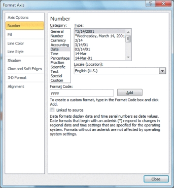 -In the figure above,the entry "yyyy" shown in the "Format Code:" box is setting up a(n)____ format to display the four-digit year.
(Multiple Choice)
4.9/5 (37)
A color bar is a conditional format that adds a horizontal bar to the background of a cell containing a numeric value._________________________
(True/False)
4.9/5 (32)
To resize the chart,drag a sizing handle,which is a square or dot on the selection box that is used to change the object's width and height._________________________
(True/False)
4.8/5 (34)
Charts include individual elements that can be formatted,including the chart area,the chart title,the plot area,data markers,and a legend.
(True/False)
4.8/5 (46)
If you add percentages to a pie chart,the percentages would appear directly on the pie slices ____________________ enough to fit the number,otherwise,percentages will appear next to the slices in the chart area.
(Short Answer)
4.7/5 (33)
The sparkline axis is simply a horizontal line that separates positive values from negative values._________________________
(True/False)
4.8/5 (40)
Edward Tufte said that ____ ink is any part of the chart that does not convey information about the data.
(Multiple Choice)
4.9/5 (39)
To reposition the legend to the left-hand side of a chart,click the Legend button,and then click ____.
(Multiple Choice)
4.9/5 (42)
Filters
- Essay(0)
- Multiple Choice(0)
- Short Answer(0)
- True False(0)
- Matching(0)