Exam 4: Enhancing a Workbook With Charts and Graphs
Exam 1: Getting Started With Excel150 Questions
Exam 2: Formatting a Workbook150 Questions
Exam 3: Working With Formulas and Functions150 Questions
Exam 4: Enhancing a Workbook With Charts and Graphs150 Questions
Exam 5: Working With Excel Tables, Pivot-tables, and Pivot-charts150 Questions
Exam 6: Managing Multiple Worksheets and Workbooks150 Questions
Exam 7: Using Advanced Functions and Conditional Formatting150 Questions
Exam 8: Developing an Excel Application150 Questions
Exam 9: Working With Financial Tools and Functions150 Questions
Exam 10: Performing What-If Analyses150 Questions
Exam 11: Connecting to External Data150 Questions
Exam 12: Expanding Excel With Visual Basic for Applications150 Questions
Exam 13: Managing Your Files150 Questions
Exam 14: Getting Started With Microsoft Office 2010150 Questions
Select questions type
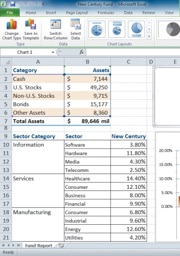 -Referring to the figure above,an example of a ____ name is row 9.
(Multiple Choice)
4.9/5  (37)
(37)
To plot the results of two data categories collected every month for a year,you should use a(n)____________________ chart.
(Short Answer)
4.7/5 (32)
To create a set of sparklines,you first select a data range containing the data you want to graph._________________________
(True/False)
4.8/5 (36)
 -Depending on the pie chart layout you choose,you can ____.
(Multiple Choice)
4.9/5 (41)
In pie charts with legends,it's best to make the slice colors as similar as possible.
(True/False)
4.9/5 (34)
Perspective values range from 0 degrees to ___________________ degrees.
(Short Answer)
4.8/5 (43)
___________________ extend the tick marks across the plot area.
(Short Answer)
4.8/5 (36)
In a pie chart,the largest piece of pie represents the data series with the smallest value._________________________
(True/False)
5.0/5 (37)
MATCHING
Identify the letter of the choice that best matches the phrase or definition.
-Compares relative values of different categories to the whole.A value is indicated by the area of a(n)____
(Multiple Choice)
4.8/5 (35)
The ____ Chart Tools contextual tabs appear on the Ribbon when you select a chart.
(Multiple Choice)
4.7/5 (38)
Excel supports the following three types of sparklines that does NOT include ____.
(Multiple Choice)
4.7/5 (43)
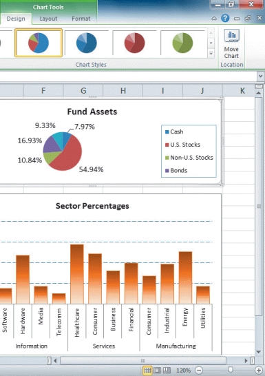
-Referring to the figure above,in the column chart,the values along the left side (0.00%,5.00%,etc. )are ____.
(Multiple Choice)
4.8/5 (43)
Increasing the rotation horizontally in a 3-D chart spins the chart ___________________.
(Short Answer)
4.9/5 (30)
To compare values from several categories with a sequential order,such as dates and times occurring at evenly spaced intervals,you would use a(n)____________________ chart.
(Short Answer)
4.8/5 (37)
MATCHING
Identify the letter of the choice that best matches the phrase or definition.
-Similar to the Scatter chart except the size of the data marker is determined by a third value
(Multiple Choice)
4.9/5 (38)
Since scientific data is often plotting two numeric values against one another,it is oftentimes best to represent this data type with a(n)____________________ chart.
(Short Answer)
5.0/5 (32)
A chart style is similar to a cell style or a table style in that it formats several chart elements at one time.
(True/False)
5.0/5 (38)
The range of values,or ___________________,of an axis is based on the values in the data source.
(Short Answer)
4.9/5 (35)
You can add visual interest to charts by using 3-D (three ___________________)effects.
(Short Answer)
4.9/5 (38)
Case-Based Critical Thinking Questions
Case 4-2
Anya has just surveyed 100 reviewers to get their reaction to a new marketing ad campaign she is heading.She has one data series that she wants to represent graphically,and she needs to display her data in a way that keeps the percent of the whole data in mind when viewing.
-Since it's important for Anya to keep percentages of her whole reviewer base in mind,she wants to represent data as parts of a whole.What chart type would you suggest to Anya?
(Multiple Choice)
4.8/5 (33)
Filters
- Essay(0)
- Multiple Choice(0)
- Short Answer(0)
- True False(0)
- Matching(0)