Exam 4: Enhancing a Workbook With Charts and Graphs
Exam 1: Getting Started With Excel150 Questions
Exam 2: Formatting a Workbook150 Questions
Exam 3: Working With Formulas and Functions150 Questions
Exam 4: Enhancing a Workbook With Charts and Graphs150 Questions
Exam 5: Working With Excel Tables, Pivot-tables, and Pivot-charts150 Questions
Exam 6: Managing Multiple Worksheets and Workbooks150 Questions
Exam 7: Using Advanced Functions and Conditional Formatting150 Questions
Exam 8: Developing an Excel Application150 Questions
Exam 9: Working With Financial Tools and Functions150 Questions
Exam 10: Performing What-If Analyses150 Questions
Exam 11: Connecting to External Data150 Questions
Exam 12: Expanding Excel With Visual Basic for Applications150 Questions
Exam 13: Managing Your Files150 Questions
Exam 14: Getting Started With Microsoft Office 2010150 Questions
Select questions type
Which of the following is not an option in the Fill options in the Format Data Series dialog box?
(Multiple Choice)
4.9/5  (32)
(32)
Anya has asked for your advice.A colleague told her to remove the legend from her pie chart,but she doesn't understand why.What would be a good reason to remove the title?
(Multiple Choice)
4.8/5 (34)
In the Format Axis dialog box,selecting Fixed 0.10 for the Minor Unit will result in ____.
(Multiple Choice)
4.7/5 (31)
MATCHING
Identify the letter of the choice that best matches the phrase or definition.
-Similar to the pie chart except that it can display multiple sets of data
(Multiple Choice)
5.0/5 (40)
Because of the compactness of sparklines,you can specify only the line color and the line leader color._________________________
(True/False)
4.8/5 (32)
MATCHING
Identify the letter of the choice that best matches the phrase or definition.
-Compares values from different categories.Areas under the lines contain a fill color
(Multiple Choice)
4.9/5 (32)
If you select a chart's series and look at the formula bar,the formula being displayed uses the ____ function.
(Multiple Choice)
4.8/5 (43)
If you want to represent the following data: 20%,25%,15%,17%,and 23%,a pie chart will best highlight the differences among the close in value data._________________________
(True/False)
4.9/5 (38)
If you do not want a chart to reflect new values in the data source,you should ____.
(Multiple Choice)
4.8/5 (42)
A 90° ____ value exaggerates the 3-D effect,making distant objects appear very small.
(Multiple Choice)
5.0/5 (47)
The ____,shown in the figure above,include data markers to indicate the high and low points.
(Multiple Choice)
4.7/5 (47)
From the Format Data Series dialog box,you can ____ as a Marker Option.
(Multiple Choice)
4.9/5 (36)
When selecting a chart,it's important to choose the right type of chart to represent your data.If choosing between a pie chart and a line chart,what factors would you evaluate in choosing which chart to use? How would each chart differ in representing your data?
(Essay)
4.8/5 (34)
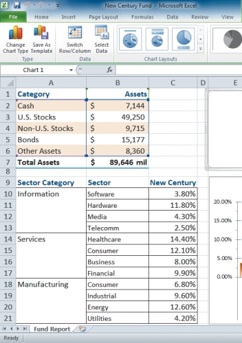 -Referring to the figure above,if you were to create a Fund Assets pie chart using the information in A1:B7,the data source for that chart would be ____.
(Multiple Choice)
4.8/5 (38)
Extreme viewing angles in a 3-D chart may elongate the chart and misrepresent the data._________________________
(True/False)
4.9/5 (39)
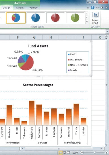 -Referring to the figure above,the entry 54.94%,shown next to the largest pie slice,is a ____.
(Multiple Choice)
4.8/5 (42)
A(n)____________________ chart shows patterns or relationships between two or more sets of values,much like an XY chart,except the size of the data marker is determined by a third value.
(Short Answer)
4.7/5 (35)
Filters
- Essay(0)
- Multiple Choice(0)
- Short Answer(0)
- True False(0)
- Matching(0)